Japanese acupuncture clinic by id inc is lined with mint-green cabinets
Pale green medicine cabinets are stacked up along the walls of this Japanese acupuncture clinic by Tokyo design office id inc (+ slideshow).
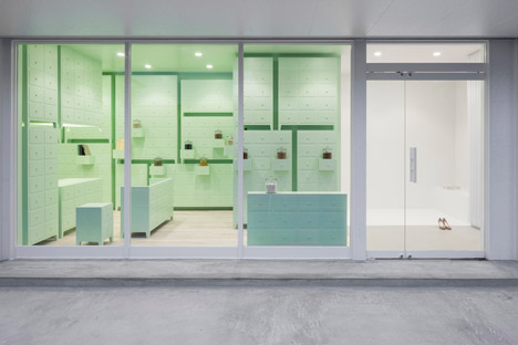
The pastel-toned space was designed by id inc for the Sumiyoshido Kampo Lounge Clinic for Acupuncture and Moxibustion – a therapy that uses the mugwort herb – in Aichi, Japan.
The space operates as both a herbal pharmacy and a treatment clinic, as well as a place for customers to learn about traditional oriental medicine.
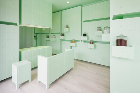
"Since early times, there have been many medicine shelves at pharmacies that handle herbal medicine," said id inc co-founders Seiji Oguri and Yohei Oki, who have also designed for Nendo.
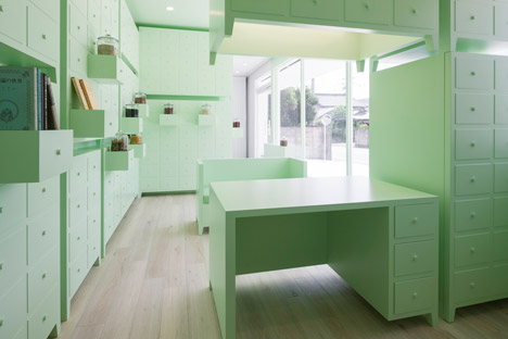
Tiers of mint green cabinets with square drawers are stacked one on top of each other, stretching from the green painted ceiling to a pale wooden floor.
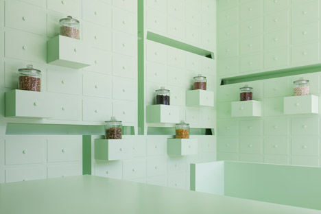
"The medicine shelves are lined up and stacked up," said the designers, "The many drawers represent how Sumiyoshido faces treatment with integrated methods," they said.
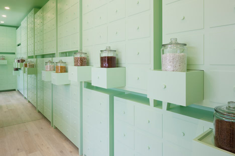
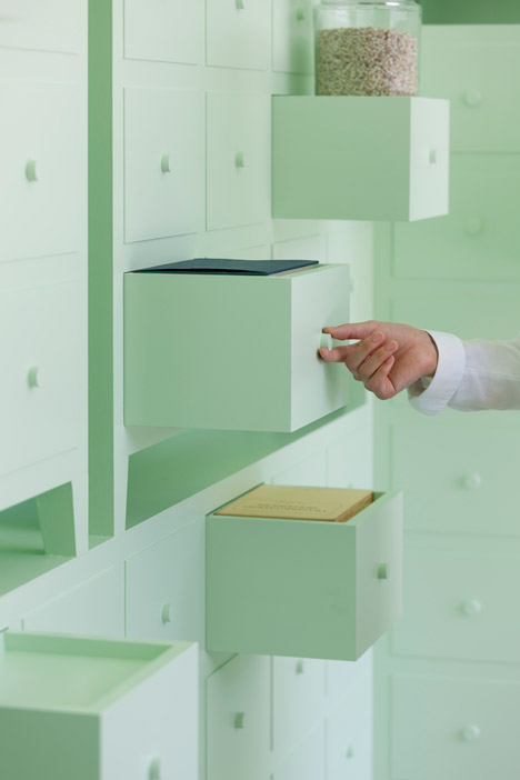
In some of the open drawers, customers can explore the texture and aroma of herb samples kept in apothecary jars, while stacks of books on oriental medicine can be perused in others.
Perpendicular to the glass shop-front, a consultation couch faces the prescription desk with a hollow cabinet containing lighting suspended above.
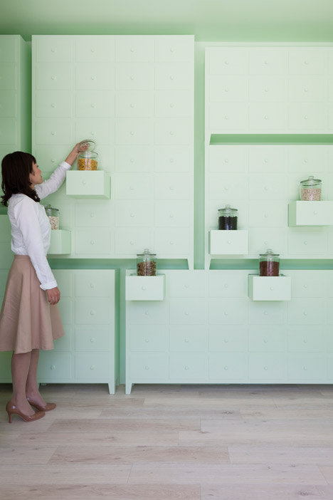
The furniture is covered in mock drawer fronts that aim to create a "uniform expression" for the space.
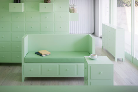
"The space painted in a mint green colour freshly expresses a world of herbal medicine, which is derived from plants," said the designers, who have also created a range of colourful heat-treated steel homeware.
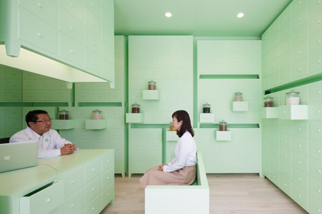
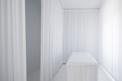
While the Kampo Lounge is dressed in pastel green cabinetry and paintwork, stark white walls and soft drapery surround the private treatment areas of the acupuncture and moxibustion clinic.
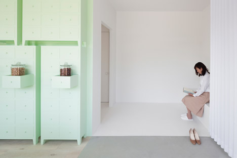
"Thick drape curtains were intended to create a soft impression even though it is an examination room," they explained.
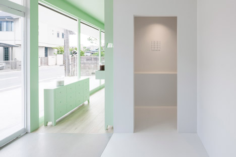
The two spaces are separated by a white waiting room with glass doors, which also form the entrance point to the building.
"It expressly tells that one building has two spaces for each different purpose," said the designers.
The studio also designed the logos and graphics for lounge and clinic to tie in with the interior design.
Photography is by id inc.