"'Looks like' is the lowest kind of criticism"
Comments update: architectural debate commanded the conversation on Dezeen this week, with one reader accusing the Modernist movement of "raping South America", while others were more concerned with defending MAD's design for the George Lucas museum from lazy criticism.
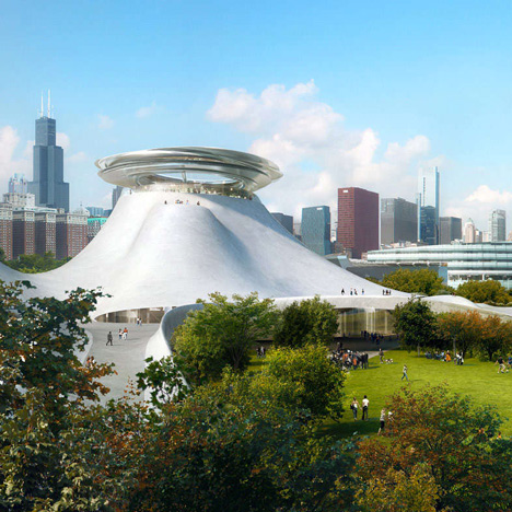
MAD architecture: The unveiling of the curvy design for the Lucas Museum of Narrative Art in Chicago by Chinese firm MAD, led to a flurry of "looks like" comments.
Commenter Jeroen van Lith compared the building to a "nuclear power plant," while junihaoni likened it to a project from 2008 by the now-defunct firm Future Systems.
One reader thought it looked more like a famous scene from Steven Spielberg's film Close Encounters of the Third Kind.
But davvid was among commenters who hit back at the form-comparisons as a lazy critique, writing "Oh please. 'Looks like' is the lowest kind of criticism." Read the comments on this story »

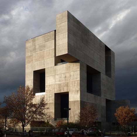
Modernism attacks: a monolithic concrete innovation centre designed by Chilean firm Elemental and Alejandro Aravena was one of the most popular projects of the week, but not everyone was a fan.
Santiago Meneses revealed that students had started referring to the building as "Azkaban Prison", a reference to the magical maximum security facility in the Harry Potter series of novels.
"I've been to the building. NO OFFICE HAS A WINDOW," wrote Cesar A. Hidalgo. "Modernism continues to rape Latin America," he added.
"If modernism rapes Latin America, what do you propose? Neo-classicism?" countered spadestick, while other commenters described the building as "beautiful".
"This building is like a biker who looks real tough, but is really a big softy," added 8mismo. Read the comments on this story »

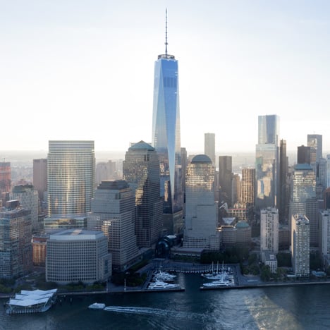
Open for business: the opening of the One World Trade Centre skyscraper by SOM reignited debate about the design of the new buildings on the site in central New York.
"What a thoroughly disappointing building," wrote Nick, in one of the most popular comments of the week. "Yawn. New York's beginning to look like a facsimile of itself," added generalpopulation.
"People love to complain about the WTC, but I never hear any articulation about what they actually wanted instead that isn't wildly delusional," responded regular commenter Colonel Pancake. "It's a quasi-private office development, which throws out the window any sort of obligation for its developers to lose money for the sake of pet projects of architectural novelty."
"The earlier Liebskind concept just had a bit more finesse," retorted Suz. "The built version is clunky in its form and already looks dated." Read the comments on this story »

Up in the air: a proposal for an aeroplane cabin with no windows and an interior covered with a giant OLED screen showing projections of the sky was not well received by Dezeen readers.
"What they're basically saying is that if they paint the interior blue with some clouds on it, it'll feel like it's all open to the outside. Good luck with that," wrote Iikka Keränen.
"Single-handedly the most terrifying thing I've ever seen. Goodbye to any customers even remotely scared of flying," added Miranda Babbitt.
Others and some practical concerns about the idea. "So what happens when someone wants to nap? And what happens when there's a horrendous storm system the plane's flying through?" asked Adam.
"The illustrations make it look as though passengers will be seeing some amazing holographic projection, when it fact sitting next to the wall will be like sitting next to your TV screen," pointed out Polishbear. Read the comments on this story »