Nendo showcases prolific product range in Japanese department stores
Nendo has designed retail concessions for its wide range of products created exclusively for department stores in Japan (+ slideshow).
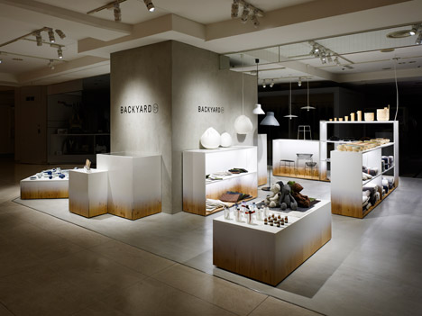
Nendo designed the Backyard spaces for by|n, the Japanese studio's range of products for Seibu – a subsidiary of Millennium Retailing, which also owns the Sogo department stores.
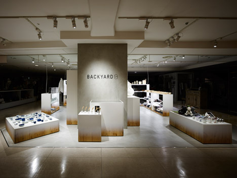
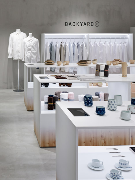
The designers wanted to "offer a tantalising glimpse into the back of the shop", so used exposed concrete walls and plywood to emulate the packing and preparation areas that customers often don't get to experience.
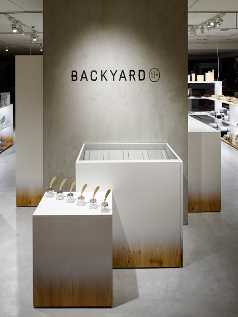
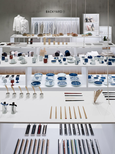
Objects are displayed on plywood plinths and shelving units that are painted white at the top but reveal the material at the bottom.
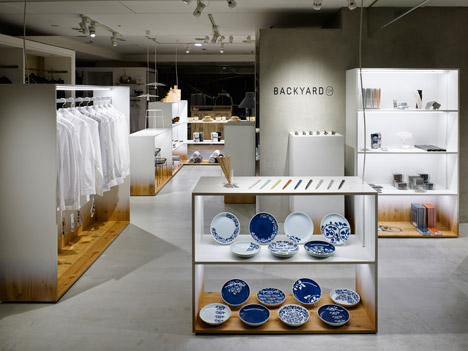
"We wanted to combine the novelty of the commercial back yard, in which new products arrive straight from the workshop, with the excitement of playing in the back yard at home," said the studio.
Dezeen Book of Interviews: Nendo founder Oki Sato features in our new book, which is on sale now
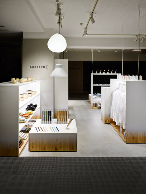
The paintwork gradually fades down to reveal the wood grain around the bases of the rectangular stands.
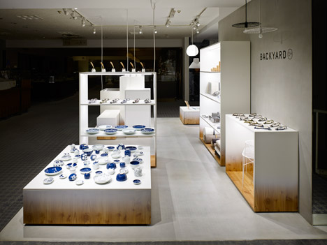
These are used to create concessions at Seibu's Tokyo locations in Shibuya and Ikebukuro, as well as the Sogo store in Yokohama.
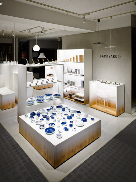
"Most shops hide the plywood base of their fixtures under licks of paint, so showing it like this brings the shop's 'backyard' into the shop itself, casually and nonchalantly creating a link between the hidden world of production and the shopping experience," the studio said.
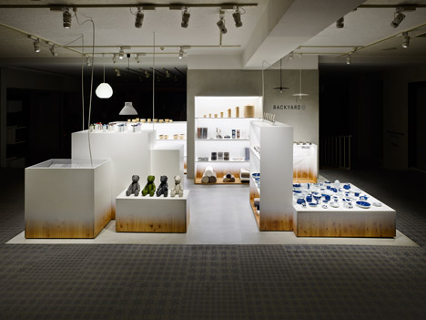
Backyard offers Nendo the opportunity to showcase its growing range of products, which range from fashion accessories to homeware.
Pieces in the by|n collection include bent-wire baskets and umbrellas with two-pronged handles that stand unassisted, both launched during the past month.
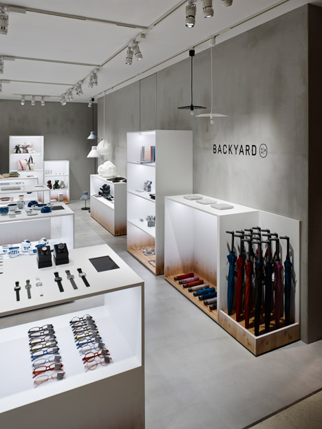
Lamps made from crinkled paper, moulded paper and wire mesh – all created while working with local artisans – are suspended from the ceilings.
At the Ikebukuro store, the displays are arranged around a chunky central column rendered in concrete.
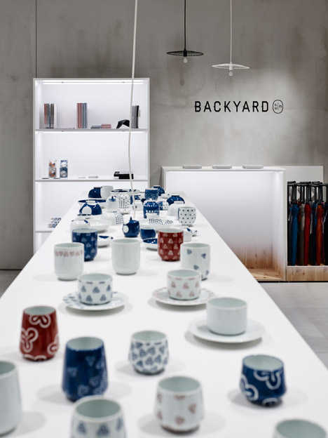
The same material is used on a panel that provides a backdrop for the square space in Shibuya, and covers corner walls on two sides of the larger area in Yokohama.
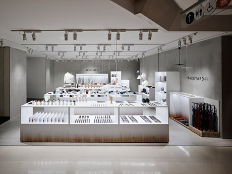
The Backyard and by|n logos are printed in black onto the mottled grey surfaces.
Photography is by Masaya Yoshimura.