Jump Studios dresses Soho juice bar with industrial fittings and tiled herringbone floor
Industrial pipework runs over the ceiling of this juice-bar by London office Jump Studios, which features a ceramic herringbone floor and a marble counter.
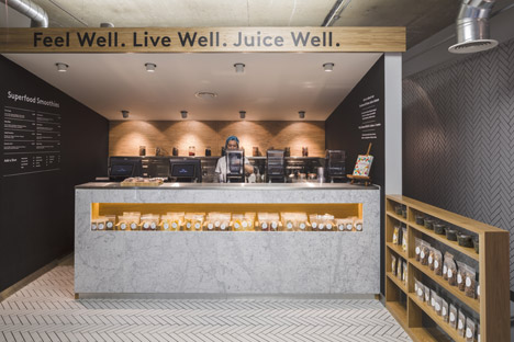
Jump Studios was behind the design of the space called The Juice Well, a cold-pressed juice bar in Soho, London. The cafe is set behind a shop front featuring a panel of patterned green glass on the ground floor of a building with an upper brick facade.
The cafe is a joint venture between documentary-maker Joe Cross of Fat, Sick & Nearly Dead – a film in which he drinks only fruit and vegetable juice for 60 days – and local restaurateur Will Ricker, who founded Mexican restaurant La Bodega Negra. It is intended to promote a healthy diet.
The London practice wanted to produce a design that reflected the home-made nature of the juices, using exposed industrial pipework and untreated wood to clad the interior space.
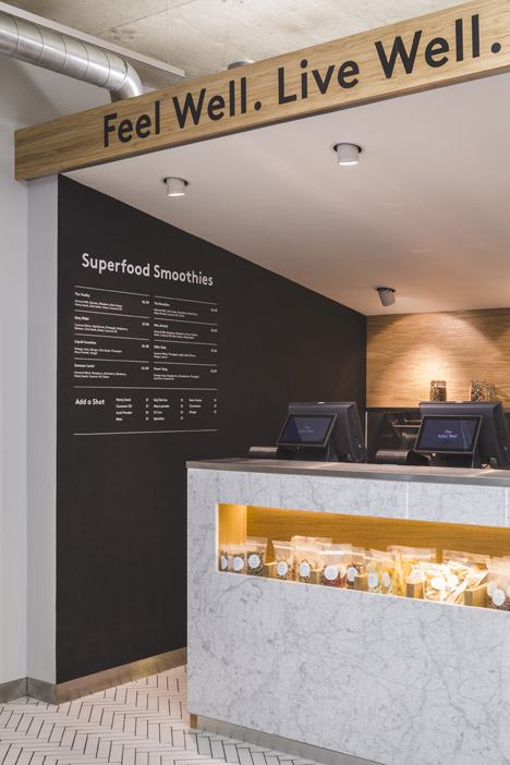
"The client brief was to create a space that conveyed the crafted and hand-made approach to the product; high-end super food smoothies, cold-press juices and cleanses all of which are made every day on the premises," said studio director Simon Jordan.
"Industrial fittings were left exposed as we wanted to reflect the fact that this is a space where the product is made; from raw ingredients to finished, bottled product. A workshop, if you like."
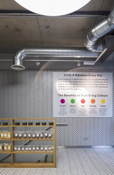
A wooden herringbone floor has been reinterpreted in slim white ceramic tiles, which run from the floor onto the walls on either side of the shop floor and into a stairwell.
A white marble counter situated under a kiosk to the rear of the shop displays the cafe's fresh produce and is used as a preparation area for the hand-pressed juices.
The cafe's motto is written across the wooden top over the serving kiosk, while white text on the black walls either side of the counter is used to display the menus and price lists.
A rectangular pocket in the front of the juice bar and a set of white oak shelves positioned at right angles to it are used to display pouches of solid snacks.
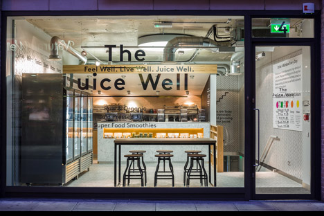
Opposite, a bank of stainless-steel fridges stores bottles of pre-prepared milkshakes and juices, for customers who have no time to wait.
"The space is designed to express the quality and carefully crafted nature of the produce, combining a utilitarian but rich, honest and natural palate of materials," said Jordan, whose studio also designed Google's colourful Madrid offices.
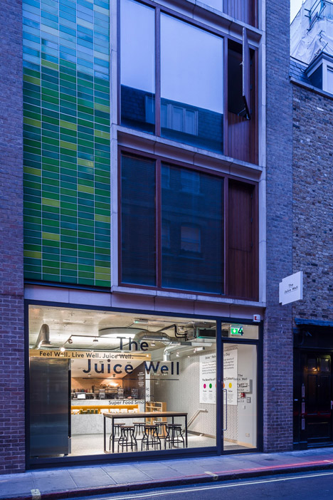
A raised table and bar stools positioned in the shop window have white oak tops and black stainless steel frames.
The shop name is presented in black text applied directly to the glass frontage.
London-based communications agency The Exposure Group created the brand identity and packaging for the cafe.