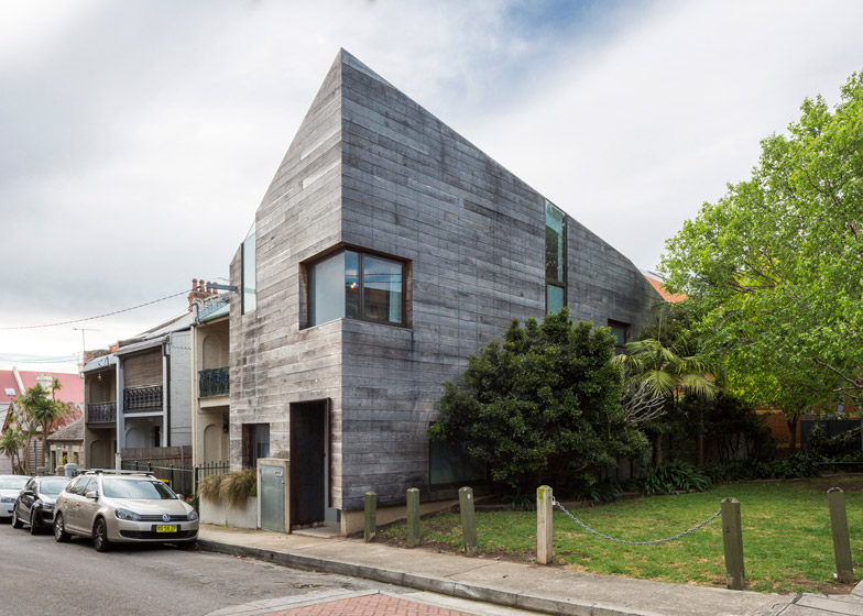
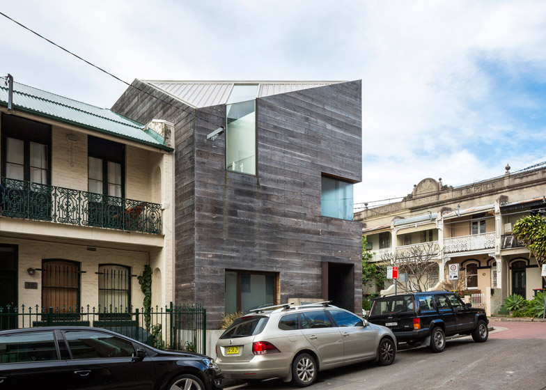
After being instructed not to design a "white box minimalist house", MAC Interactive Architects specified weathered timber boards for the exterior of this narrow Sydney residence (+ slideshow).
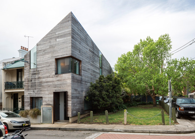
The 5.5-metre-wide Stirling House, dubbed "the ark" by local residents, was designed by local firm MAC Interactive Architects to replace two dilapidated old cottages considered beyond repair by Australia's national heritage body.
"After much discussion with Heritage it was felt that it would not be possible to restore them to anything other than museum status as they could not be brought up to current BCA standards," said architect Andy Macdonald.
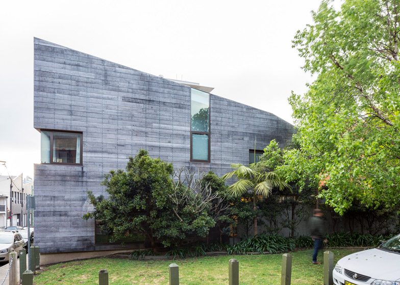
To pay tribute to the clapboard facades of these now-demolished structures and respond to the client's anti-"white box" brief, the new house is clad with weathered grey timber, which has been laid horizontally. There are no eaves details or window sills, so this cladding sits flush with every edge.
"The cladding appears to end abruptly against the sky, with no parapet flashing, whilst the windows wrap around the main edges to articulate the three-dimensional form, tying the exterior and interior into a unique whole," explained Macdonald.
The three-storey building features an asymmetric profile that is at its highest on the building's south-west corner. The architect said he started with a simple three-storey form and "eroded" it to suit planning regulations.
"Architecturally, the form came directly from combining both the context of the surrounding two/three/four-storey buildings and the numerical planning controls determined by council."
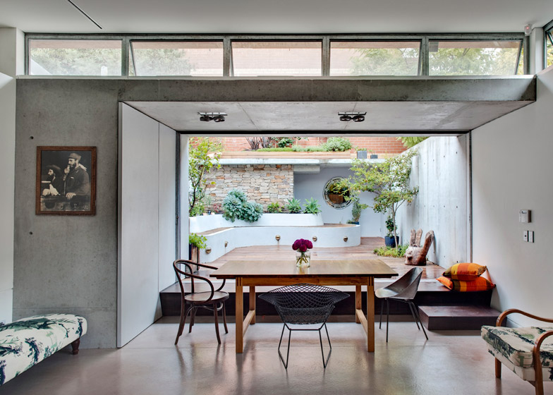
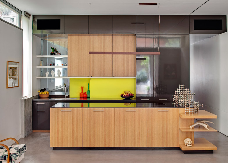
Inside, the ground floor is split into two halves – the front is a secluded living room overlooking the street, while the rear space houses a combined kitchen and dining space that can be opened out to the garden.
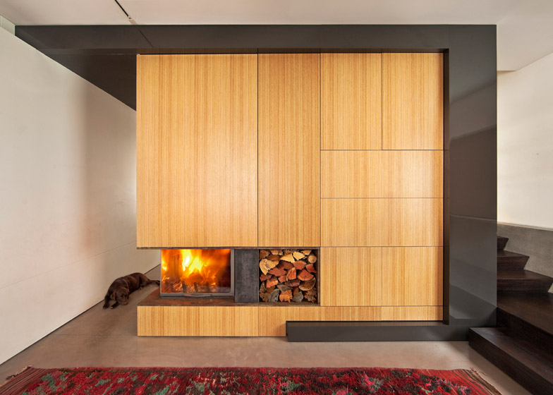
A central staircase divides the two rooms. The wall surrounding it is fitted with timber joinery that wraps a WC, and extends to the kitchen units and the television and music storage.
Two equally sized bedrooms with accompanying en-suites occupy the second floor, alongside a double-height study squeezed into a narrow space. The window of this room folds up across the roof.
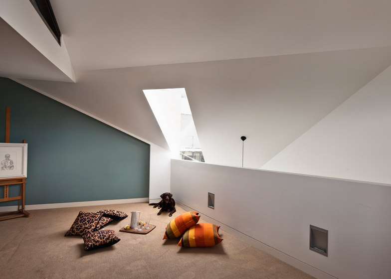
Above, a mezzanine loft serves as a children's play space – fulfilling the clients' brief for "a child-friendly house".
A concrete structure was chosen for both cost-saving and aesthetic reasons. It is left exposed in several rooms, standing in contrast to the accompanying white-painted plasterboard.
An eclectic selection of furnishings are accompanied by the clients' artworks and other curiosities.
The building's location at the end of the street also allowed the addition of side windows, offering views out to a small neighbouring park.
Exterior photography is by Tom Ferguson. Interior photography is by Murray Fredericks.
Project credits:
Architecture: MAC Interactive Architects
Project architect: Andy Macdonald
Design team: Ian Lim, Emanuele Rattazzi, Robert Kalocay
Builder: Spyker/Taylor Constructions

