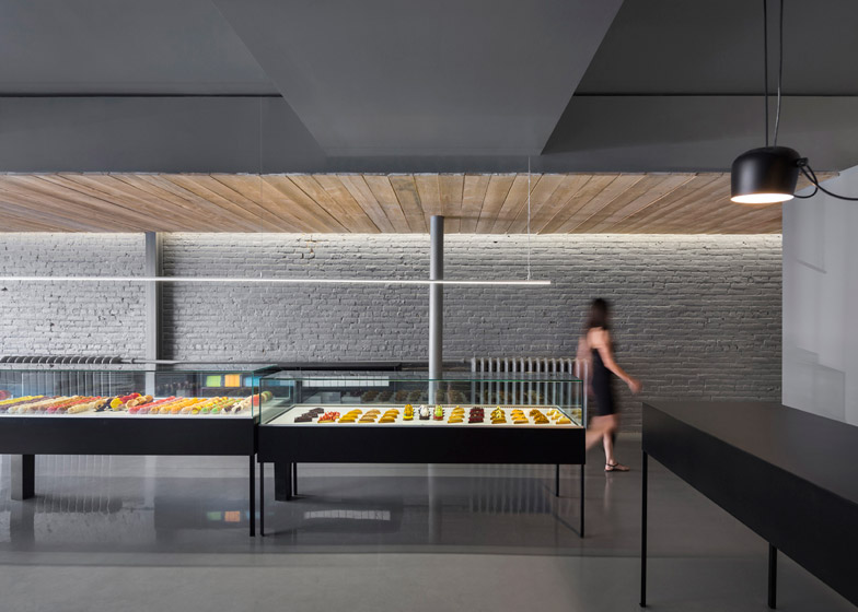
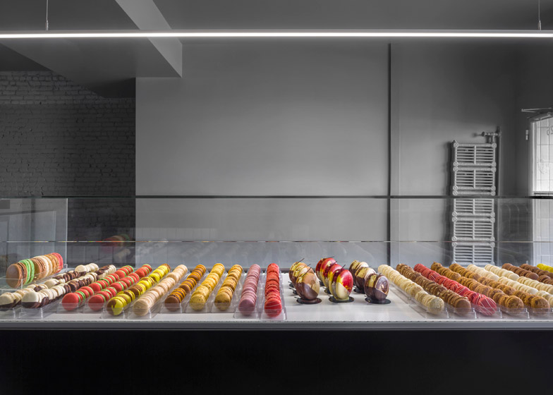
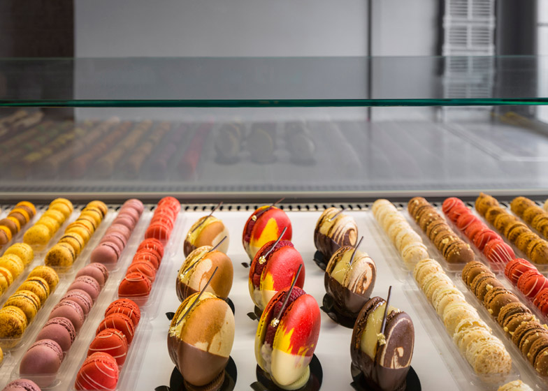
Colourful cakes and pastries are displayed in glass vitrines against a stark monochromatic backdrop in this Montreal patisserie by designers Atelier Moderno and Anne Sophie Goneau (+ slideshow).
Having previously run the business elsewhere in the city, the owners of À La Folie decided to relocate the store to a space on Avenue du Mont-Royal and invited Atelier Moderno and Anne Sophie Goneau to renovate the interior.
The designers said the proprietors of the patisserie "were open enough to understand that they had to get out of their comfort zone" with the design of the new shop.
Named À La Folie, the 60-square-metre shop features black and white surfaces on both its interior and exterior, designed to act as a "backdrop to the vibrancy of both the street and the pastries within".
"The only colour we wanted to show is the colour of the product," the designers told Dezeen.
On the outside of the patisserie, three generously sized windows encourage customers into the store, while the entrance sits to the right above a worn tile step.
Inside, the lengthy space is divided into two sections – the customer area and the kitchen with a small WC – by a mid-height wall placed towards the centre-back of the floor.
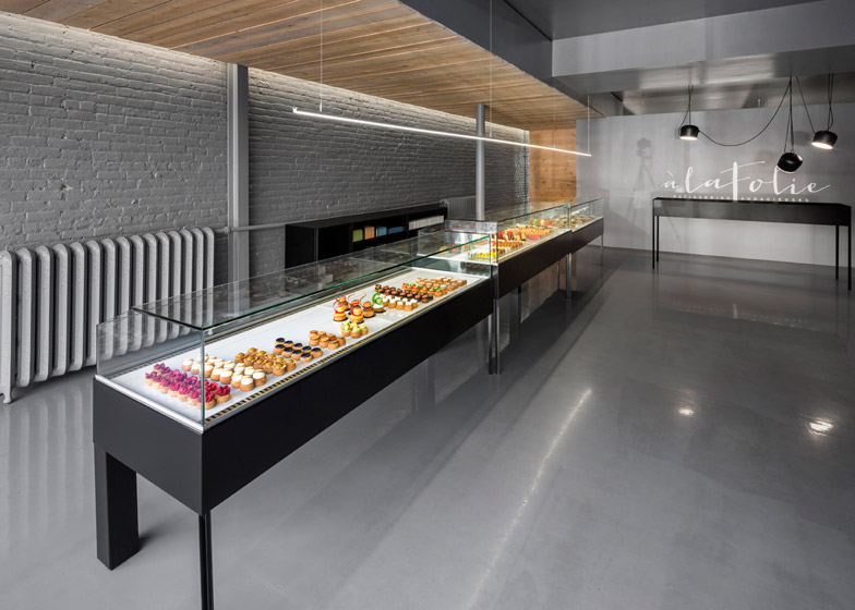
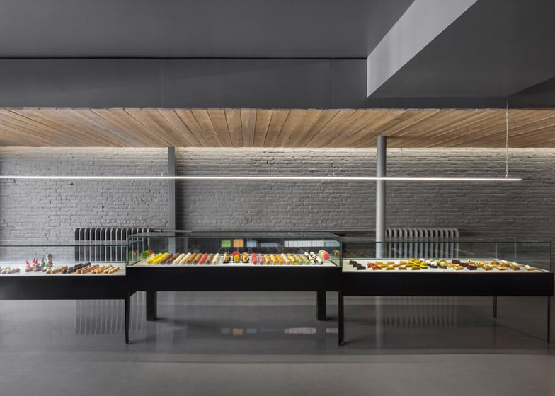
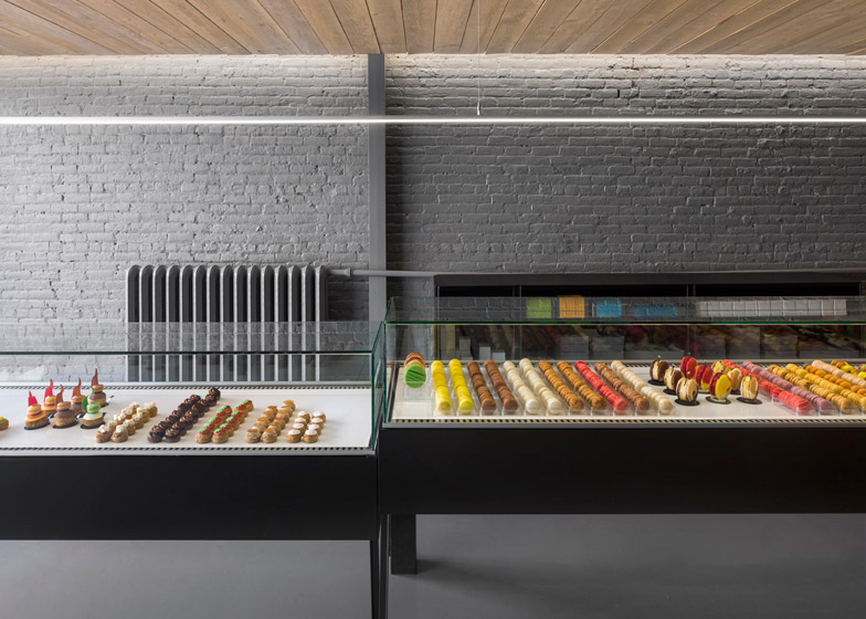
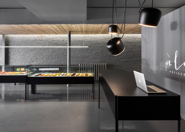
Pastries are displayed in three custom-made, steel-framed refrigerating units that stand in the centre-left of the space. A long, thin strip of LED lights hangs above.
Black storage units, flanked by two cast iron radiators, are hidden away behind.
On the ceiling over the pastry display units, the designers have fitted a band of hemlock wood slats that stretch the depth of the space and descend part of the back wall of the customer area.
According to the designers, these unpainted slats were installed as a nod towards production line industries, "recalling the aesthetic of the wooden pallet or the conveyor belt" while attempting to create "a link between the kitchen and the front".
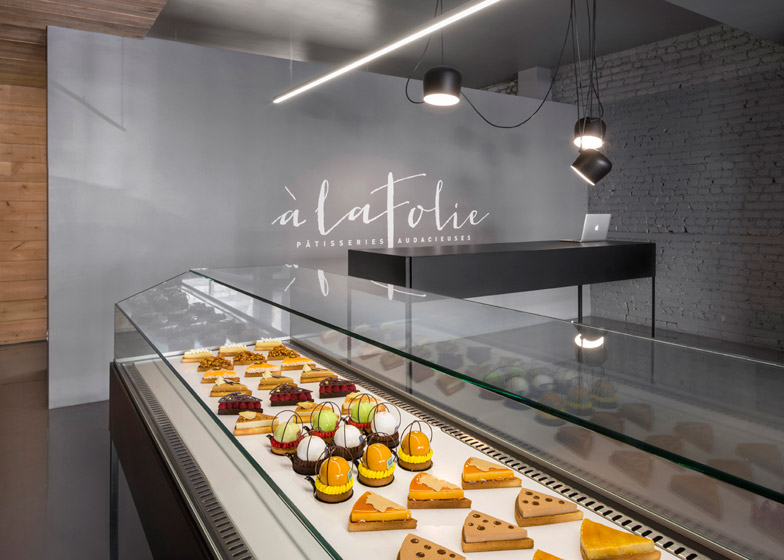
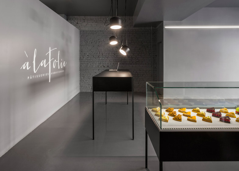
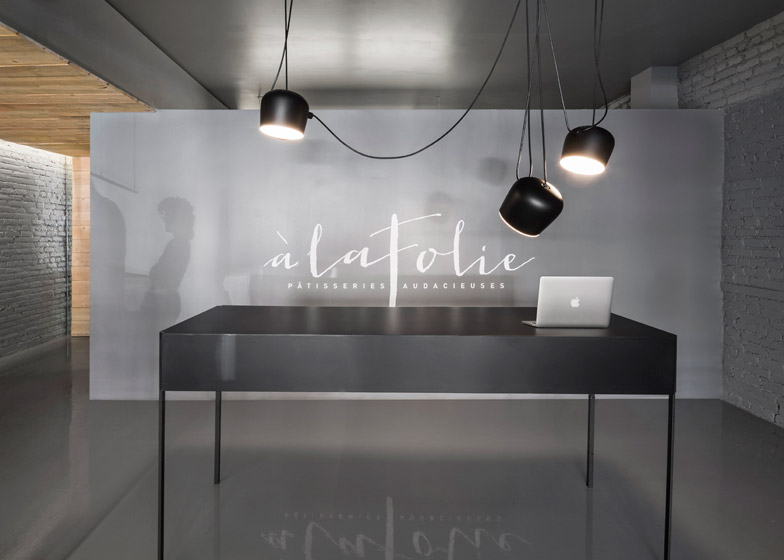
The payment counter – a taller variant on the display case units – stands towards the back of the shop floor. Above it hang three Ronan and Erwan Bouroullec-designed AIM pendent lamps. These were chosen, said Atelier Moderno and Goneau, because they display both a "laboratory and artistic look".
An open entrance to the kitchen sits behind the payment desk. The designers wanted to allow the sounds and smells of the kitchen to bleed through to the customer area, hoping that this would "tease the senses of the patrons".
Photography is by Stéphane Groleau

