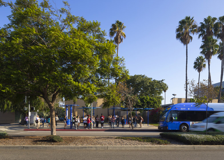
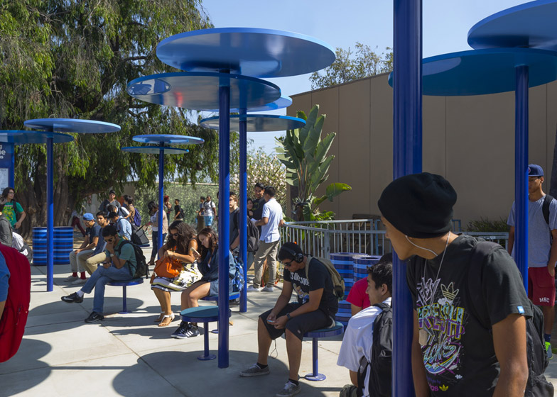
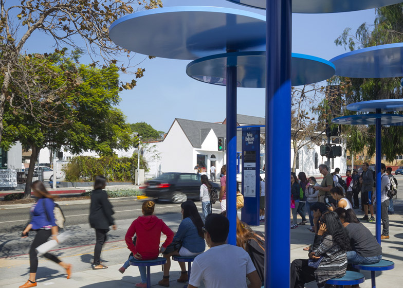
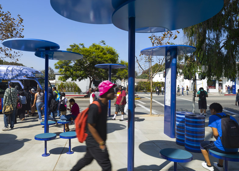
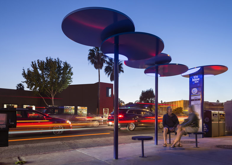
Lorcan O'Herlihy Architects has redesigned Santa Monica's bus shelters by developing a modular kit of parts that can be used to build an assortment of round blue canopies, supported on slender poles (+ slideshow).
Los Angeles-based Lorcan O'Herlihy Architects (LOHA) was commissioned by the city council to address the bus network's reputation as an undesirable method of transport by creating new attractive shelters that can be easily adapted to suit every stop.
Comprising overlapping circular canopies that sit atop narrow poles, the Big Blue Bus Shelters were designed as a more flexible take on traditional shelters. They are accompanied by fixed stools with the same round shape.
"When we reached a pole-and-disc solution, a modular kit of parts became an obvious way to address the provision of shade in over 360 locations, each with unique site constraints" O'Herlihy told Dezeen. "This flexibility has been key."
Using this modular design, the firm was able to create a series of shelters that both avoid subterranean services and adhere to government disability requirements. The canopies also take account of the angle of the sun to maximise shading.
"While conducting research, we were struck by the amount of people we witnessed standing by light poles or nearby utility boxes even though a conventional shelter was only a few feet away. It became clear that the conventional mail-order bus shelter was not necessary in the sunny California climate," added the architect.
"It was also requested that the new shelters be impervious to vandalism and loitering, and provide maximum visibility to surrounding businesses," he added.
The team see the structures as a model for sustainable urban development. They were all constructed with reclaimed and locally available materials – mostly steel – to lower the cost per unit.
Ensuring ease of maintenance, the shelters are connected to alternate power sources and feature high-efficiency LED light fixtures.
A selection of the stops also utilise GPS technology to provide passengers with real-time information on the location and approximate arrival time of buses. These details appear on independently standing consoles, known as Rider Information Displays.
Bruce Mau Design worked with the firm to design a graphic identity for the project.
Photography is by Lawrence Anderson/Esto.
Project credits:
Team: Lorcan O’Herlihy, FAIA (Principal), Donnie Schmidt (PD), Ian Dickenson, Tom Myers
Brand Identity Consultant: Bruce Mau Design

