"How about a reasoned discussion?"
Comments update: Zaha Hadid generated a heated string of comments – and a pleading request for a reasoned debate – after hitting back at criticism of her Tokyo Olympic Stadium.
Tokyo rift: Hadid's comments were aimed at Japanese architects who had been campaigning against her scheme – a number of whom had also entered the competition to design the stadium. "They don't want a foreigner to build in Tokyo for a national stadium," she told Dezeen. "On the other hand, they all have work abroad."
"I think it's embarrassing for them, that's all I can say," said Hadid. "I understand it's their town. But they're hypocrites."
A large number of commenters backed Hadid's stance, including Onedog who wrote "sounds like sour grapes to me. The judging panel has made its decision and you didn't win, move on."
But opponents included TYO, who said that Hadid should "listen to what people are saying, not just label them hypocrites because they are against her design."
"Architectural arrogance and sour grapes aside, the general mood of today seems to be far more willing to endorse something more modest and subtle than this sort of flailing whale of a stadium," added l'oncleb.
"Just constant egotism from both sides. How about a reasoned discussion?" pleaded will, while arielnano was just enjoying the entertainment: "There are too many snobs in the profession for so much drama. *Grabs popcorn*. I love Zaha, and Toyo Ito, etc. but they're sounding like children right now." Read the comments on this story »

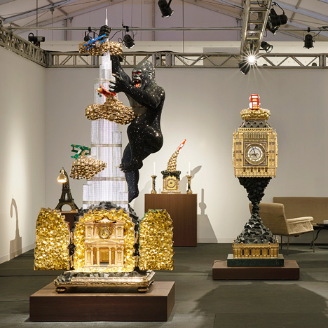
Good Job? A collection of monumental furniture pieces by Studio Job, inspired by architectural landmarks, debuted at Design Miami and proved instantly divisive when we published them on Dezeen.
While commenters who had been at the event described the show as "the best at Design Miami", others were unimpressed.
"Studio Job creates kitsch, drowns it gold and calls it design. It's greatly disappointing," wrote Nout.
"Perhaps I don't understand. I have really tried to see the beauty here, but I can't," added James. "The craftsmanship is clearly of a high quality though, which is something."
But dirty nick was among those who felt that the pieces worked. "Obviously beauty is in the eye of the beholder and pretty poor beholders here, but the thing that makes these pieces work is attitude... Daring to go your own way no matter what and I must admit it seems like fun to show the finger design-wise and get rich doing it," he wrote. Read the comments on this story »

Dizzy heights: news that the freshly completed One World Trade Centre building in New York had been named the most expensive skyscraper of all time triggered a discussion about the treatment of labourers.
"Well, there's no slave labour in New York so they can't keep construction costs down that way," wrote ismellittoo in the most popular comment of the week.
"Or you can face the reality and say it's amazing how inexpensive a skyscraper can be when unions aren't in total dominance of a construction site," chimed in Trent.
But his comment left Simon Saunders unimpressed. "Yes it IS dreadful when the people building enormous, massively complicated structures have to be paid properly and given safe working conditions isn't it," he wrote.
"Oh for those halcyon days when people fell to their deaths in preventable circumstances and had to prostrate themselves before stovepipe-hatted industrialists..." Read the comments on this story »

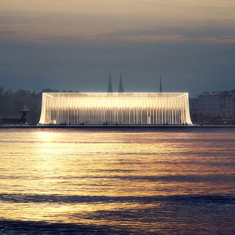
Helsinki debate: the unveiling of the six anonymous designs shortlisted for the Helsinki Guggenheim open architecture competition was a hot topic, with many readers failing to find their favourites from the 1,715 submissions on the list.
Commenter Guggen called for some of the shortlisted entries to be disqualified, feeling that they had not complied with the rules of the competition, while miss match said one of the entries looked similar to a finalist for the Oslo Waterfront competition.
"These six finalists look like a choice for some provincial museum that nobody cares about," wrote critic. "It is Guggenheim. It should be a statement of architecture, not some poorly done, visually cheap building."
"I am a member of one of the shortlisted teams and I don't feel like what my team has accomplished is 'visually cheap'," retorted P. "Maybe all six fall short of having world class visuals, but keep in mind the extraordinary cost and volunteer hours to each team in completing this project."
But some readers did manage to time something they liked in the six projects, including KB-P who wrote: "The draped curtain takes the Semperian idea of dressing to the next level. White walls, designer dresses! My winner!" Read the comments on this story »

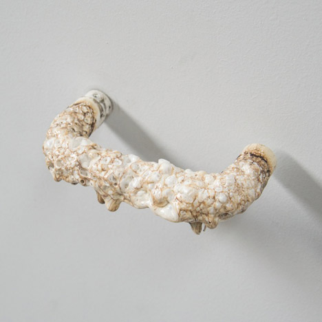
Sensory overload: Eindhoven designer Rene Siebum recreated a set of standard commercial doorhandles in various textures, as part of a project about making objects more interesting to touch.
One version in particular prompted a visceral response from a reader: "If I ever feel the need to get a door handle that looks and, I guess, feels like a diseased penis I know who to go to," wrote the guest commenter.
"It reminds of the time when I was living in residence and we dropped by the local barber, got a bag of hair and then glued it to the door handle of this one guy who was always coming home drunk," added Charlie Bing.
But The Liberty Disciple was a fan of the idea: "I love exploring touch in design. It's under utilised in today's visual-based architecture. Any exploration is welcome, especially when it comes to door handles, as this is typically the first haptic experience from architecture that someone experiences." Read the comments on this story »