Shopify offices by MSDS Studio feature meeting rooms designed to look like shipping containers
Canadian design firm MSDS Studio has fitted out a Toronto warehouse with modular boxes to form offices for e-commerce company Shopify (+ slideshow).
Toronto-based MSDS Studio was approached by online retail brand Shopify to redesign the interior of its offices in a 100-year-old warehouse. The studio divided the existing space into two volumes representing different areas of trade activity.
"The design of the office is built on the metaphor of the mechanisms of contemporary commerce: the front office block and reception area are the market, the rear office is shipping and transport, while the third floor, currently under development, will be production or fabrication," said the designers.
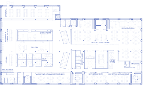
One side of the plan contains offices, while a social area comprising a games room, cafe and a meeting space called the War Room are located on the other.
The layout accommodates 90 desks, a reception and retail space, meeting rooms and several areas intended for staff interaction.
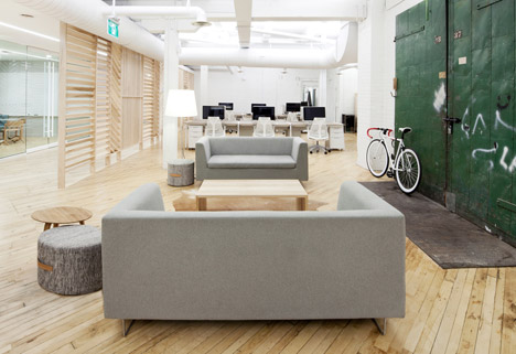
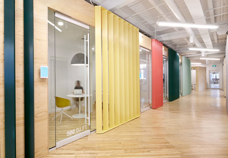
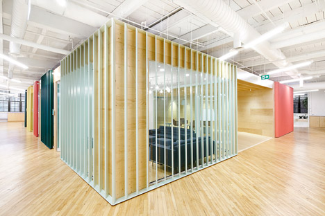
The reception area operates as pop-up shop displaying wares by Shopify's clients, while rooms are enclosed in timber and metal boxes that are intended to suggest shipping containers.
"Aluminium louvres cladding much of the block, painted in a palette derived from the shipping containers, imply the corrugated material used in their construction," said the team.
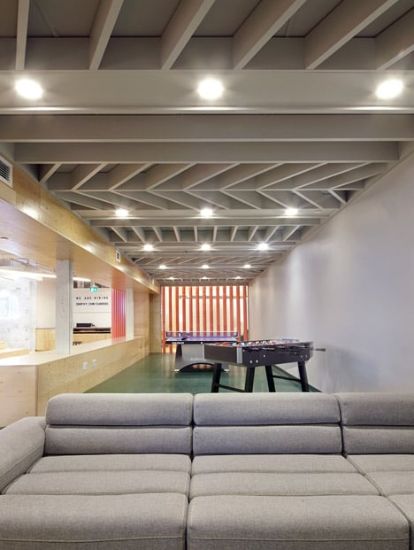
White electrical and extraction pipes run across the ceiling, giving the interior an industrial feel that resonates with the shipping container- and crate-inspired enclosures.
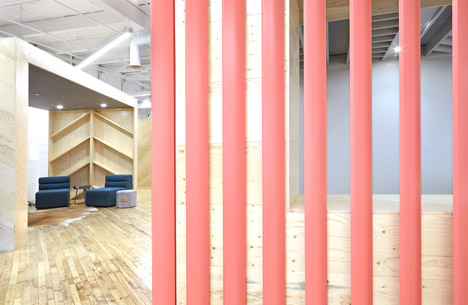
Chunky planks of pale maple, retained from the original building, run diagonally across the floors and joists are arranged in a chevron pattern across sections of the ceiling.
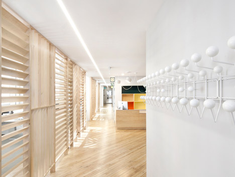
This pattern extends onto storage units that have slanted shelves and a series of slatted partitions, with wood running in horizontal, vertical and diagonal patterns. Collectively the wooden elements are designed to give the space the appearance of a giant wooden palette.
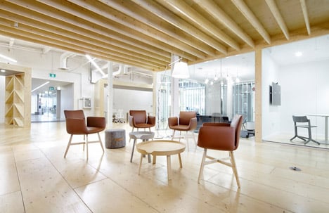
Louvres are used to partially separate one space from another, while maintaining a sense of openness and visual connection.
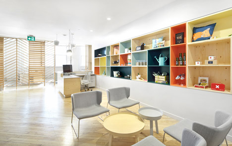
Soundproof glazing and soft furnishings help to dampen noise from neighbouring meeting and work areas in the open plan spaces.
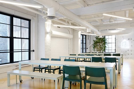
A staff kitchen that doubles as a bar for evening events wraps around this central space. Long sections of tube lighting are suspended from the ceiling and the company's logo is emblazoned on a white-painted brick wall, using fluorescent lighting often used on shop signage.
Photography is by Paula Wilson.
