Snøhetta references religious architecture for Aesop's 100th store
Architecture studio Snøhetta has created a ceiling of intersecting domes inside Aesop's first outpost in Norway – the Australian skincare brand's 100th boutique (+ slideshow).
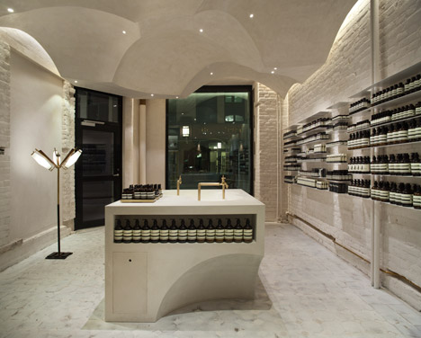
The small space on Oslo's Prinsensgate has been by overhauled Snøhetta, which has offices in Oslo and New York, to house the newly opened Aesop store.
"In this intimate 66-square-metre space, our goal was to do a lot with little; to play with contrasts in both material and form – with the contemporary and the traditional," said a statement from Snøhetta, whose designs have been selected to feature on the back of Norway's new banknotes.
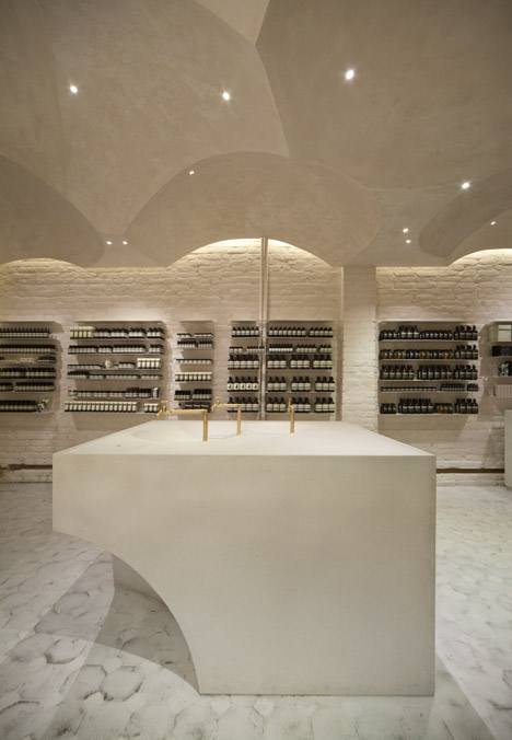
Through "a process of archeology", the architects have peeled back layers from existing surfaces to uncover materials and fixtures that date back to the 1800s.
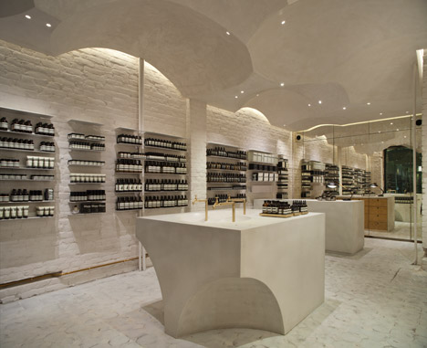
New interventions include the ten intersecting domes of various proportions that span across the ceiling, finished in matte gypsum plaster to create "a traditional form reminiscent of Orthodox churches and monasteries".
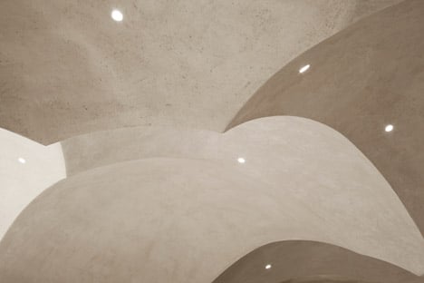
Small spotlights are dotted around the concave surfaces to light the room, with additional illumination provided by cove lighting hidden between the ceiling and walls.
A sink located in the centre of the space also has curved dome sections removed from the corners around the base to minimise its footprint.
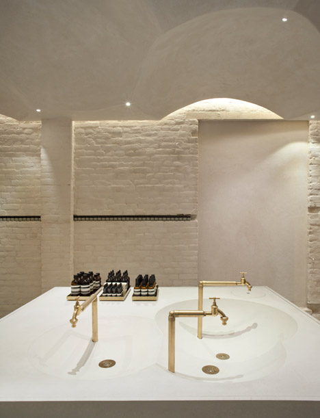
"Its form replicates those of the ceiling domes almost in reverse," said Snøhetta. "The multiple domes in the ceiling function to de-focus the space, while the single wash basin focuses the activities."
Three brass taps stand above the bowl-like indents in the surface that form the basins, where customers can test the products and wash their hands.
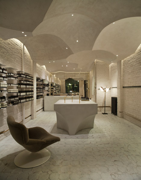
Whitewashed brick walls provide a backdrop for displaying the brand's signature bottles, lined up on shelves along one side of the store. More products are slotted into a horizontal niche formed by a missing line of bricks in the opposite wall.
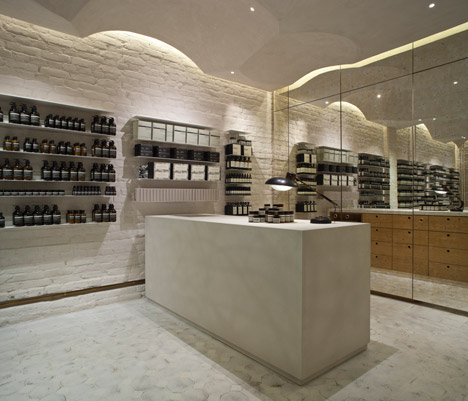
Mirrors cover the back wall behind the chunky cuboid-shaped retail counter, facing the large window that looks onto the street. The floor tiles uncovered during the renovation are treated with a pale finish to match the monochrome interior.
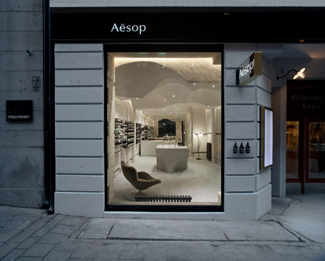
The Oslo shop is number 100 in the list of Aesop's global retail outposts, each designed to be unique. In an interview with Dezeen, the skincare brand's founder Dennis Paphitis said he was "horrified at the thought of a soulless chain" so made sure that no two stores have the same design.
Recent Aesop interiors include a Stockholm store with a huge gnarled elm wood counter and an Adelaide boutique that uses pale wood and antique marble.