Funny, cutting, witty and informed – comments from Dezeen readers never fail to get under the skin of a story. Dezeen's social media editor Ross Bryant selects 10 of his favourites from the past 12 months.
"We, the concerned neighbours, will be watching... forever"
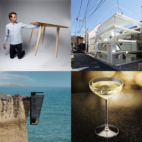
There are few things that get Dezeen readers hot under the collar like Japanese architecture, and this house featuring a transparent facade was no exception.
Sparking a debate about the practicalities of daily life and intimate moments shared among its residents, the divisive see-through home impressed, bemused and amused readers in equal measure. Read the story and comments »
"Let's call Pamela Anderson and make a soup kettle"
This Champagne coupe was created from a mould of British model Kate Moss' breast, referencing the popular mythology surrounding the first Champagne coupe, which was supposedly shaped around the left breast of French queen Marie Antoinette.
Never far from a cheeky comment, our Champagne-guzzling readers suggested the creation of vessels with larger proportions. Read the story and comments »
"And the Lord said to Noah, 'Go into the ark and watch the neighbours suffer'"
Responding to the completion of the UK's "first amphibious house" that can float on floodwater like a boat, one reader said the idea could relieve worry, pain and suffering for whole communities, if only everyone could afford it.
Other commenters agreed, suggesting it might be cheaper and more practical to build houses in flood-prone areas on stilts. Read the story and comments »
"I'm friends with cats who'll love this"
Cat-lovers among our readers were excited by this table designed specifically for feline friends, which was presented during Milan Design Week earlier this year.
CATable features a series of openings and tunnels carved out by hand to create spaces for curious cats to explore, encouraging owners to work from home alongside their pets. Read the story and comments »
"Scandinavian countries are so cool it's infuriating"
These Snøhetta-designed Norwegian banknotes were revealed in October, just weeks before Norway unveiled its new minimal passport designs.
Dezeen readers took to the comment sections to express their admiration and envy of the country's approach to aesthetics. Read the story and comments »
Frank Gehry's blunt response to criticism of his architectural style amused many readers – but some also thought this was the best photograph of 2014. Read the story and comments »
"Listen here bruv, it's gotta fit like a glove"
Few readers are as lyrical as our regular rapper Eynak East, who delights us with regular instalments of poetic verse in the comments section.
Despite attracting a mixed reaction from other commenters, East continues to post rhyming observations on stories such as this cliff-hugging house. Read his full rap here »
Boxy partitions that follow the pattern of existing ceiling trusses were inserted into this clothing boutique in Osaka, Japan, but where are the clothes?
As one of our readers playfully observed, it must be a very special shirt to have such a shop built around it. Read the story and comments »
"Obesity is the last thing I look for in a chair"
What do you look for in a chair? Comfort was almost guaranteed with this chair covered in memory foam material styled to look like a flabby human, but some commenters weren't sure they'd feel happy sitting in one. Read the story and comments »
"One slight knock and the creme anglaise could be all over your diner guests"
We've featured a few lightweight table designs on Dezeen this year, but none of them are as light as this wooden example by German designer Ruben Beckers, which "is probably the lightest in the world".
Weighing a mere 4.5 kilograms, commenters were quick to question its practicality, highlighting examples of potential dining-related hazards. Read the story and comments »

