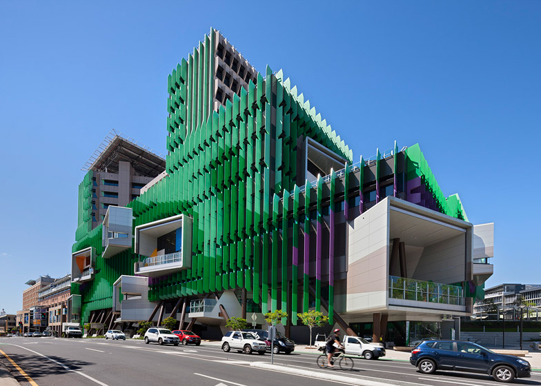
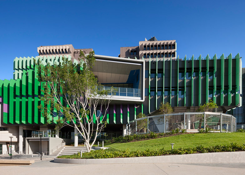
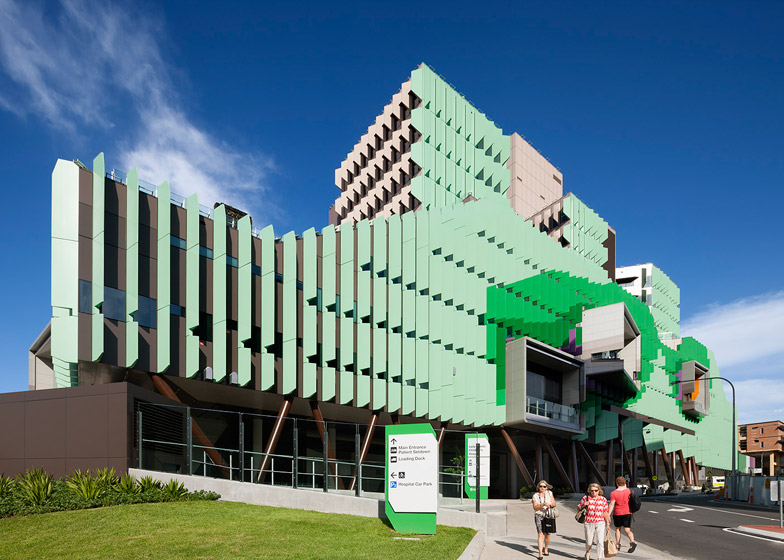
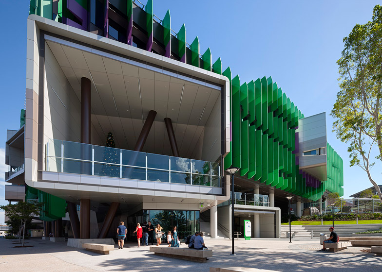
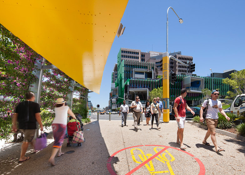
Huge green and purple fins shade the glass facades of this children's hospital in Brisbane, designed to match the colouring of native Bougainvillea plants (+ slideshow).
Architecture firms Lyons and Conrad Gargett describe the design concept for the Lady Cilento Children's Hospital as "the idea of a living tree", with plant-inspired cladding, wildlife-themed artworks and a network of spaces based on trunks and branches.
Keen to avoid the conventional model of podium and tower, the architects designed a 12-storey building featuring two generous atriums, numerous double-height spaces, and a series of roof terraces, developed through workshops with the hospital's users and stakeholders.
"Design work began with research into the genealogy and typology of the contemporary hospital," said Lyons, whose past projects include a medical school in Tasmania and a scale-covered university building in Melbourne.
"We studied hospitals from the 1980s through to the present day and saw these as being largely functionally driven and medico-centric in their planning", the studio told Dezeen.
"The Queensland project was an opportunity to contest these prevailing paradigms; to radically rethink both the care model and the way in which the building might contribute to the city as a civic marker and as a touchstone for the Brisbane community".
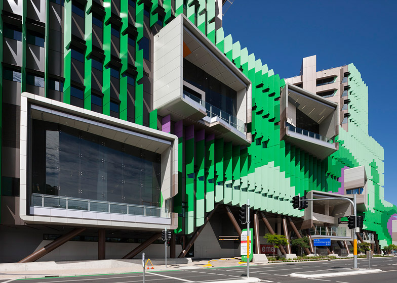
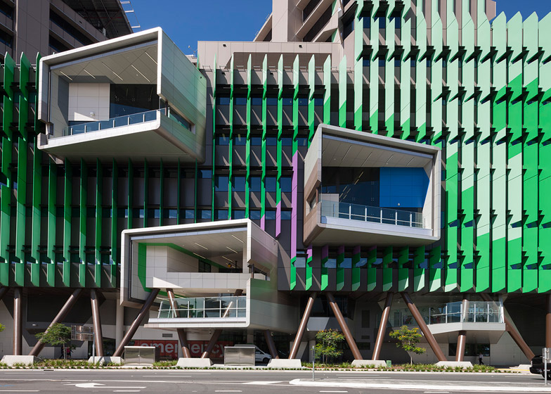
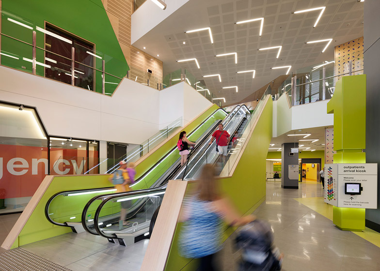
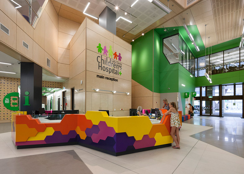
The two atriums, thought of as the tree trunks, help visitors and staff to easily navigate the paediatric facility. These connect up with the various double-height department spaces – the branches – that extend beyond the facade to form balconies.
"The branch spaces extend beyond the street lines to form a series of framing portals and external balconies where users can view the city," said Lyons.
"Each branch is oriented toward a key landmark in the surrounding city – to the high rise buildings of central Brisbane, to the adjacent parklands, to the distant mountains and to the Brisbane River."
The green and purple fins shade the building's glazed exterior from direct sunlight, while the recessed ground-level walls are fronted by zigzagging brown columns, reminiscent of logs.
The same colour palette continues through the interior, where wall imagery and sculptures feature parrots, butterflies, beetles and insects. Lyons thought these would provide engaging distractions for the hospital's youngest patients.
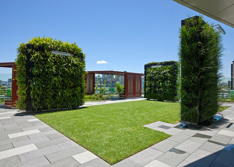
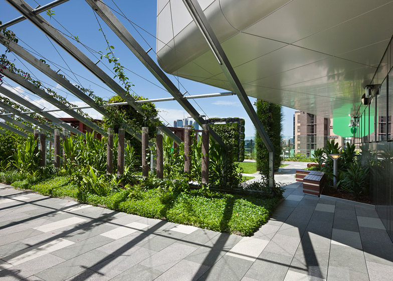
Patios and gardens cover the building's roof, offering patients a place for recreation – an integral part of many rehabilitation programs.
Photography is by Dianna Snape.

