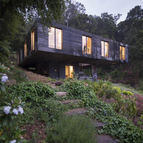
Comments update: a top heavy concrete house beside a Chilean lagoon proved unexpectedly divisive this week, with readers describing it as both "beautiful" and a "brick sh*thouse".
The two-storey Casa Guna by Pezo von Ellrichausen occupies a rural site in central Chile. But some readers found the contrast of concrete against the leafy surroundings unsettling.
"In Australia we have the self-explanatory term "brick sh*thouse". This is an excellent example," wrote commenter Rank. Frank. "Beautiful site destroyed by mass concrete. If you need to live in a nuclear shelter this is it," he added.
"Over here we have a term for people like you. Can't write it here though..." responded Thomas.
Juan pitched in with a more measured response: "This is by far one of the most beautiful projects by Pezo Von Ellrichshausen. It's all about his theory about space, experience and sensitivity... have you really studied the plans and photos?!"
"The weathering's going to provide beautiful moss," added spadestick. "The floor plan is an excellent blend between architectural dissertation and a functioning residence." Read the comments on this story »
Tread carefully: as 2014 drew to an end, we rounded up some of the best architecture and design features of the year – including our top 10 staircases. The inclusion of bannister-free designs like this one by Warm Architects raised a few safety fears.
"To be in the top, a child must be able to fall off the stair or bust their head on the underside of the treads," wrote Micahel Korach.
"Creativity like this is detrimental to architecture. Safety should be a fundamental priority," added Shafiya Rizwan.
"Think of this kind of creativity as a full bottle of pure whiskey," responded VTousignant. "You might not drink the entire bottle. You might just put a little bit into your personal drink recipe. But without having the full strength from which to dilute down from our own personal needs we are diminished. These architects show us what is possible. Bravo." Read the comments on this story »
Glow sticks: as part of our ongoing collaboration with MINI, we interviewed Dutch designer Teresa van Dongen about her lamp powered by bioluminescent bacteria usually found on octopuses. But the light's two-day lifespan and low-level glow prompted some sceptical responses.
"So the main objective is to encapsulate smaller living beings in order to supply our needs in the future?" asked André Romitelli. "A hamster on a spinning wheel would conceive a longer solution than two days."
James stepped in to defend the design. "This lady has cultured and developed a prototype, developed a food medium for the bacteria and produced a proof of concept – as a student.
"With the same equipment she had been able to extend the life cycle of these bacteria tenfold," he wrote. "It takes multinationals and specialist bioengineering companies weeks and months with dedicated teams to develop commercially viable monera and you're slagging her off because you can't just plug it in?" Read the comments on this story »
Demolition debate: news that the Portland Building – the troubled municipal office by architect Michael Graves that has become an exemplar project of the Postmodern movement – was to be saved from the wrecking ball wasn't entirely well-received.
NB76 was one of a number of commenters who felt no-one would miss the building: "I don't think anyone will look back to that period and think it was instrumental in the evolution of architecture. Move on!"
"Pruitt-Igoe this monster, and bill its creator," wrote regular commenter the Liberty Disciple, referencing the ill-fated 1950s American housing project that was demolished after less than 20 years.
Not everyone agreed. "Not attractive, just as Frank Gehry's Guggenheim building in Bilbao isn't attractive. But tearing down a building just because it's not to everyone's taste is a crime against nature – resource wise," wrote Push/Daisy.
"Nowadays some might think it's ugly (I also wouldn't call it pretty), but it's so incredibly unique and special, and was so innovative at its time," added Daniel. Read the comments on this story »
Green-eyed monster? This children's hospital in Brisbane, Australia, is covered in huge green and purple fins that reference native plants while helping shade the occupants of the building, which the architects say is based on the structure of a tree.
Joseph Strawbridge described the project as "eclectic Brutalist/Postmodernism with a bright green twist," adding that "the imposing streetscape is in tune with an avatar scale." Not everyone was convinced.
"This eye-plucking sight owes something to our ruling video game aesthetic," wrote Arjay Cee. "It wouldn't be out of place as the grand achievement of some obsessive dweeb in Minecraft."
Emma added that users of the building had reported lack of storage among other issues. "I feel that this is a classic example of where the 'fluffy' and 'idealistic' nature of architecture has stamped out all aspects of functionality and practicality," she added. Read the comments on this story »

