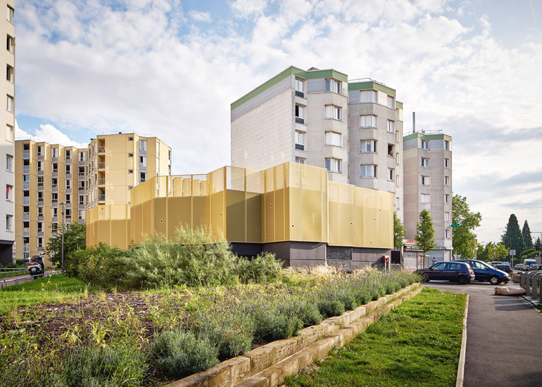
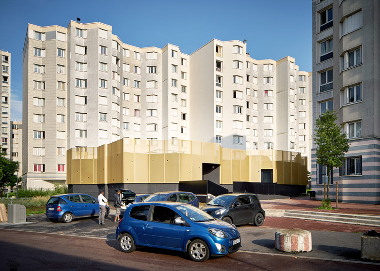
French studio CUT Architectures has revamped a 1960s community centre in a Paris suburb, adding perforated golden cladding that references the original yellow-painted facades (+ slideshow).
Located in Montreuil, to the east of the city centre, the CLEC Community Centre had remained popular with local residents but became severely dilapidated over time.
CUT Architectures was tasked with remodelling the old concrete building, but the team was keen to preserve as much of its original character – from the shape of the building to the colour of the walls.
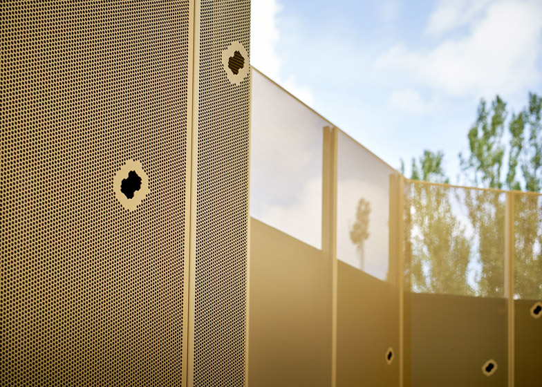
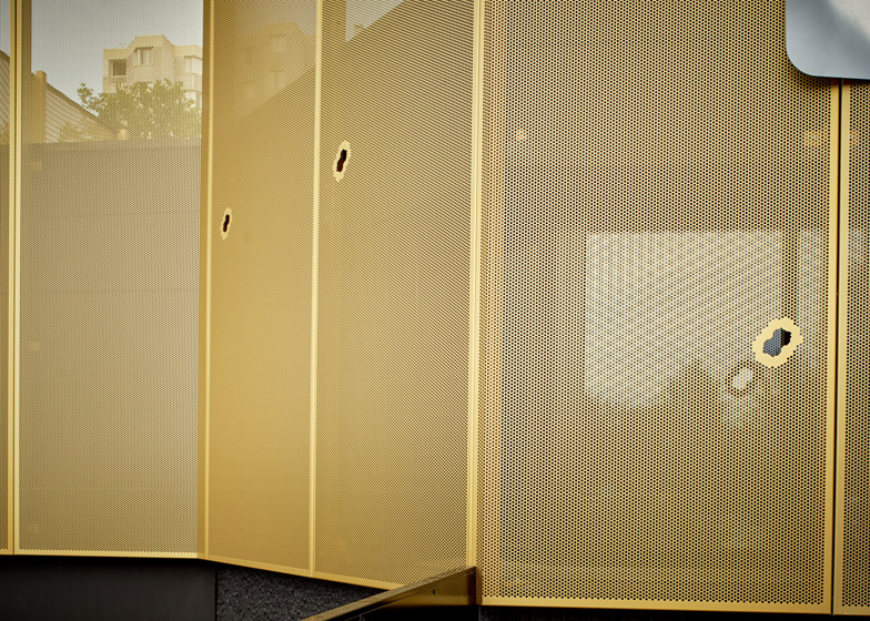
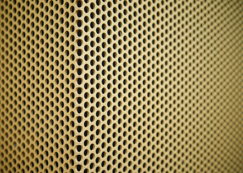
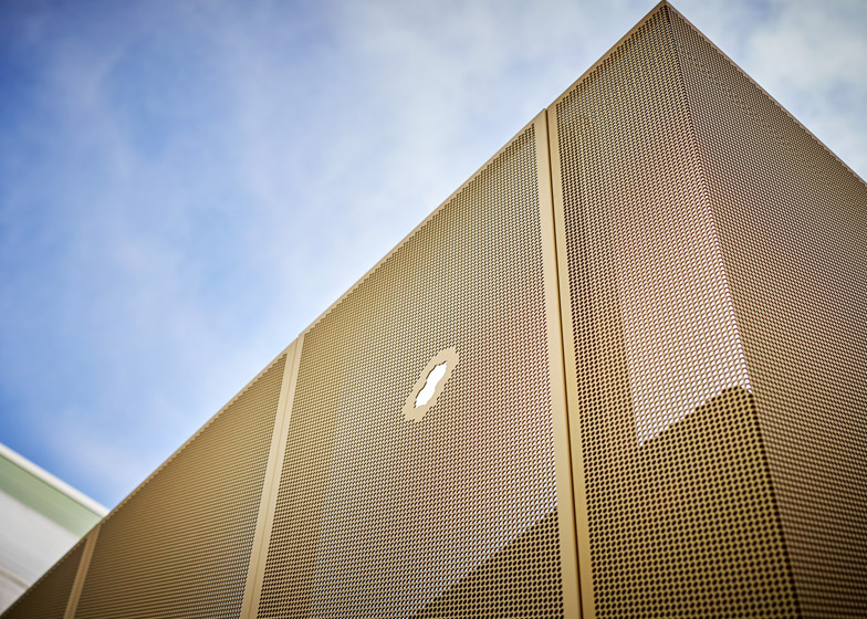
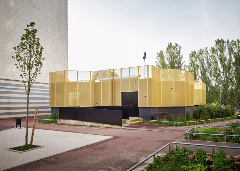
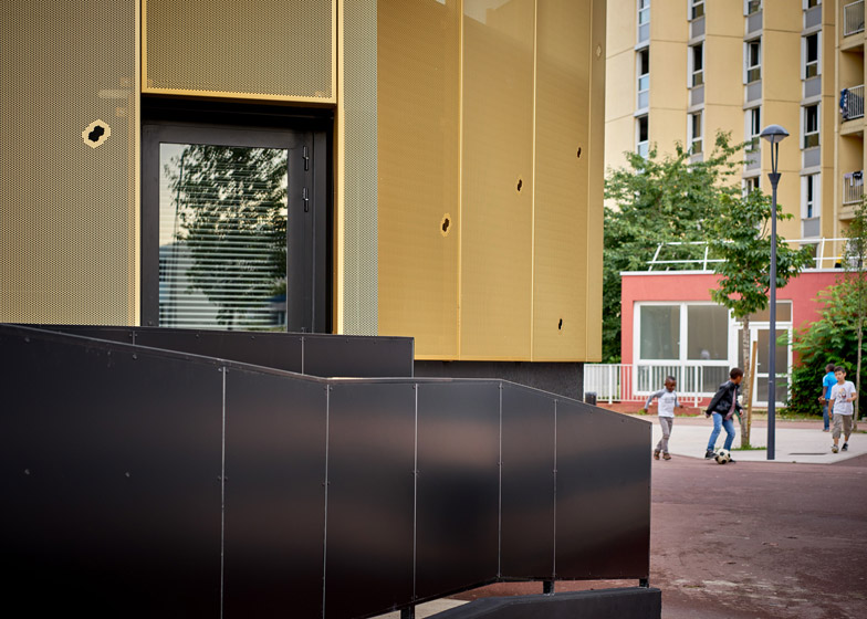
Perforated golden panels, made from anodised aluminium, were installed over the existing walls. Most of the panels are punctured by at least one larger opening that takes the shape of the building's original plan.
"The renovation of the building honours its faceted outline and its yellow colour," explained architects Benjamin Clarens and Yann Martin, whose past projects include an extension to a 100-year-old house and a Parisian hamburger restaurant.
"We considered that it was a part of the building's identity that we didn't want to neglect since the building, built in the 1960s, was a kind of milestone for the neighbourhood. So we chose to reinforce its identity by turning mud into gold," they told Dezeen.
The golden panels extend up higher that the roof to conceal technical fixtures. Below the panels, the base of the building was painted black to help it match the proportions of neighbouring structures, many of which are medium- and high-rise residential blocks.
"We chose aluminium perforated panels identical in proportions to the yellow painted facade but heightened by one metre," said the architects.
"Lastly the use of overall panels was also a mean of security, as the windows of the original building were barred."
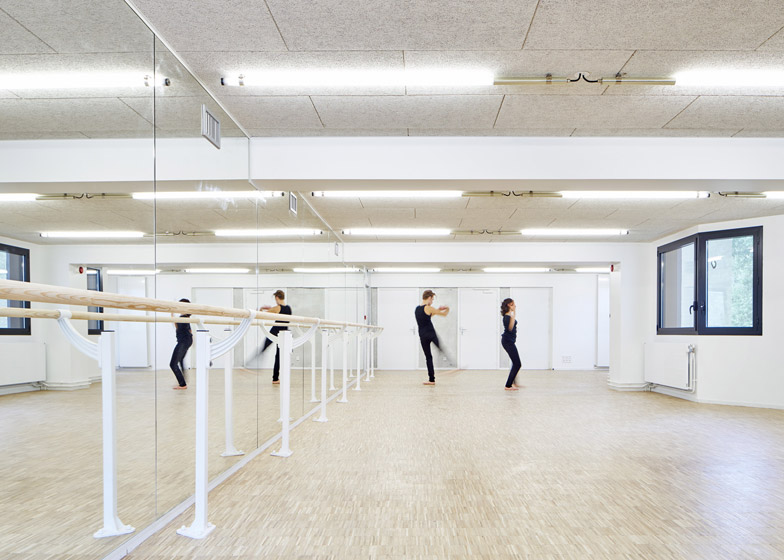
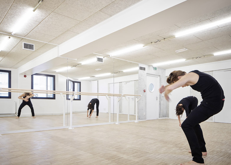
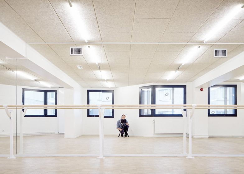
Inside, the layout of the 230-square-metre building was completely re-planned, providing offices for social workers, an art studio and a community dance studio with accompanying changing rooms.
The dance studio runs along the more private eastern edge of the building, enclosed behind concrete walls that help to keep its acoustically separate from other rooms.
The architects were keen to avoid adding useless corridors, so the rest of the ground-floor rooms are arranged around a simple route that runs between the entrance and exit.
Additional facilities are located in the basement, which extends beyond the limits of the ground floor plan. On its roof, a variety of plants and grasses flank the golden outer walls.
"It's only technical but since it's visible from every flat in the surrounding towers we chose to cover it with plants," added Clarens and Martin.
Photography is by David Foessel.

