Visitors to Lisbon's Vertigo Climbing Center can clamber on the cafe
Architects João Quintela and Tim Simon have built a pavilion inside a climbing centre in Lisbon, providing a cafe and reception space that visitors can also scramble over (+ slideshow).
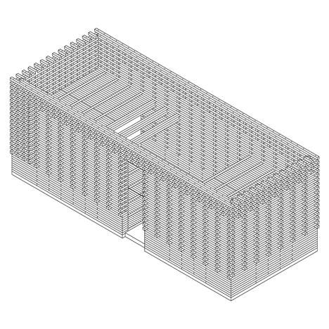
Conceived as a "box within a box", the Vertigo Pavilion was designed by German architect Tim Simon with Portuguese architect João Quintela, following the success of a previous collaboration for the Lisbon Architecture Triennale.
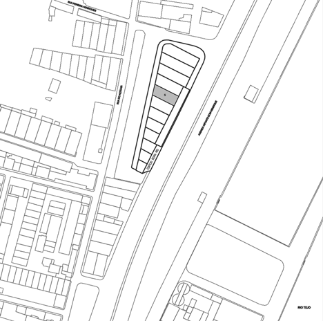
The brief called for a flexible structure that could offer a variety of uses inside the Vertigo Climbing Center, which occupies an old warehouse building on the riverfront in Lisbon.
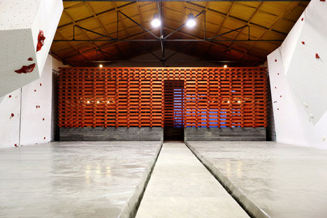
"This is an area that intends to host a small cafe but also a reception to a sports centre as well as a small shop to sell equipment and an informal lounge area," said the architects.
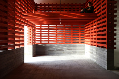
"The pavilion that hosts the cafe must be assumed as a transitional filter between the outer reality of the city and the inner world of the sports, keeping a direct relation with both."
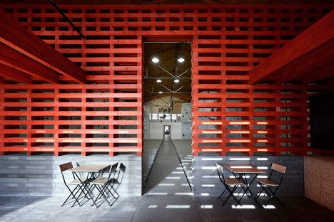
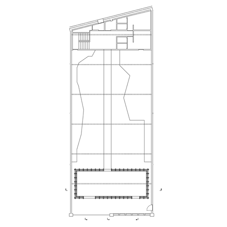
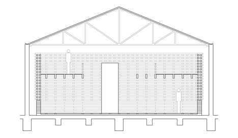
The warehouse was derelict, so the building was first restored and repaired to allow a specialist to fit out the climbing space. The architects then created a new 12-by-5-metre freestanding concrete and wood structure inside.
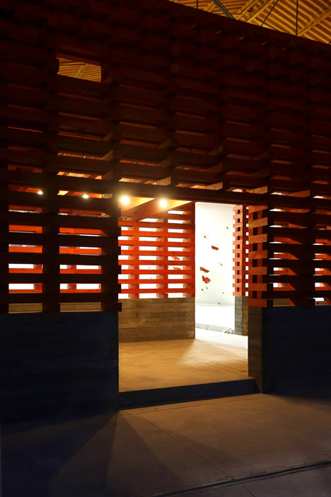
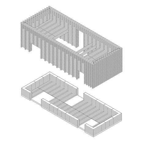
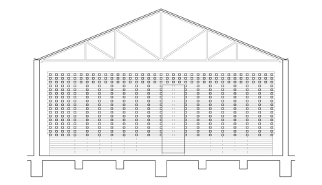
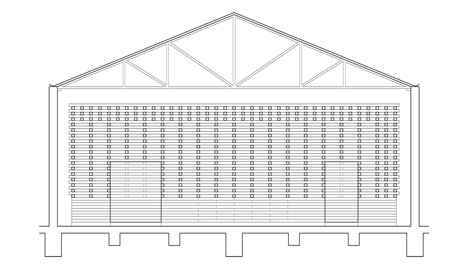
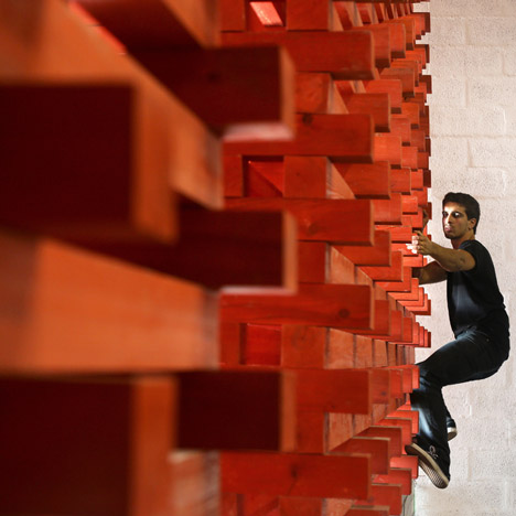
Supported by a foundation of pre-cast grey concrete blocks, the climbable portion of the pavilion is made from lengths of pine, which have been painted red. These are stacked on top of each other, with shorter planks turned on their side in between to create a pattern of overlapping joints and openings.
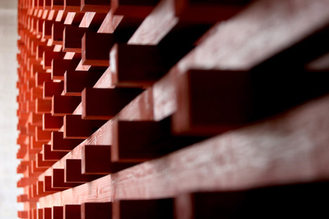
"The scale of the project appears to be somehow uncertain due to the use of massive pieces of wood, overlapped perpendicularly in order to allow the visual relationships," said the architects.
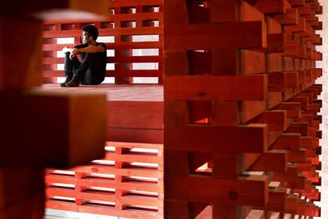
"These wooden pieces are strictly aligned in the inner surfaces, in order to give a certain calmness inside, while they are misaligned in the whole of the outer surfaces, which repeat in a not imposing neither evident manner some of the main patterns of the climbing areas."
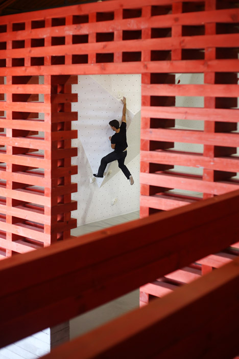
The outer ends of the square planks are left exposed, jutting out to act as extra grips for climbers.
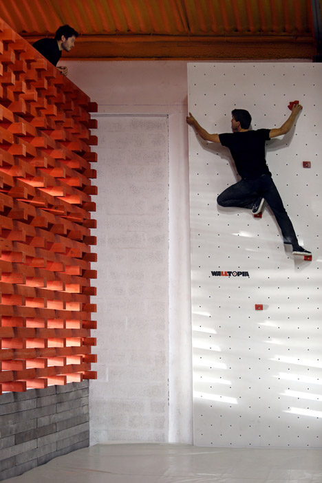
A platform level has been created at each end of the space by including full-width planks, with black metal cables adding extra support and black metal railings.
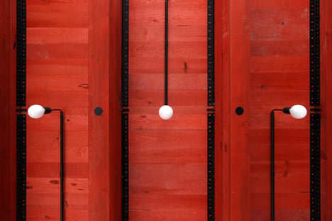
Lighting is provided by bulbs attached to the walls and spaced out regularly around the edges of the structure, with their cables hidden in black casing. A final black accent is added by metal corner bracketing on the inside vertical joints.
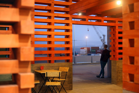
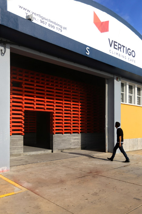
The pavilion is positioned just inside the entrance to the warehouse, and access is provided from both sides by a pair of off-set entrances.
"It is intended that the physical experience of the building can emphasise the pre-existing architectural features using elemental architectonical tools: the entry is made by a large and low door through a tensioned space, while the way out is made through a high and narrow opening, which monumentalises the climbing area and simultaneously becomes a privileged window from the upper spaces."
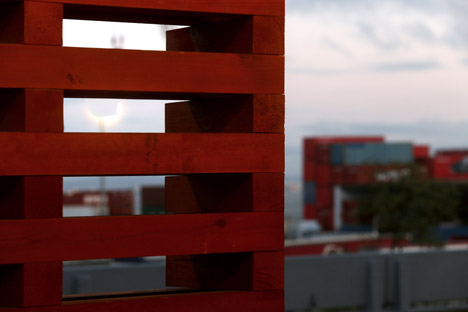
Its red finish is a reference to the industrial shipping cranes and containers found along the river, as well as to the colour of Lisbon's oldest river bridge.
"The using of the black metal elements inside belongs also to this symbolic but fragmented memory of the industrial period in Lisbon during the 19th century," added the architects.
Photography is by Diana Quintela.
Project credits:
Architecture: João Quintela, Tim Simon
Structure: Daniel Maio, Urban 360
Coordinator: Pedro Alves
Construction: António Augusto, Jaime, José Figueiredo, Pedro Alves, Tiago Martins, Nuno Batista, Marta Jerónimo, João Quintela, Tim Simon
Volunteers during construction: Pedro Quinteiro, Sarah Monte Alto, Hélio Morais, Leonor Oliveira, Jerônimo Sôro, Vera Marmelo, Hugo Castro Silva, Martim Vidigal, Duarte Medeiros
