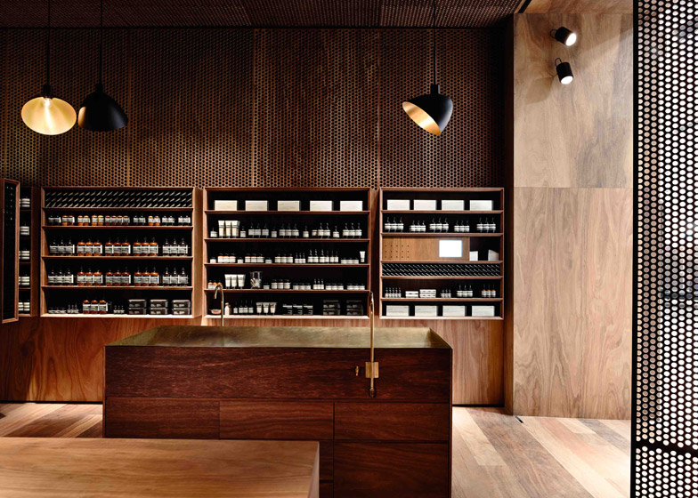
Panels of gum wood in a variety of tones and textures cover surfaces in this Aesop store designed by Kerstin Thompson Architects for a Melbourne shopping centre.
Kerstin Thompson Architects used a limited palette of materials in the project for skincare brand Aesop to create an interior they said achieves "beauty through restraint".
A combination of perforated and smooth lengths of spotted gum wood – a timber indigenous to Australia – are used across all vertical and horizontal planes. The dark-grained wood creates a contrast between the shop interior and the circulation areas of the Melbourne Emporium, a brightly-lit shopping centre in the heart of the city's business district.
"Sustainably sourced spotted gum timber is the sole material in this project, reflecting the Aesop ethos to marry natural, botanical ingredients with the precision of technology," said the architects.
"The warm hue of the timber compliments the product and the simple forms of the store are enriched through the expression of the timber's grain."
Two islands clad in pieces of dark grained wood occupy the shop floor. An Art Deco-inspired lamp sits on the smooth surface of one island used as a cash desk, while a sink embedded within the other allows customers to rinse their hands after testing the products.
A scooped-out surface in the top of the second island makes way for the curving copper trough of the wash basin and two slim copper taps are attached to the exterior of the box.
The architects collaborated with lighting studio PSLAB to create soft illumination for the natural-toned store. Black LED projectors and a set of pendant lamps hang over the central islands.
The lamps have rotatable shades that allow staff to alter the direction of the light when the displays are updated.
Products are framed within a series of deep oblong box-shelves and bench seating is recessed into the wooden wall behind the shop counter.
A strip of perforated panels runs around the top of the walls and continues onto the ceiling. A screen made from the same material concertinas across the shopfront at closing time.
The exterior features backlit wooden signage, a television screen and a display mount for a row of tester products. A further perforated panel set into the solid wooden facade filters the light from the shopping concourse to "provide a calm retreat from the arcade which, by contrast, is reflective and brightly illuminated".
The project won the Retail Category of the 2014 IDEA Awards.
Photography is by Derek Swalwell.

