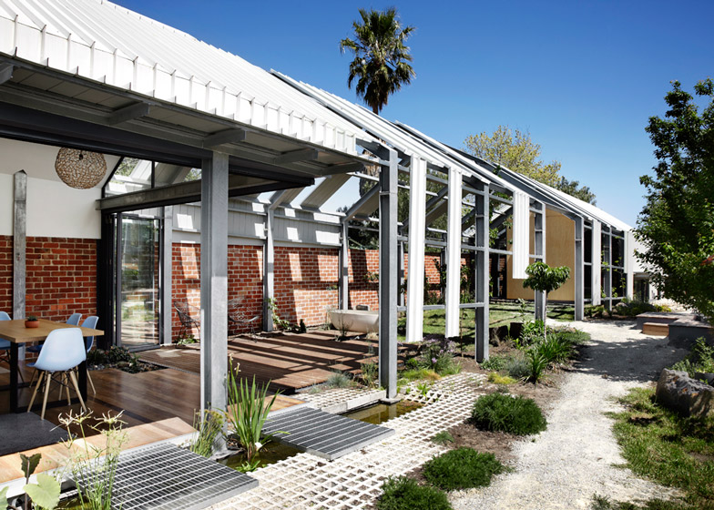
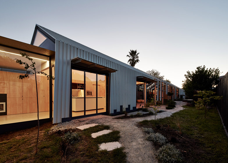
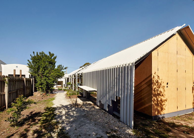
This metal-framed extension to a clapboard house near Melbourne was left intentionally incomplete by architect Andrew Maynard to show off the "beautiful skeleton" of an unfinished building (+ slideshow).
Taking reference from construction sites, Andrew Maynard Architects used a steel framework to renovate and extend the timber house in the Melbourne suburb of Seddon, for a couple who asked for a house that was "ridiculously inside-out".
The project, named Cut Paw Paw after its location, creates a new open-plan living area for the two-bedroom property.
Galvanised steel beams and patchy cladding outline a fragmented boundary between extension and garden.
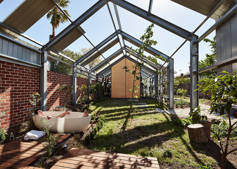
This framework continues over a strip of garden to the rear of the extension, forming a transitory area between inside and outside.
"Construction sites are fascinating. When wandering the street and stumbling upon an anonymous house in construction we all get excited by the possibilities," said Maynard. "Often it is when a building is at its most beautiful."
The enclosed space leads through to a studio housed within a gabled wooden shed at the bottom of the garden.
An oval bathtub sits in a flowerbed at the edge of the living-room patio, offering residents the opportunity to bathe outdoors.
"It further strengthens the inside/outside link," said studio architect Ray Dinh. "We are told that it gets regular use, and is the best spot to spend outside on a cold, crisp evening."
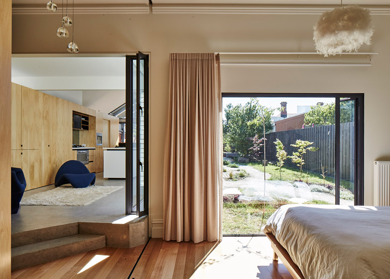
The extension sits over a smooth concrete slab with underfloor heating, while the flooring in the existing building now comprises planks of kiln-dried Victorian ash and spotted gum wood.
Two angular concrete steps mark the transition between the original building and the extension, while sliding wooden walls and bi-fold doors separate the older rooms from the new living space.
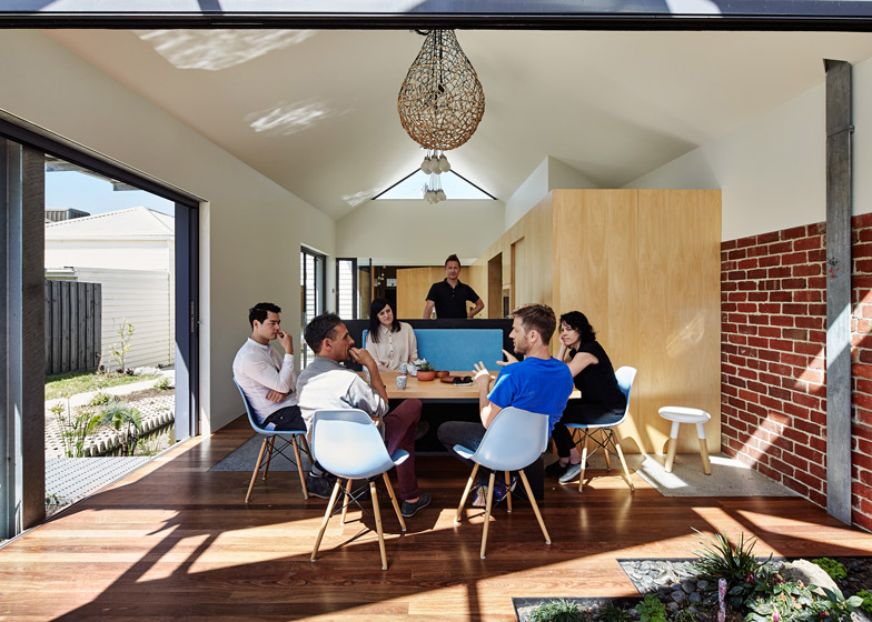
Recycled red brickwork runs along one side of this open-plan space, while metal-clad awnings can be battened down on the other to protect against inclement weather. A narrow water trough skirts this boundary.
A free-standing sink unit divides the kitchen and living spaces. One side of the island doubles as a backrest for bench seating that aligns with a dining table.
Photography is by Peter Bennetts, unless otherwise stated.
Project credits:
Architect: Andrew Maynard Architects
Directors: Mark Austin and Andrew Maynard
Design architect: Andrew Maynard
Project architect: Mark Austin
Builder: Marcus Hamilton, Mark Projects
Engineer: Maurice Farrugia and Associates


