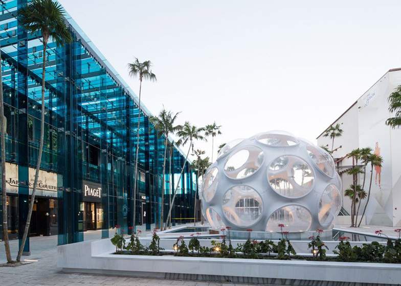
Japanese architect Sou Fujimoto aimed to create "crystallised showers of sunlight" with the blue glass fins that front his shopping centre in the Miami Design District (+ interview + slideshow).
Sou Fujimoto's design for the Palm Court retail centre was influenced by Miami's tropical and unpredictable weather, which he experienced during his first visit.
"I was impressed by the weather – really strong sunshine – and during the stay I had the experience of a really heavy shower suddenly coming in and then suddenly getting sunny again," Fujimoto told Dezeen during an interview at the complex in December.
Split over two levels, the building accommodates a row of shops that all face onto a plaza. Long thin sections of blue glass are attached vertically to the facade around these store fronts – intended to look like rain.
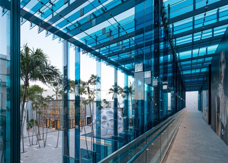
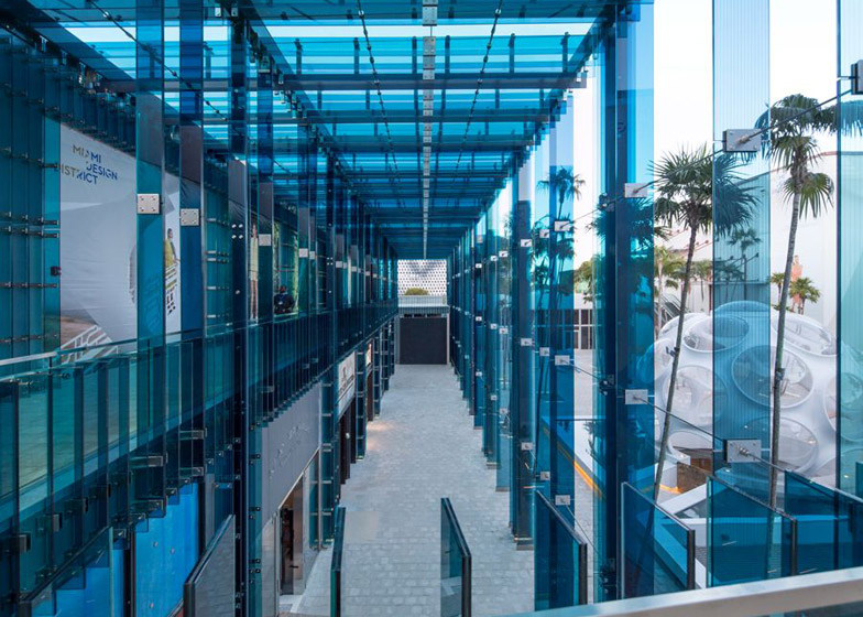
The fins also extend out from the roof and down almost 13 metres to the ground, creating a curtain that partially encloses corridors in front of the boutiques on both floors – which Fujimoto likens to "small streets".
The louvres let sunlight into the spaces, while forming areas of dappled shade and allowing air to flow through.
"My inspiration was the strong sunshine and the rainfall showers, and to try to integrate them together to create these kind of crystallised showers of sunlight," said Fujimoto. "This is the first for me to use glass not as a window, but more like a half-object to create the architectural space and the first time for me to use colour as well."
Dezeen Book of Interviews: Sou Fujimoto features in our new book, which is on sale now
The use of blue is a departure from the Tokyo-based architect's usual choice of white, which he used for the 2013 Serpentine Gallery Pavilion in London.
"The colour is from my impression of Miami – the blue sky and the rainfall," Fujimoto said. "If you have the blue colours or blue shadows then you might feel a bit cooler."
The slender fins are orientated so they don't obscure the views of the brand's shopfronts when seen face on.
"From the front you can almost see through this surface," said the architect. "Of course, from other directions – if you walk down the corridor – you will feel like you are surrounded."
Structural columns and beams that support the canopy are sandwiched by the glass sections. Steel tension wires brace the components against strong winds.
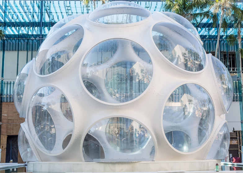
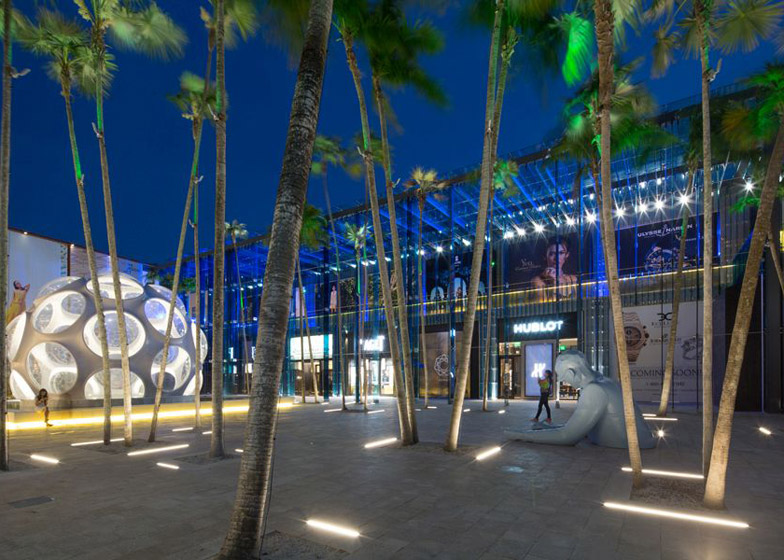
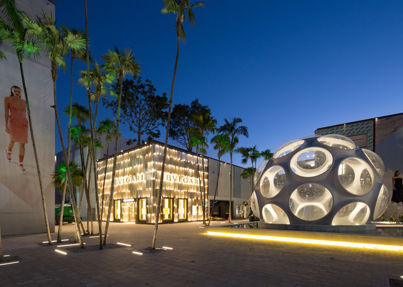
In the plaza, a version of Buckminster Fuller's Fly's Eye Dome is installed over the access to the car park, so that shoppers ascending up from their vehicles arrive in the bubble-shaped structure.
Opposite the dome, a giant bust of Modernist architect Le Corbusier rises from the paving.
The Miami Design District was initiated by local property developer Craig Robins, who has transformed an area between N Miami Avenue and NE 2nd Avenue into a hub for design boutiques and luxury fashion brands.
Loosely bound by NE 43rd and NE 38th streets, the district also includes an events space and a retail building by American architects Aranda/Lasch – both nearing completion.
Photography is by Robin Hill unless specified otherwise.
Read an edited version of our interview with Sou Fujimoto below:
Dan Howarth: How did the Palm Court project come about?
Sou Fujimoto: This is a commercial building facing onto Palm Court, and it started three or four years ago. I came here to meet with Craig Robins and his office Dacra contacted me to ask about the possibilities to design something here.
From the very beginning he had the idea about Palm Court and he asked me to design this building at the end of the central axis. It is for the smaller but really prestigious high brands, jewellery, watches. One building for a group of different brands. The inspiration in a sense was very straightforward. It was the first time for me to be [in Miami] and I was impressed by the weather – really strong sunshine – and during the stay I had the experience of a really heavy shower suddenly coming in and then suddenly getting sunny again. So it was kind of a weather thing that was really impressive.
The first idea is to have a canopy against the strong sunshine and the rainfall but at the same time to create half-public, corridor-like areas. Not just shops facing to the plaza, but more like a space in front – a cloister-like space. My inspiration was the strong sunshine and the rainfall showers, and to try to integrate them together to create these kind of crystallised showers of sunlight.
Dan Howarth: Is that why you chose to use glass?
Sou Fujimoto: Yes, and to keep the quality of buildings as equal as the brands. Of course we thought about aluminium or stainless-steel plates, but the glass has transparency and it has its own heaviness, and the materiality that could make the buildings more equal to the brands. So to keep the balance.
This is the first for me to use glass not as a window, but more like a half-object to create the architectural space and the first time for me to use colour as well.
Dan Howarth: How did you choose the colour?
Sou Fujimoto: The colour is from my impression of Miami – the blue sky and the rainfall. So then we started to try the blue colour, it's really straightforward! And, of course the climate – like today it's getting hot – but if you have the blue colours or blue shadows here then you might feel a bit cooler.
Dan Howarth: A lot of your architecture is very white. Do you think the use of colour creates a different type of atmosphere for the building?
Sou Fujimoto: Yeah, it was a big challenge for me to not just use white every time. It depends on the situation. I like to try different colours and different materials, because we should have such diversities.
Dan Howarth: How does the structural system work? How does it all fit together?
Sou Fujimoto: The basic structure is very simple. You can see between the glass that there are thin columns and beams to support the canopies. And the structures of the main building are really like the usual, economical, shop-sized spaces. The canopy areas make it very light. And we have columns, but every column sandwiched by the glass with a small gap – to make it half-invisible. So, of course, we used laminated glass but combined via these cables not to make like this. There were hurricane regulations, so we had to make it more stable – connected by cables to keep its lightness.
Dan Howarth: Behind this facade, how are the units arranged?
Sou Fujimoto: It's just empty space that [the occupants] can do as they like with, the same as the front of the shop. We could only make the frames of the shops. That was the very basic condition from the very beginning. We cannot control the shop front of each different brand.
Dan Howarth: How did you deal with designing a shopping centre design that has to fit with all of the different brand facades?
Sou Fujimoto: Each shop has its different front, so I don't want to disturb or block their shop front. That is why we use these thin glass veins, so from the front you can almost see through this surface. Of course, from other directions – if you walk down the corridor – you will feel like you are surrounded. You are in the corridor, so you are more part of this shop and more integrated into the shopping environment.
Dan Howarth: What do you think is the most interesting thing about designing a shopping centre?
Sou Fujimoto: It's like a small city. And, of course, this is only one part of the shopping area. But still it has a corridor, so it is more like not only designing the corridor but also the small street itself. And the shopping area here is like a small town or village. For me, that's very exciting to see how architecture can be integrated with a landscape or urban strategies.
Dan Howarth: The mall is quite a standard architectural typology in America. Have you purposefully tried to move away from this?
Sou Fujimoto: This is the first time for me to do this kind of shopping building. Of course a shopping centre has its own logic. I don't know if it's possible to change drastically the typology or the archetype of a shopping centre in a different way. But I just feel the potential because it has the combination of the city aspects, the architecture aspects and the landscape aspects together.

