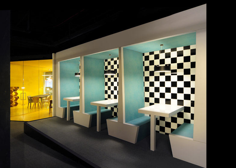
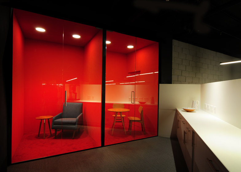
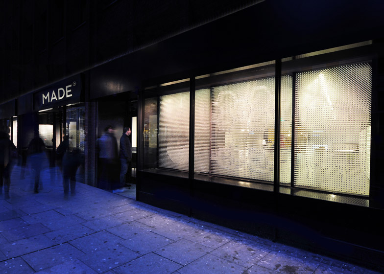
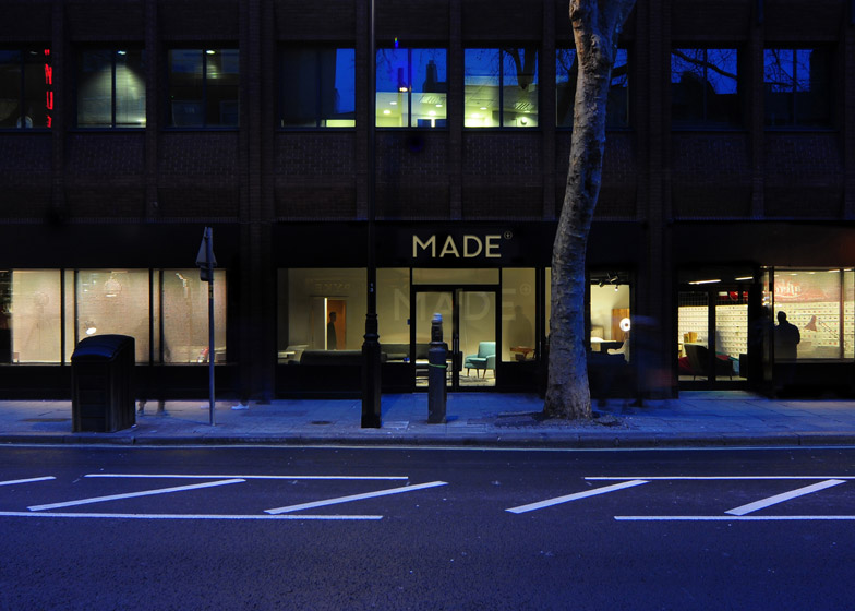
Homeware retailer Made.com has opened a showroom in London's Soho, featuring a shopfront based on a pin-art toy and a series of domestic sets combined with full-scale video projections (+ slideshow).
Designed by London studio Bureau de Change, the Made.com showroom is used to present the products available to order via the company's website, with no on-site sales.
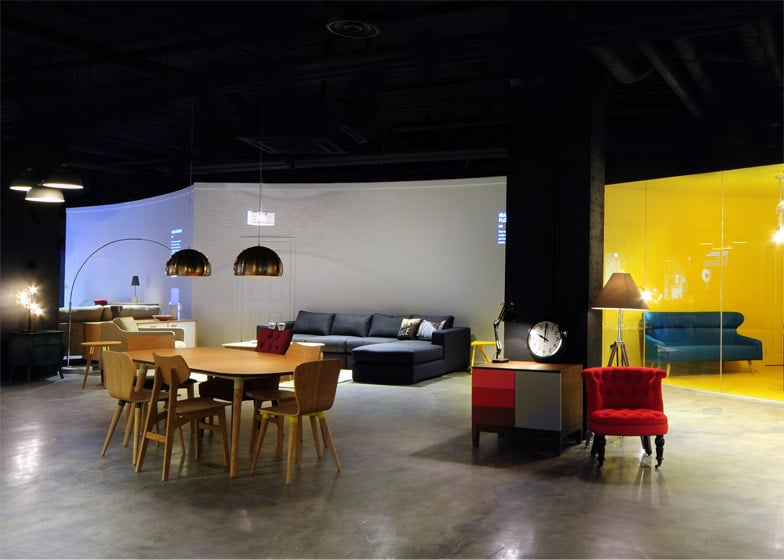
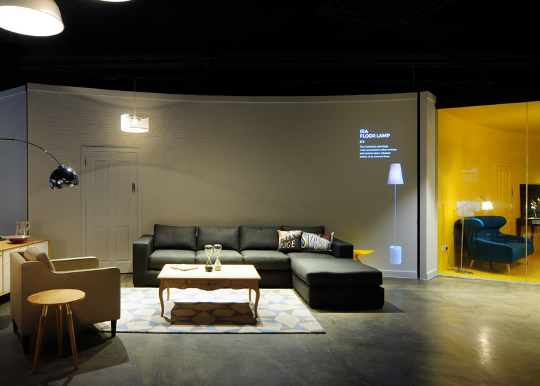
The challenge was to develop a space that "adds value" to the digital retail experience, which prompted designers Billy Mavropoulos and Katerina Dionysopoulou to introduce video projection alongside the physical products.
In this way, customers can pair up different items to understand how they might work together in the home.
"For us, the design challenge was how to display in-store, where space is at a premium, the breadth of content you can see on a website," explained Dionysopoulou.
"The projections provide a true, adaptable representation of the products, at the right scale, in the right place. Without them, the room sets feel unfinished, so for us they were the missing link to achieving a flexibility you can normally only achieve online," she said.
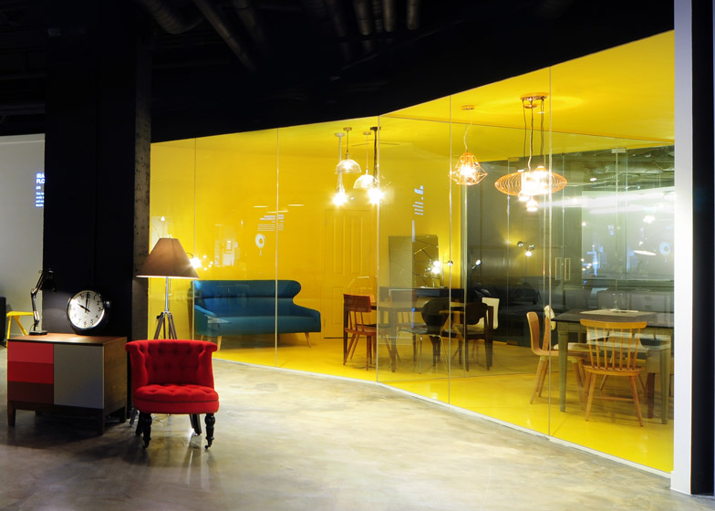
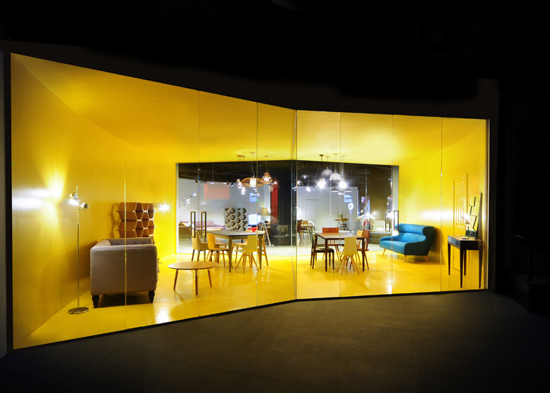
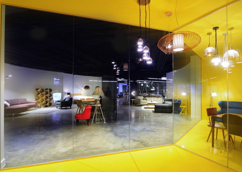
Avoiding the Ikea model of recreating whole rooms, many of the products are simply displayed against colourful backdrops.
Others are set in front of curving white screens. This creates a useable surface for projection, but was also intended by the designers as a reference to the building's history as a bookshop – as the proportions are reminiscent of a book's pages.
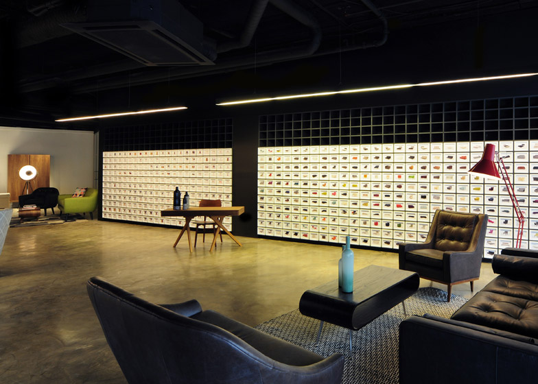
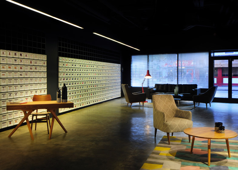
Another feature of the space is a wall of framed postcards, indicating where customers can help themselves to material swatches. There are also computer tablets on hand for sourcing extra information about pieces on display.
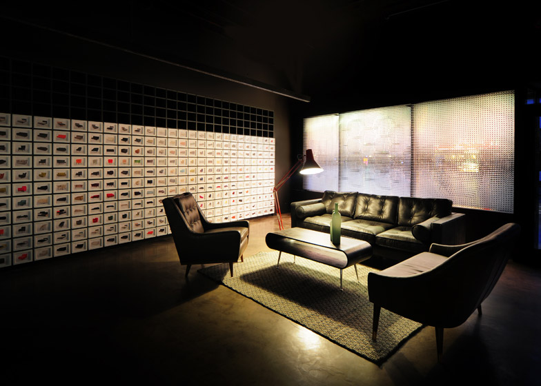
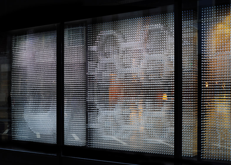
For the shopfront, a typical product display seemed less appropriate, so the designers opted instead for an installation that operates like the popular pin-art toy.
Some of the brand's most popular pieces of furniture were pressed into 40,000 clear plastic rods that puncture a row of 10 windows, leaving only their impressions behind.
"This is such a bustling street, with so many stores vying for your attention, we wanted to produce something unexpected – an idea that would set it apart from the traditional format of lots of products in a display," said Mavropoulos.
"Instead, we have taken a single idea – of the products pushing through the glazing – and filled each window with it. You still get a sense of the products beyond the frontage, but the views are more intriguing, more oblique," he added.
Made.com opened its first showroom in 2012, two years after launching its online retail business, which specialises in affordable design. It's products are batch manufactured once a volume of customers have purchased the same item, cutting out the need for warehouses and helping reduce the cost of its furniture and accessories.
The appointment of Bureau de Change for the second space followed a project by the architect duo to rework the London home of Chloe Macintosh, co-founder and creative director of the company.
"Taking on a central London location is a huge step for us as a brand," said Macintosh. "We see it as an opportunity to meet with a broader range of customers and for them to experience the Made way of thinking."
"The space was designed on a tight budget and timeframe but Bureau de Change brought a lot of ingenuity and flair and turned an old rundown bookstore into a crisp, spacious and inviting design for our customers," she added.
Photography is by the architects.

