Givenchy store in Seoul has an undulating moulded-metal facade
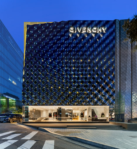
A black box made from panels of moulded steel creates a rippling enclosure for the upper storeys of this Givenchy flagship store in Korea by Italian architects Piuarch (+ slideshow).
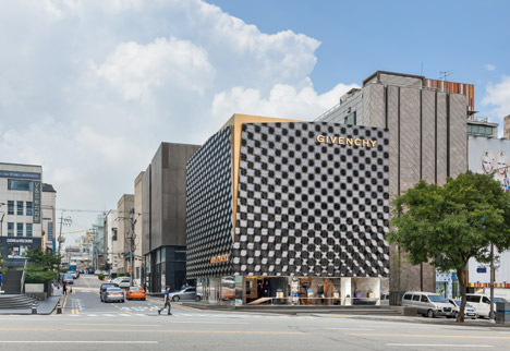
Milanese studio Piuarch collaborated with Givenchy art director Riccardo Tisci on the design for the new store, which stands on a corner plot in the heart of the Gangnam-Gu shopping district of Seoul, South Korea.
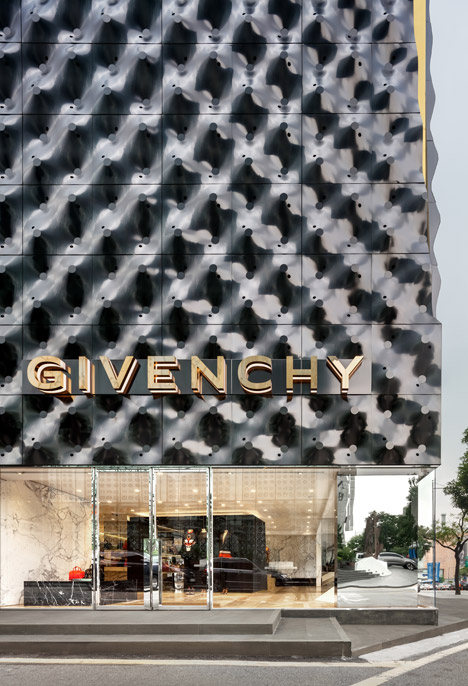
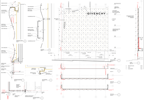
The textured facade is made up from undulating panels of steel with a highly polished surface that reflects the light and surrounding street.
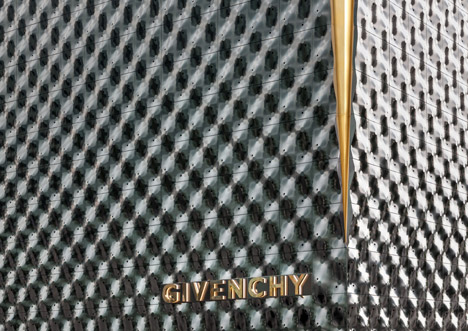
Each mirror-like panel was moulded into a shape featuring peaks and troughs and aligned to form the bumpy surface that creates a shifting houndstooth-like pattern when light reflects off the surface.
Small perforations in the material allow light to penetrate into the upper floors.
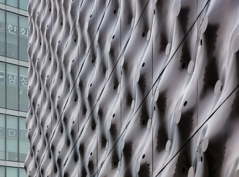
According to the architects, the facade references the textures and patterns used in the work of Italian artists Enrico Castellani and Lucio Fontana in the 1960s, and the optical patterns used in the brand's latest collections.
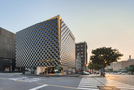
The metal cladding peels away along one corner of the building to reveal a tapered T-shaped slice of the golden brass wall beneath.
"Designed as a sort of enclosure – a second embossed skin is an expression of an urban identity – the facade is meant to evoke the distinctive tailoring 'T cut' that characterises the style of the French brand," explained the architects.
The metal hood stops short of the grey basalt pavement, revealing the ground level of the shop behind a layer of glass.
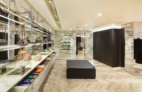
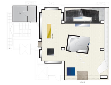
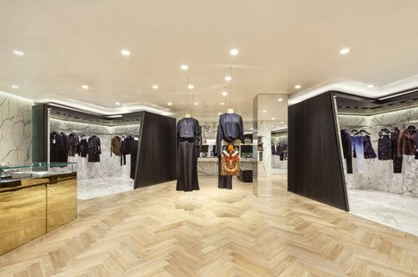
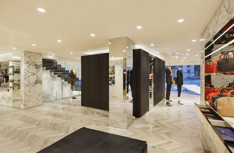
Inside, parquet flooring is laid in a herringbone pattern, while the walls are lined with pale grey marble.
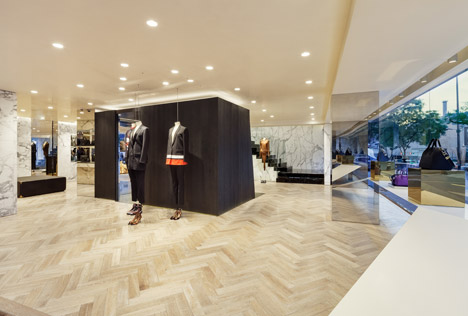
Mannequins suspended between the ceiling and the floorboards offer places to display garments from the brand's latest collections.
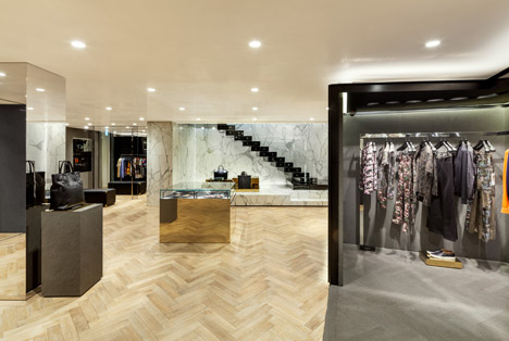
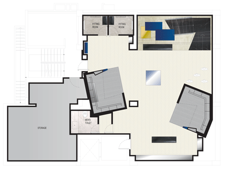
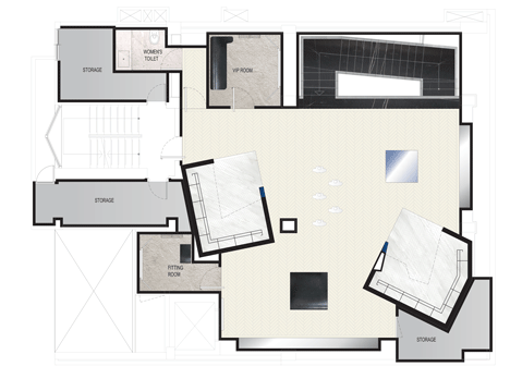
Accessories are displayed on mirrored plinths and shelves, while pods with black timber partitions and marble floors display rails of clothing.
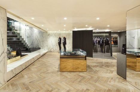
The architects describe the design as "a hyper-minimalist interior that reflects the themes and the allure of the brand."
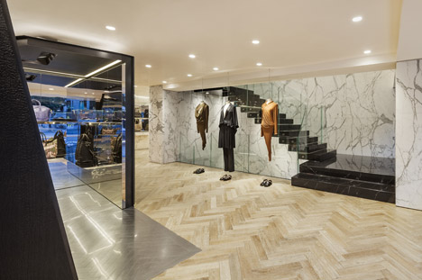
Black marble treads cantilever from a contrasting pale marble wall to create a staircase, which leads to the upper floors through a glazed well.
Photography is by Shin Kyung Sub.
