Behind a shimmering aluminium facade, the rooms of this Montreal house are organised around a three-tiered courtyard that allows daylight to funnel through to every storey (+ slideshow).
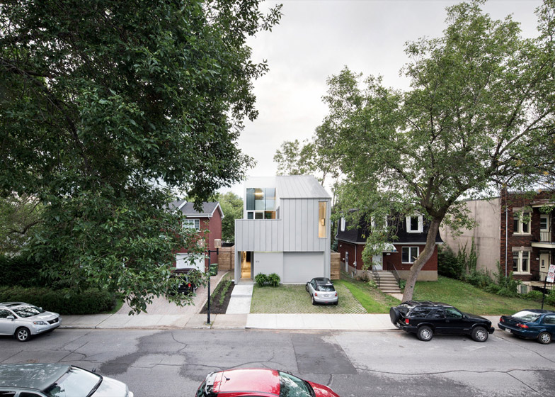
TBA, a studio led by architect Thomas Balaban, designed the four-storey property for a young couple. It is located in a residential neighbourhood in the south-west of the city, characterised by traditional war veterans' homes.
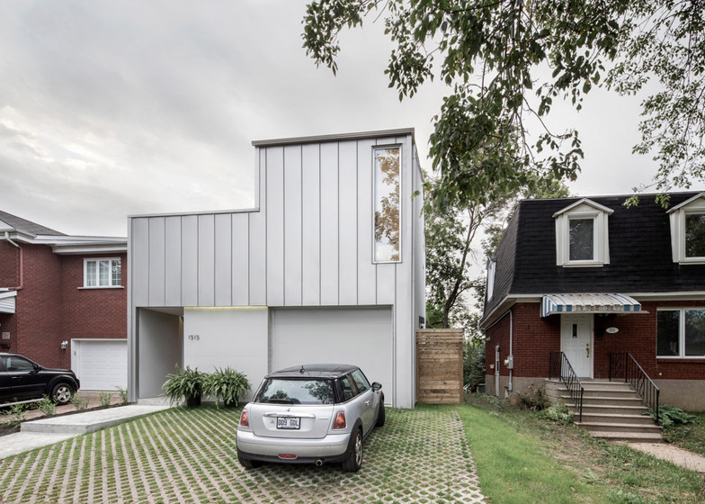
Named Holy Cross House, the property takes it name from the adjacent street. The scale and massing of its facade appear similar to its neighbours, but instead of brick walls or a tiled mansard roof, its whole exterior is wrapped in a silvery aluminium skin.
This standing-seam cladding covers both the external walls and the roof, creating what the design team describes as "a tough working-class facade".
"[We] set out to make a house that simultaneously fits in and stands out from its heterogeneous context without resorting to mimicry, and without sacrificing the contemporary nature of the project," they said.
Inside, the house's four levels comprise a small square basement, a rectangular ground floor, an L-shaped first floor and a small upper-level mezzanine – all arranged around the multi-level terraces that make up the courtyard.
"The principal challenge lay in bringing light to the living spaces, given the tight nature of the lot and the availability of direct sunlight limited to its centre," said TBA.
"By flipping the traditional vertical hierarchy found in most two-storey homes and by carving out a series of spaces from the house's volume, the project was able to address the need for exposure to direct light and concerns about maintaining privacy," the architects explained.
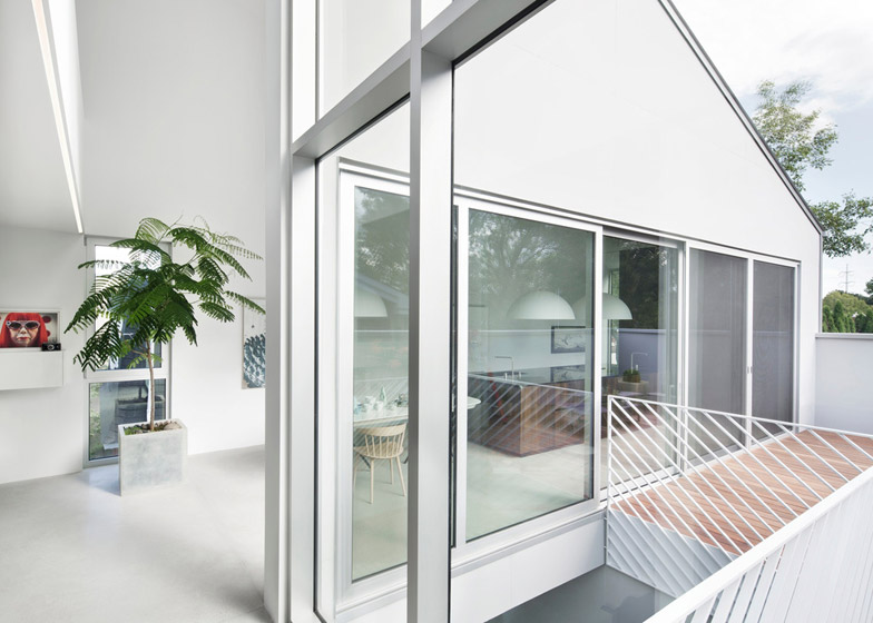
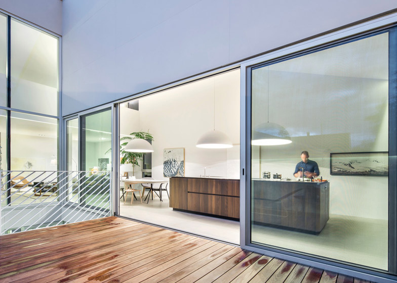
Each terrace has a surface of warmly toned Ipé wood decking. Some areas are sheltered below overhanging sections of the roof, and balustrades featuring diagonal struts separate different levels.
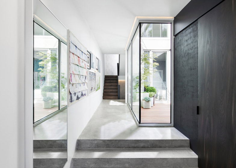
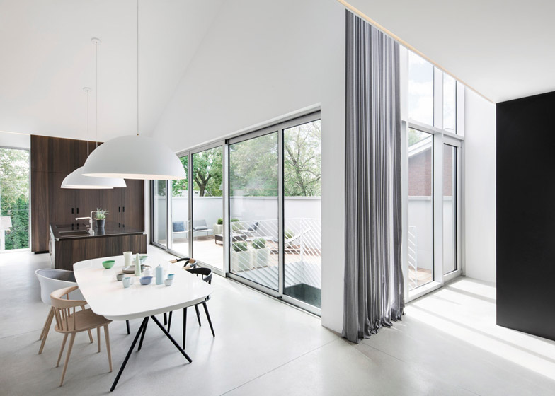
Almost every room in the house faces into this central space, and most have direct access to one terrace. This detail is emphasised by the use of floor-to-ceiling glazing.
"Full-height windows at different levels provide a theatrical quality to the courtyard space and foster for the homeowners an awareness of each other's movement throughout the house," added the team.
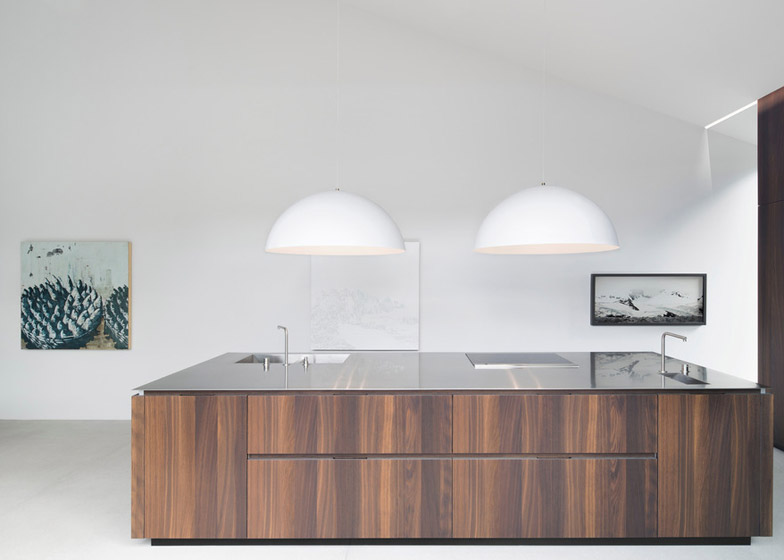
The main living spaces occupy the L-shaped first floor. A dining area and kitchen are situated at the front, where the architects have added two fixed elements – a kitchen island and a storage wall, both constructed using white oak that has been heat-treated to create a chocolatey brown tone.
A row of oversized pendant lamps brings extra light over the worktop and the dining table. Just beyond, a large sofa dictates the layout of the lounge.
There are three bedrooms in total – one on the ground floor and two on the level below. A parking garage is also located on the ground level, while the uppermost floor houses a work studio.
Walls have predominantly been painted white and the floors are largely polished concrete, to place the focus on the couple's collection of art and design objects. In contrast, bathrooms are lined with dark tiles.
Photography is by Adrien Williams.

