New York studio Grzywinski+Pons has ripped out the "sterile" interior of a lobby in a London hotel to reveal industrial fittings, which it has paired with pastel accessories and paintwork (+ slideshow).
Matthew Grzywinski and Amador Pons were commissioned to design the reception and bar of Urban Villa, a 100-room boutique hotel in a new-build tower in Brentford, west London.
The space had already been finished with clean white walls and suspended ceilings, but the architects wanted to make it appear more rustic so they stripped away the new finishes to reveal the services of the building. They then added a cafe and bar to the open-plan lobby.
"We found it to be rather prosaic and sterile," they explained. "We had to look hard to find any character within the existing environment and, where possible, we tried to peel back the layers that were at odds with our intentions."
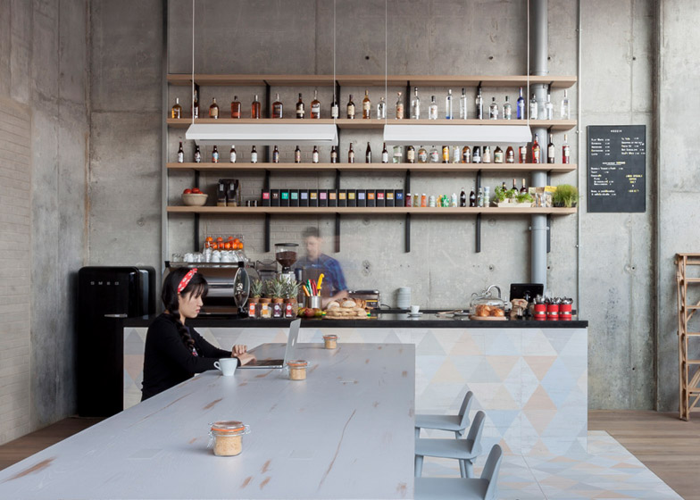
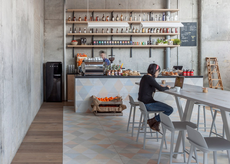
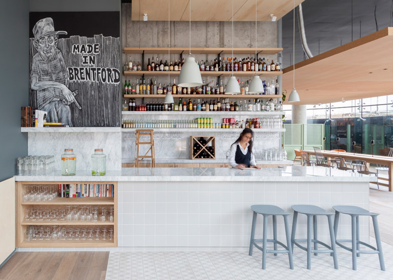
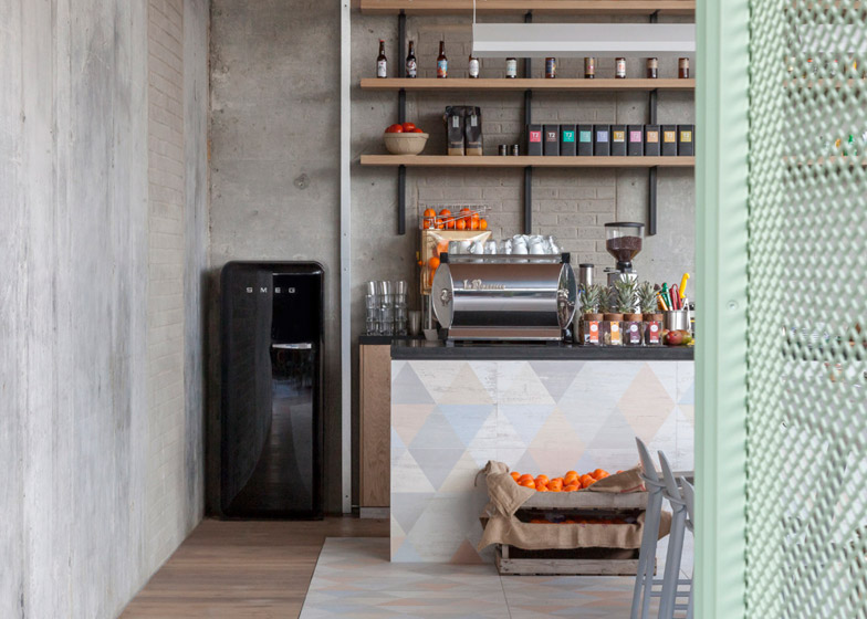
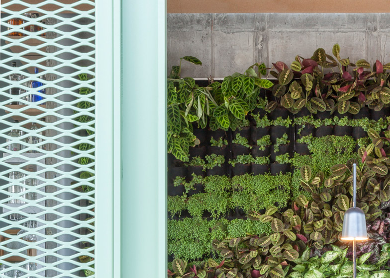
Electric cables and metallic ductwork are left visible above the new timber suspended ceilings, while a raw concrete wall backs a well-stocked bar. Wall-mounted planting partially covers a further section of exposed concrete wall.
Triangular paintwork and patterned tiles mark out bar and cafe spaces that are filled with pastel-coloured furniture – including peach-toned bucket chairs and grey dining seats.
A long wooden table designed for communal dining was painted in light grey, but has been distressed to give it a lived-in appearance.
"We chose a palette that is bright and welcoming yet robust and functional — an environment where it felt just as natural to ask for extra towels as it would to order a cocktail," said Grzywinski and Pons, whose past projects include a home covered with brick-like aluminium panels in Upstate New York.
Keeping the space largely open-plan, the architects also added a series of mint-green mesh screens that section off more intimate pockets of seating within the glazed lobby.
"We wanted to balance the abundant glazing and high ceilings with vertical breaks, warm and authentic materials, lush vegetation and texture," added the pair.
They continued this design theme into guest suites, adding sofas upholstered in pale fabrics and brightly coloured mismatched furniture.
Mesh panels enclose the sides of open wardrobes and shelving, while extra timber chairs are folded and hung on the wall.
"We had less latitude to reveal the bones of the building so we focused on designing custom furniture and a finish schedule that would be congruent with the aforementioned public spaces," said the architects.
"We managed to create an atmosphere that belies its shell and injected some heterogeneity into an otherwise uniform environment," the architects said.
Photography is by Nicholas Worley.

