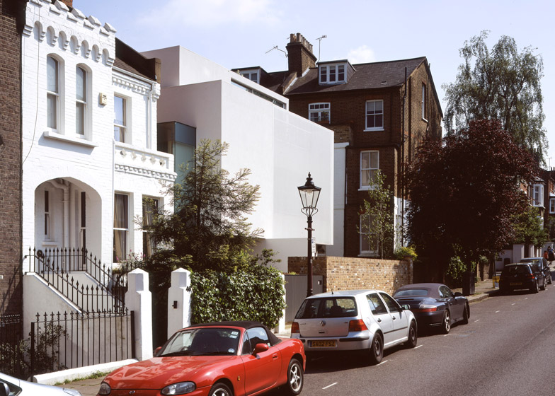
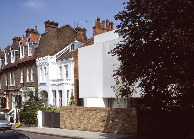
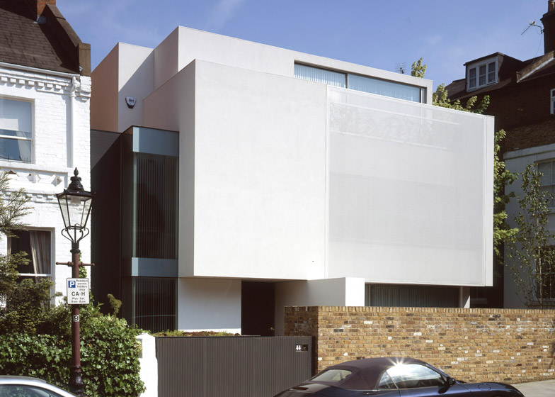
A painted fabric screen concealing windows and balconies merges with the crisp white facade of this artist's house in north London by local firm Guard Tillman Pollock (+ slideshow).
The Hampstead property was designed to replace an early 20th-century house that was in a state of disrepair.
Planning regulations stipulated that the new house should maintain the size of its predecessor but didn't necessarily have to look like it. Guard Tillman Pollock instead proposed a minimal boxy form and plain white finish to reference the heritage of 1930s Modernist properties in the area.
A section of the front facade that projects outwards from the first and second floor levels is a nod to an attribute typical of other local Modernist properties.
"The screen establishes the floating box aesthetic which is a reference to the 1930's Modernist buildings in Hampstead," architect and studio co-founder Mark Guard told Dezeen.
"There is no reference to the adjoining Victorian buildings other than to acknowledge the verticality of the Victorian terrace with the vertical glass corner window and the vertical louvered element that connects the new house to the adjoining terrace."
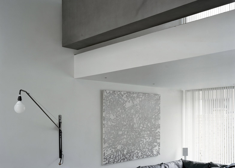
The house's interior provides spaces for painting and acts as a backdrop for the owner's collection of mid-century furniture and art. Its layout is based on London's traditional Victorian studio houses and incorporates double-height spaces that are naturally lit by large window and skylights.
The main double-height space houses the reception area, with a library and study accommodated on the galley above. The owner requested that the studio be located in the basement, which opens onto a courtyard at the front of the house.
A metal grate covering the courtyard allows light to filter down to the basement level and creates a second outdoor space connected to the ground-floor living area.
A narrow pond runs along the base of the boundary wall at this level to create a buffer between the house and the street, while a perpendicular surface extends from the facade and separates the courtyard from the entrance.
The plot's vicinity to neighbouring properties determined the positioning and treatment of windows, which aim to maintain privacy for the residents.
The PVC-coated fabric panels – similar to those used for advertising on buildings – screen the largest areas of glazing. The spray-painted fabric restricts views into the house during the day but allows the occupants to look out.
"It's a similar effect to that achieved by a net curtain or voile blind, except that it is outside rather than inside the window," added Guard.
At night, the fabric panels enable movement within the house to become visible from outside. Vertical blinds inside can be closed to ensure privacy when required. At the rear of the house, the fabric protects the reception space from unwanted solar gain.
Glazing that extends around the corner of the dining area and kitchen encloses a small terrace slotted in front of the brick boundary wall, while the frameless corner windows projecting from the front facade offer views from a study space on the ground floor and a bedroom on the first floor.
Concealed doors minimise interruptions to the pure white-walled rooms, integrating storage designed to meet the requirements of each particular space.
Concrete floors and wood-burning stoves evoke those found in the traditional studios, while a twisting timber staircase connects the three above-ground floors and basement.
Photography is by Morgan O'Donovan unless stated otherwise.


