"Great architects, engineers and designers make the 21st century a safer place"
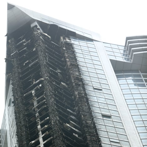
Comments update: a fire that ripped through one of the world's tallest residential skyscrapers dominated the conversation this week, as readers discussed the safety features of tall buildings.
The fire broke out early Saturday morning on the 50th floor of the 79-storey Torch in Dubai – a 336-metre-high skyscraper. Despite causing extensive damage, nobody was killed or injured in the incident and the fire was extinguished just two hours after it started.
"That's pretty impressive engineering and logistics management," said Kay. "So much could've gone wrong but didn't, and that's an ode to the people who designed this thing."
"The 21st century is a safer place thanks to the great architects, engineers and designers making it so across the spectrum," he added.
Many readers agreed, including one calling themselves Dubai resident. "Good urban planning and design is ultimately important for reasons of efficiency and safety. It seems the Torch hit the mark on both these points." Read the comments on this story »

Wooden ride: created out of wood but strengthened with custom-made 3D-printed aluminium parts, this bicycle designed by woodworker Paul Timmer caused readers to question whether the material was strong enough for the job.
"There is a reason the majority of bicycles are made from metals," said Kay. "Over time wood will loosen up and you will hear the results of this when exerting force on the frame."
Other commenters thought wood might be useful for its shock-absorbing qualities.
"This design isn't a road-racing bike, so I can see where he is going with using wood", argued Ray. "The vibrations usually translated to the rider would be absorbed by the frame, offering a comfortable and smooth ride."
"It would be interesting to stress test it," he added. Read the comments on this story »

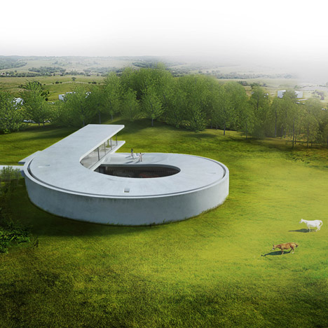
Snail house: BIG's looping house design for a car collector sparked a debate about the firm's aesthetic choices this week.
"I really admire BIG's conceptual, strategic and analytic diagrams," said JMan. "It's satisfying to see the same clarity and rigour from larger commissions being applied to smaller scale works."
"What you happen to call 'clarity and rigour' is what almost every professor would call a lack of sophistication in a first-year project," responded Davide.
Other commenters wondered if BIG's design was trying to tackle problems that didn't really exist.
"Once again the backwards-directed logic of BIG," wrote Rob. "Creating non-existent causes to justify the rather awkward design decisions to reach surprising final results." Read the comments on this story »

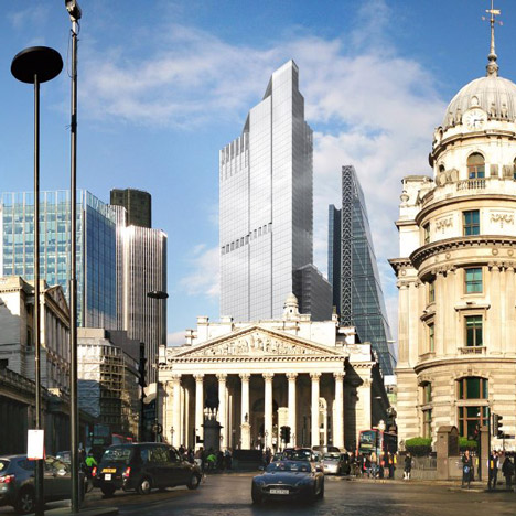
New heights: images revealed this week of a replacement for the part-built Pinnacle skyscraper in London angered many readers, who think the new building will ruin views of its high-profile and historic neighbours.
"The Bank of England and The Royal Exchange – the historical epicentres of world finance are now going to be (quite literally) overshadowed by this generic monstrosity," responded regular Dezeen commenter generalpopulation. "Can we just make Richard Rogers mayor already and do away with this architectural banality?"
Not so argued Alun, who feels the new design's "generic" qualities could be its greatest asset.
"I think London has dodged a bullet," he said. "This new thing looks fairly generic and will hopefully fade in to the background noise along with Heron Tower." Read the comments on this story »