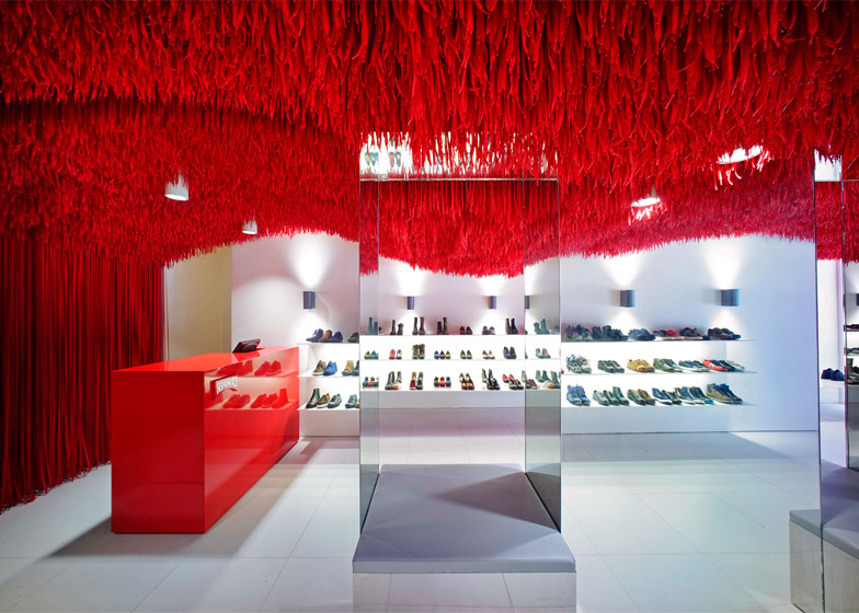
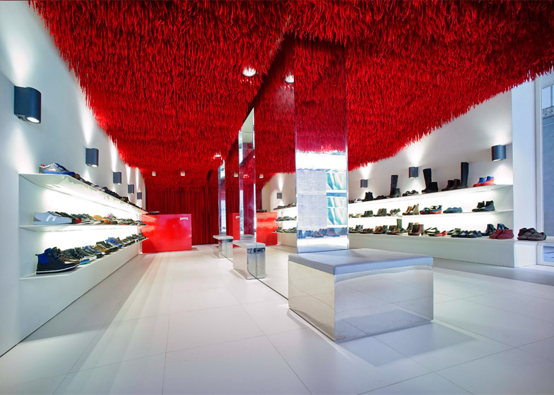
Brazilian architect Marko Brajovic has fixed thousands of bright red shoelaces to the undulating ceiling of this Camper footwear shop in Melbourne (+ slideshow).
São Paulo-based Atelier Marko Brajovic created the store interior as part of Camper Together – an ongoing project by Spanish shoe brand Camper that invites architects and designers to create unique products and store interiors.
Behind the stark white and glazed frontage of the shop on Lonsdale Street in Melbourne, 30,000 red shoelaces were attached to a false ceiling to create a series of varying curves and dips.
According to the architect, the design was intended to reference the brightly coloured fringing often used to decorate Brazilian carnival floats and costumes.
"We looked towards the festivities found in traditional Brazilian folklore," studio founder Marko Brajovic told Dezeen. "The environments and spaces involved in these festivities were created using dense layers of coloured stripes."
The studio was asked to overhaul several stores for Camper using the same concept. To individualise each installation, they created different ceiling shapes based on local weather phenomena.
For a shop in Brazil they created a wave-shaped ceiling, while in the Melbourne store the studio made use of parametric 3D modelling software – used to produce curved shapes in architecture – to convert a satellite image of a cyclone into an undulating form.
This shape was recreated in the store by tying laces of different lengths to a mesh base, attached to the concrete beam structure of the ceiling.
"We were asked to design a concept store that could be adapted in several locations, maintaining always a coherence," explained Brajovic. "So our concept was creating a 'think global, act local' project."
"I researched a lot about natural phenomena in Australia and one image that came to me very strongly was a satellite image of a cyclone," he explained.
The tip of each lace was attached to the mesh with a cable-tie, while the ends were left to dangle freely.
Pendant lights with white bell-shaped shades were integrated into the design, poking through the fringing to illuminate the shop display.
Behind a shiny red counter at the back of the shop, a row of long laces was suspended from the ceiling to the floor, functioning like a curtain into the stockroom.
Long white shelves were added around the edge of the shop floor to display shoes and boots, while benches with reflective sides and light-grey upholstered seats were built into angular mirrored arches in the centre of the space.
Other designers who have recently completed store interiors for Camper include Japanese architect Kengo Kuma, who covered the interior of the brand's Milan store in a grid of pale plywood.
Photography is by Oliver Cole.
Project credits:
Client: Camper
Project by: Atelier Marko Brajovic
Parametric design: Henrique Stabile
Constructor: StorePro


