Nendo fills Camper's Stockholm store with paper-thin spirals
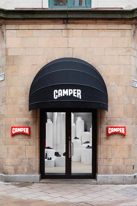
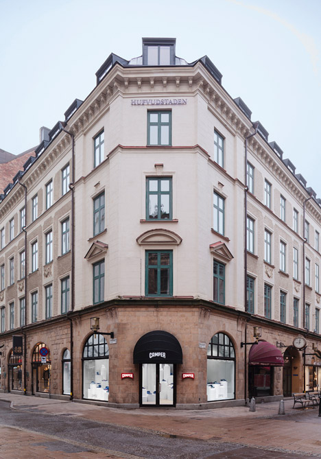
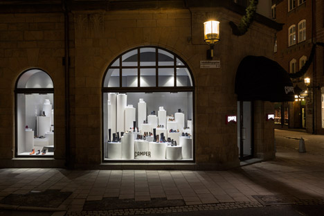
Shoes appear to rest on huge rolls of white paper inside this Camper store in Stockholm – the third interior design concept that Japanese studio Nendo has developed for the Spanish shoe brand (+ slideshow).
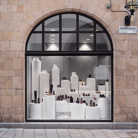
Having previously designed shops where shoes seem to walk through the air and protrude from the walls, Nendo's concept for Camper Stockholm features spirals of white paper-thin material that create display stands for footwear.
Rather than actually using paper or cardboard, the designers worked with two-millimetre-thick resin flooring to create the coils in a variety of different heights and thicknesses.
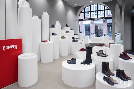
"Rolling it in a spiral manner has led to a self-supporting structure serving as a display platform, giving a sense that the shoes are balancing on the paper-like objects," said Nendo in a statement.
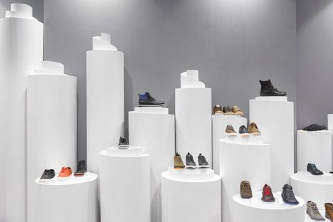
LED lighting concealed within the rolls of material illuminate the products from below.
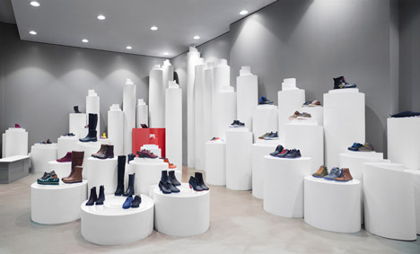
One roll has also been half unravelled and laid flat, creating a seating area where customers can try on shoes.
"The variation in not just height and size, but the curling of the structures as well, has created a display space that is visually rich, envelops the customer, and is characterised by three-dimensionality through the use of flat platforms and a partially 'unravelling' bench," said Nendo.
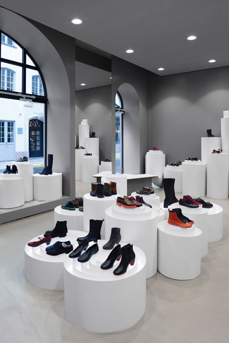
According to the team, the process of shaping the rolls could be compared with the practice of shoemaking.
Dezeen Book of Interviews: Nendo founder Oki Sato features in our new book, which is on sale now
"Taking a soft and thin flat material and giving it form – this is, also, the core idea behind the shoemaking process," they said.
Nendo's first interior concept for Camper – which featured shoes supported on thin metal rods to create the appearance of footwear walking through the air – was completed in 2012 at the Osaka store and was then rolled out to shops in Paris, San Francisco and Moscow.
Speaking to Dezeen, principal designer Oki Sato said the design was intended to show that "Camper shoes are not for running fast or for luxury, but something to enjoy walking".
The second concept, described by Sato as resembling an "orderly stockroom" and covered in hundreds of white shoes sticking out from the walls, was presented in New York in 2013 and was also used for a store in Madrid.
Camper regularly works with external designers – including Japanese architect Kengo Kuma, Chinese studio Neri&Hu, London duo Doshi Levien and Spanish designer Jaime Hayón – to create unique store design and products as part of its ongoing Camper Together project.
Photography is by Camper and Joakim Blockstrom.