Perforated screens cover the facade of São Paulo apartment block by Studio MK27
Perforated wooden shutters allow the residents of this São Paulo apartment building by Studio MK27 to control the levels of daylight in their living spaces (+ slideshow).
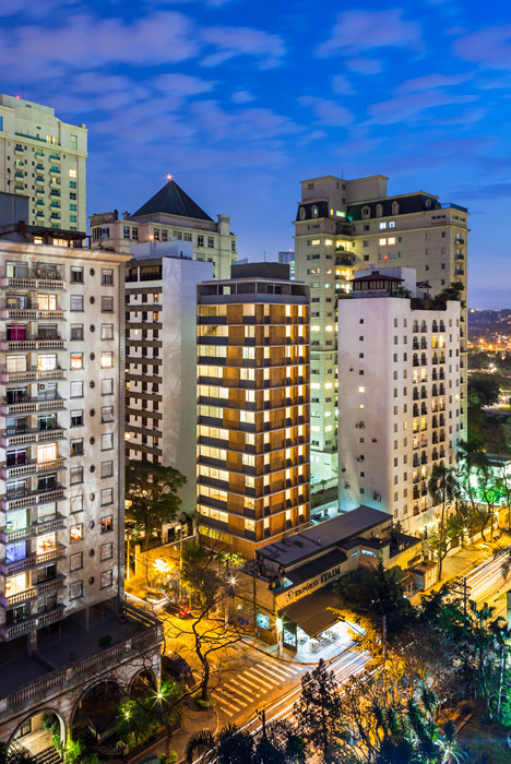
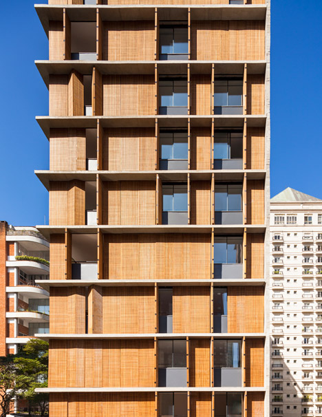
The Vertical Itaim building was designed by local firm Studio MK27 for a site in the city's upmarket Chacara Itaim neighbourhood and contains 10 apartments. Most of these are 144 square metres, with a larger penthouse occupying the top of the structure.
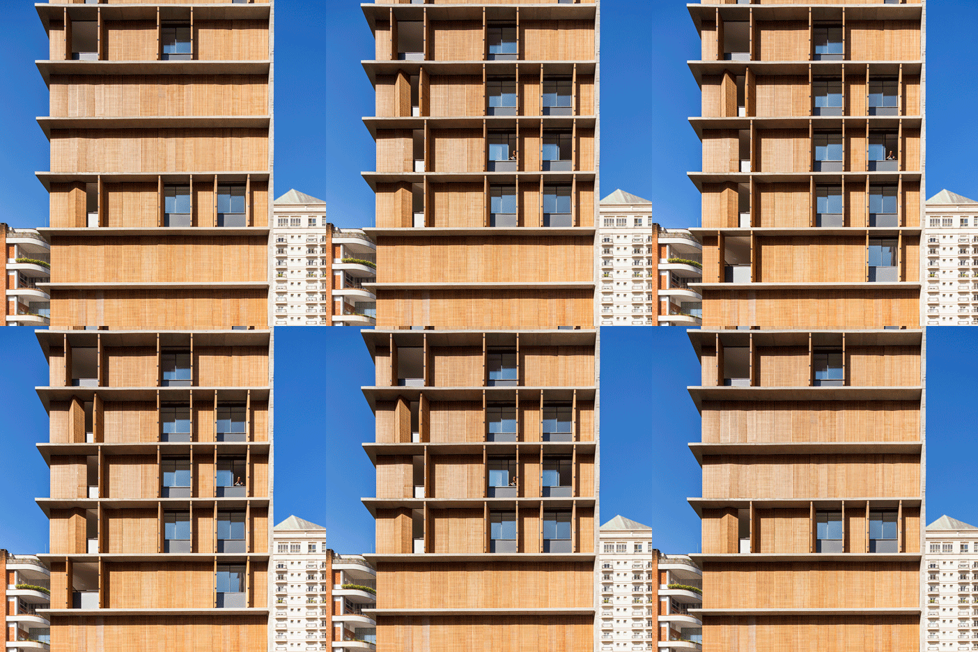
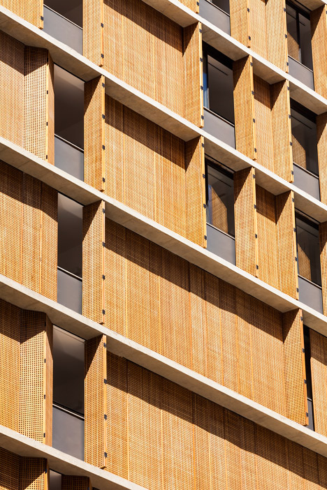
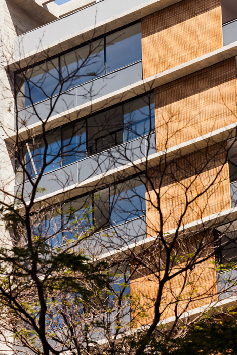
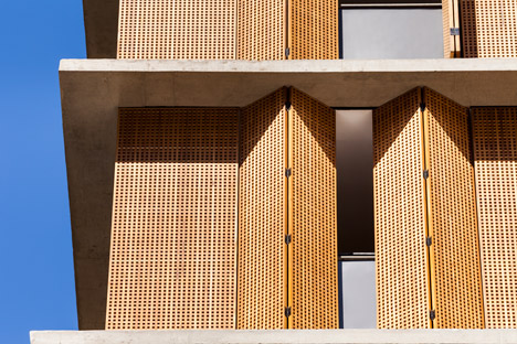
The timber shutters are covered in a grid of square holes that reference traditional Arabian mashrabiyas – carved latticework screens that were first used in Brazil by Portuguese settlers. These recently featured in the design for a São Paulo family house by architect Guilherme Torres.
This window treatment is applied to the building's north facade, where the most sun-shading is required. Dappled sunlight is able to enter the interiors through the perforations, and the holes also allow air to circulate and cool the rooms when sliding windows behind the screens are opened.
"The wooden elements have perforated squared patterns and do not block the wind, just like the Arabian mashrabiyas," said the firm, which is led by architect Marcio Kogan. "This solution results in very pleasant temperatures."
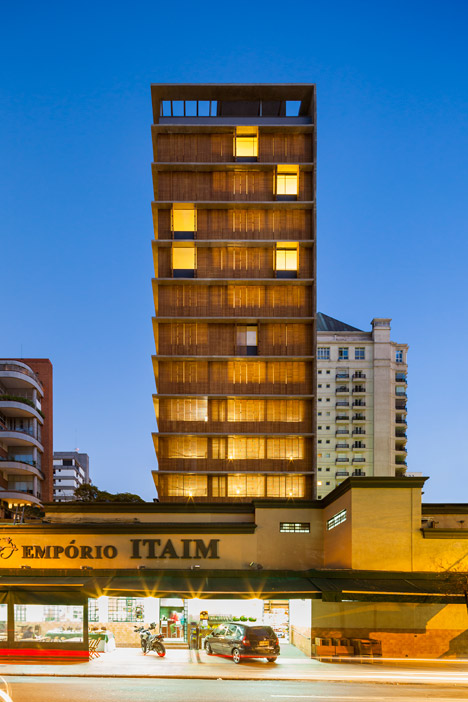
When all the shutters are completely closed they form a dense surface, with a slight opacity that becomes evident when the lights inside are on.
When the shutters are fully opened, they extend outwards to the edge of the projecting concrete floor plates.
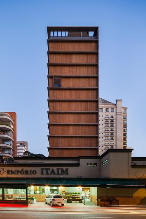
Along the east facade, where the main living spaces of the apartments are located, horizontal bands of glazing provide expansive views across the city.
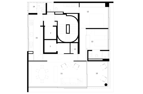
The north-east corner of each apartment features a terrace accessed through sliding doors from the living room.
A sliding screen – with the same pattern of perforations as the shutters on the adjacent facade – can be pulled across to provide privacy for the terrace without impairing the open-air feel.
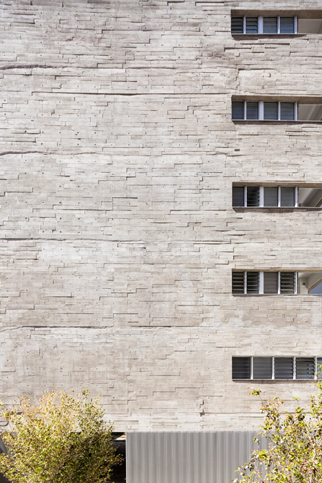
The tower's south and west facades sit close to neighbouring buildings. These are concrete, but have a textured surface created from wooden formwork.
The choice of concrete references the Brutalist architectural style that is common in the city, while its uneven composition creates shadows that intensify as the direction of the sun shifts throughout the day.
"The texture of the slats – when lit by the sun – produces a surprising and poetic effect for the larger gables," added the firm.
The thickness of the concrete facades is visible at the ends where they meet the glazed walls. The textured surface also continues through to the inner walls of the residence.
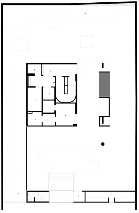
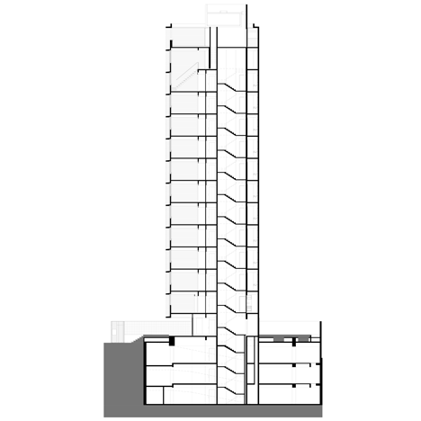
A core containing lifts and a staircase is positioned slightly off-centre to maximise the floor area of living rooms and bedrooms that can be arranged in different configurations, depending on the owners' requirements.
Bathrooms, a kitchen and an entrance hallway are positioned around this circulation and service core.
The ground floor contains a communal reception hall, storage space, technical services and access to the lifts. Steel columns supporting the floors above give this level a more transparent feel that enhances its connection with a small garden outside.
Photography is by Pedro Vannucchi.
Project credits:
Architects: Studio MK27
Author: Marcio Kogan
Co-author: Carolina Castroviejo
Project team: Carlos Costa, Fabiana Stucchi, Fernanda Palmieri, Laura Guedes, Mariana Simas, Oswaldo Pessano
Landscape architect: André Paoliello
Structural engineer: Avila Engenharia de Estruturas
Facilities: PHE Engenharia de Projetos Hidráulicos e Elétricos
Acoustic consulting: Akkerman Projetos Acústicos
Construction: Vitacon, Abraão Frankel, Marcus Alcantara de Castro
