Penoyre & Prasad has reskinned the Constructivist-influenced Guy's Tower in London, giving it back its crown as the tallest hospital in the world. Architect Sunand Prasad explains how his team updated an "ugly building designed with a great deal of love" (+ slideshow + interview).
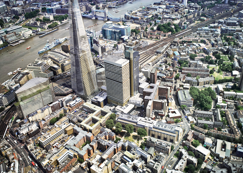
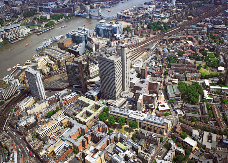
Located on the South Bank of the River Thames in central London, the structure – which is actually made up of two towers joined by a bridge – is one of the 19 buildings that form the Guy's Hospital campus, a major medical teaching facility that includes the Guy's and St Thomas' NHS Foundation Trust, and King's College London.
The building was completed by Watkins Grey Architects in the early 1970s. Less than 40 years later, it was suffering from decay. Sizeable cracks had formed in the walls and the concrete had begun to deteriorate.
"It was completely clapped out," explained Prasad, who served as RIBA president between 2007 and 2009. "The concrete surface was flaking off to the point where abseilers had to go up the tower and carefully break off pieces before they could fall away. And also it was leaking energy like a sieve."
Working in close partnership with engineering firm Arup, Penoyre & Prasad carried out a full analysis of the building. They developed a series of strategies for its repair that could be implemented without closing the busy hospital.
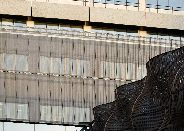
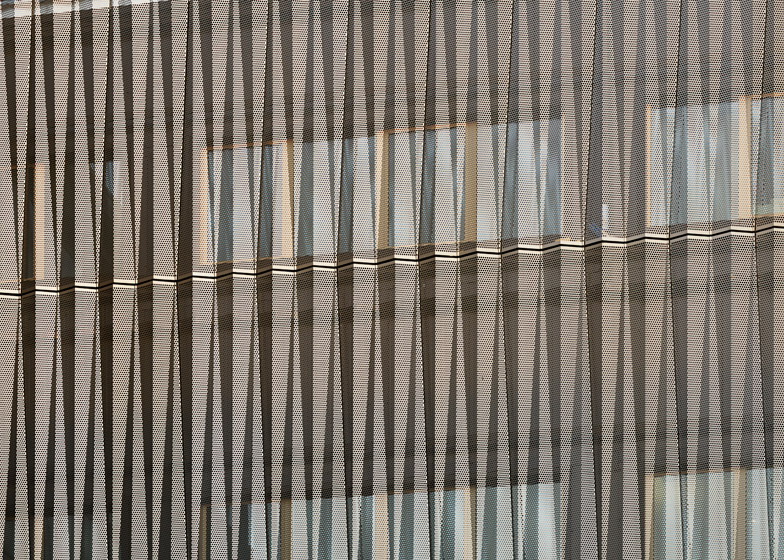
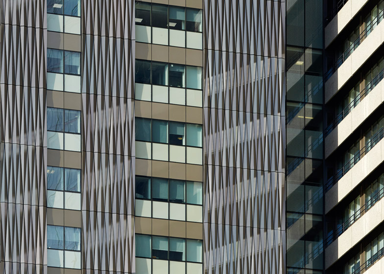
The taller of the two structures – the 143-metre-high Communications Tower – was also the most damaged so it required an entirely new facade. Anodised aluminium was chosen, intended to give the building a solid hewn finish, and the old windows were swapped for double glazing.
"The vertical Communications Tower has been clad in a special geometric, folded origami-like aluminium skin that we devised and tested – it's super insulated," Prasad told Dezeen.
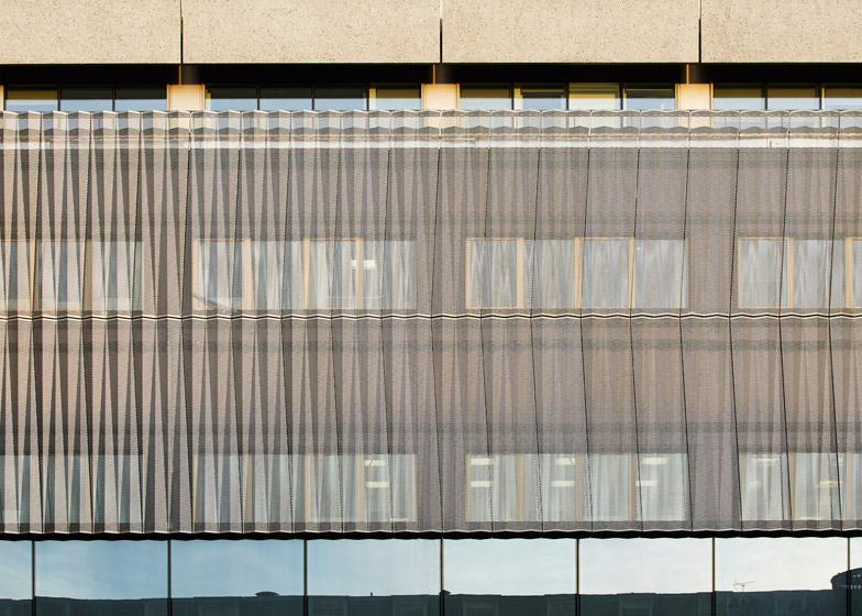
For the accompanying User Tower, all the glazing had to be replaced and the concrete required a thorough restoration, revealing its original white-cement aggregate.
"The User Tower has also been completely reclad, but working entirely from the balconies so that the workers didn't have to go inside to reclad the building," explained the architect. "Eventually, from inside, the old walls will be removed and the building will get slightly larger."
Guy's first opened in 1974, at the same time that the Barbican Estate was rising on the other side of the city. Its raw concrete exterior led to it being connected to the Brutalist style – and all the negative associations that later came with that.
But Prasad describes the design as Constructivist – the engineering-led style that flourished in the Soviet Union in the 1920s and early 1930s. He believes this is most clearly present by the jaw-like lecture theatre that cantilevers from the top of the taller tower.
"It is an ugly building, but it's an ugly building that was designed with a great deal of love," he said. "Maybe a sad or interesting fact about the 1960s is that a lot of the buildings that people think of as pretty ugly and Brutalist were actually done with enormous care and finesse."
"I didn't think we could make it into a beautiful building – and that wasn't the aim," he continued. "The aim was actually to, if anything, emphasise what I think is its Constructivist character."
As part of the renovation, a 14-metre-high light-relecting installation by German artist Carsten Nicolai was added on the roof, increasing the overall height of the building to 148.65 metres.
Because of this, Guy's can now once again call itself the tallest hospital building in the world – a title it held for 16 years before being overtaken by the 145-metre-high O'Quinn Medical Tower in Houston and the 148.5-metre-high Hong Kong Sanitorium & Hospital.
"It has a new presence in what is a very exciting quarter that is emerging because of The Shard," added Prasad, referencing Renzo Piano's 300-metre tower that now sits nearby.
"The whole London Bridge area is undergoing complete change, and Guy's Tower stands as a refreshed, new part of the collection of interesting buildings on the South Bank."
Read the full interview with Sunand Prasad:
Marcus Fairs: Tell me about the project. What is it and why were you commissioned to do it?
Sunand Prasad: Guy's Hospital is the tallest hospital in the world. It is a very interesting building dating from the early 70s and has some very interesting facts about it. It is incredibly versatile because it is designed to have a core and separate user plates.
But by 2008-2009 it was completely clapped out. The concrete surface was flaking off to the point where abseilers had to go up the tower and carefully break off pieces before they could fall away. And also it was leaking energy like a sieve.
So we won a competition with Arup to completely remodel the outside of the tower. We weren't allowed to touch the inside because there's everything going on in there from operations to dentistry.
Marcus Fairs: Tell me about the original building.
Sunand Prasad: It's at London Bridge next to The Shard. For a long time it was the tallest building in that area. It was the landmark by which you would find London Bridge station, but now you've got the Shard.
It is an ugly building, but it's an ugly building that was designed with a great deal of love. Maybe a sad or interesting fact about the 60s is that a lot of the buildings that people think of as pretty ugly and Brutalist were actually done with enormous care and finesse.
I didn't think we could make it into a beautiful building – and that wasn't the aim. The aim was actually to, if anything, emphasise what I think is its Constructivist character.
Marcus Fairs: You wouldn't describe it as a Brutalist building?
Sunand Prasad: Brutalism is very often attached to anything made of concrete of a large scale, because exposed concrete comes from, of course, béton brut, which is what Le Corbusier called raw concrete. But I call it Constructivist is because it has a projecting lecture theatre.
It has two clearly articulated bits – the circulation core and the floor plates. The way that it sits on the ground is actually very obscured, but originally when it sat on the ground it would have been quite an interesting thing to enter from below.
It's very graphic – showing its parts very clearly and separately. So we've tried to reinforce that a little by emphasising the separation of the two towers, by cladding the projecting lecture theatre in a slightly different material, by putting a sculpture on top to give it a little more presence.
And the light at the top of the tower, which is actually quite subtle, is connected to the energy use of the tower through a computer.
Marcus Fairs: The building has a distinctive cantilevered jaw-like form at the top, which contains a lecture theatre. Why is the theatre at the top of the building rather than the bottom?
Sunand Prasad: Partly to make a dynamic and interesting top. Watkins Gray Architects – who were behind the original design – must have thought quite long and hard. The whole device of the cantilevering lecture theatre – which was actually one of Stirling's student projects, there were other precedents for it at that time – obviously captured imaginations.
It was first done by a Constructivist, Melnikov, in a workers club – the Rusakov club in Moscow. So it's kind of in the culture to do cantilevered lecture theatres. And somebody obviously thought that we can have a hospital and all of the education can be at the top with fantastic views of London.
Underneath the lecture theatre there's a big space with a balcony where you can look out over London. It's a shame actually – it's one of these hidden spaces of London that we ought to have access to and one of our proposals was to give access to it - which I hope still will happen one day.
Marcus Fairs: Describe how you've remodelled the building.
Sunand Prasad: Of the two towers, the vertical Communications Tower has been clad in a special geometric, folded origami-like aluminium skin that we devised and tested – it's super insulated.
The User Tower – which had these 1200-square-metre floorplates over 34 storeys, with some interstitial plant floors – has also been completely reclad, but working entirely from the balconies so that the workers didn't have to go inside to reclad the building. Eventually, from inside, the old walls will be removed and the building will get slightly larger.
Marcus Fairs: What was the aim of the project?
Sunand Prasad: There were three keys aims really: one was to make it safe and long lasting, but another was about making it energy efficient. Relative to the performance of the cladding, it is 18 per cent more energy efficient that it was. The carbon cost of the work will be repaid within about 10 years. So that has all been calculated.
And thirdly, it creates a new image; it has a new presence in what is a very exciting quarter that is emerging because of The Shard. The whole London Bridge area is undergoing complete change, and Guy's Tower stands as a refreshed, new part of the collection of interesting buildings on the South Bank.

