Renovated Baroque museum in Portugal features a mirror-clad ticket office
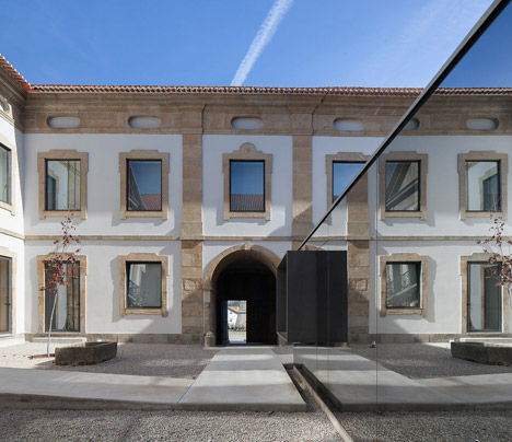
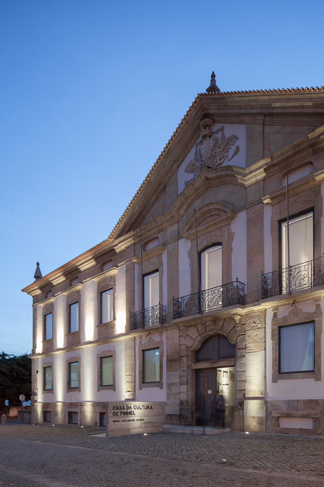
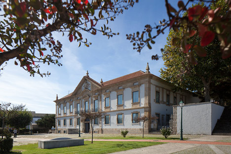
DepA has transformed an 18th-century palace in Pinhel, Portugal into a cultural centre and added a mirrored glass box in its central courtyard to house a ticket office (+ slideshow).
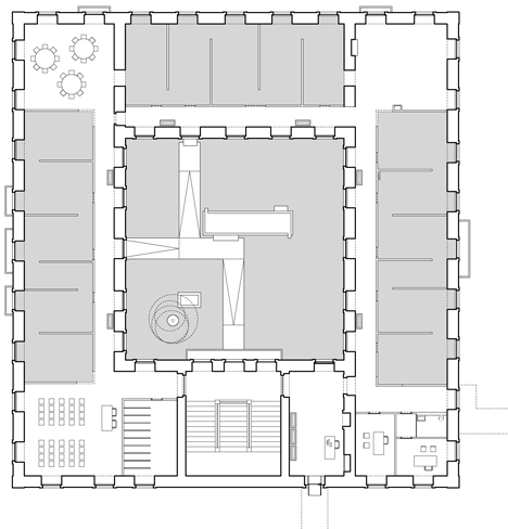
The project for the Cultural House of Pinhel involved renovating the former Bishop's Palace to create a museum dedicated to the work of José Manuel Soares, a 20th-century painter and comic book illustrator.
The building will eventually also accommodate another museum for the local municipality, which depA is working on as part of its ongoing masterplan for the site.
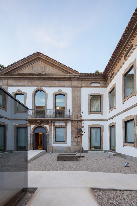
The Baroque palace had been used for several purposes in recent decades, most recently involving the subdivision of its interior to create student accommodation. The team chose to clear out and reorganise these spaces to meet the functional requirements of the new programme, but was careful to retain the building's character.
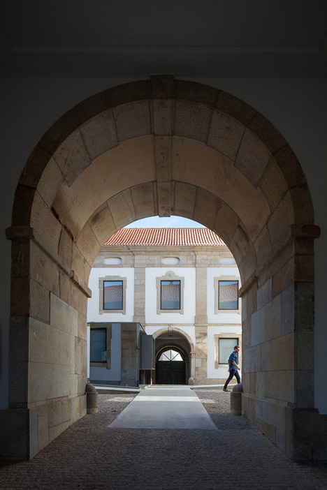
"More than to build, we had to bring back this building's dignity by selectively demolishing its additions, and keeping and valorising its original and meaningful elements," architect Luis Sobral told Dezeen.
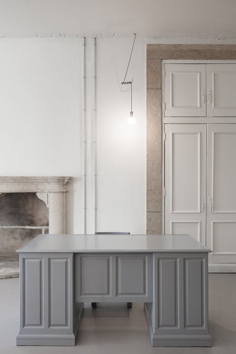
"We removed all the elements that were not essential to the museum experience and weren't from the original building, leaving only the walls that could be part of the museum's path," Sobral explained.
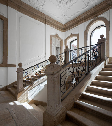
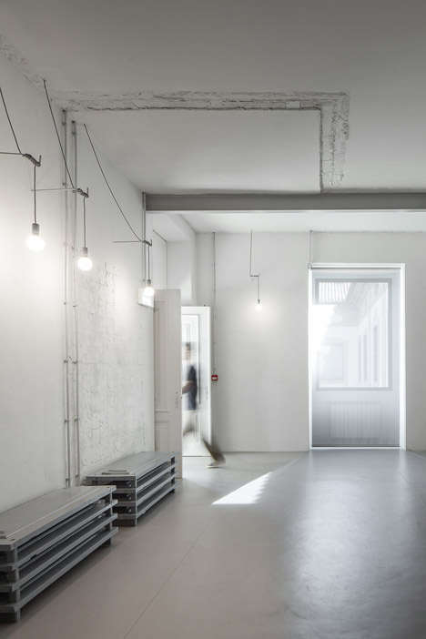
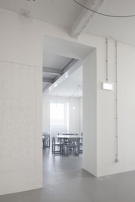
The palace's historic features, including decorative plasterwork ceilings and iron balustrades, have been carefully preserved or restored, while evidence of the more extracted elements can be seen throughout the rooms in the form of exposed bricks and plasterwork.
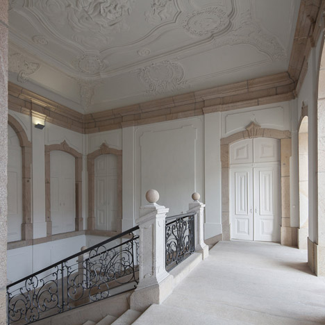
"We didn't want to completely erase the building's past as we understand that this is what brings it to what it is today," Sobral added. "So we assumed our intervention as an obvious new layer and left all the 'scars' from its previous lives."
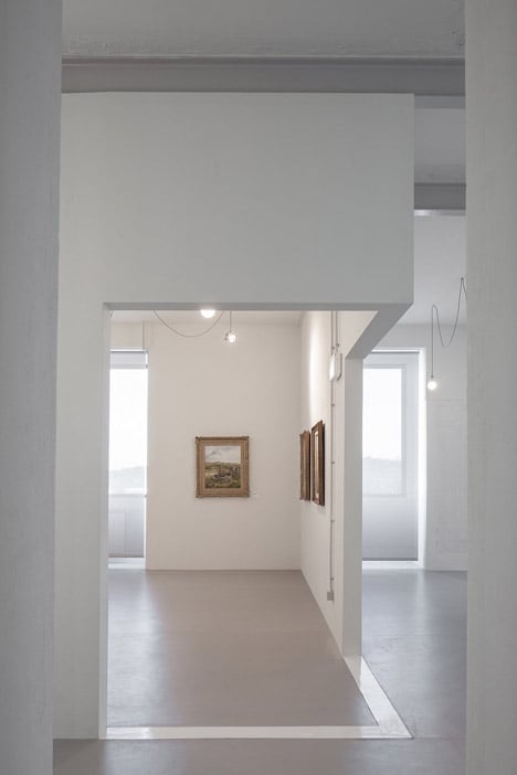
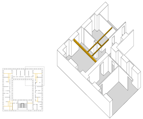
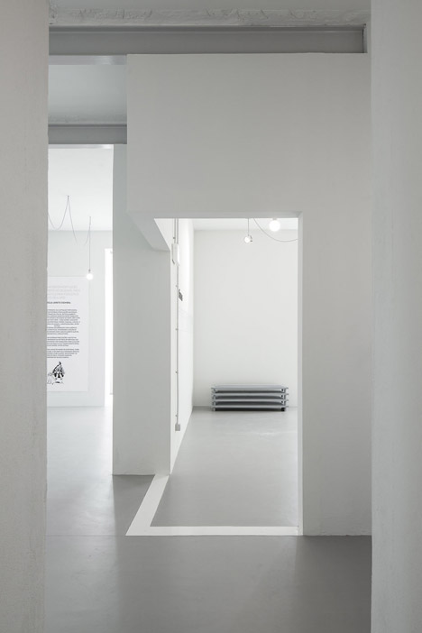
Following the demolition and removal of unwanted walls, the project's second phase involved the addition of partitions that help to reorder the visitor's journey through the galleries.
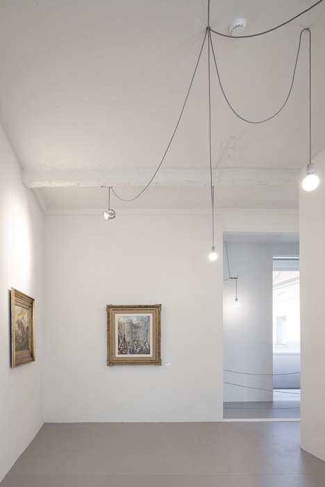
The interior spaces are uniformly whitewashed to give old and new surfaces a homogenous aesthetic, with only their texture providing a clue as to their origins.
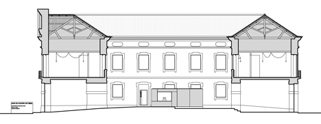
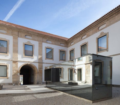
A further addition was created in the courtyard, where the mirrored glass walls and steel structure of the new reception and ticket office offer a contemporary counterpoint to the surrounding buildings.
"We believed that the kind of intervention we did on the museum needed somehow to be balanced with some very rigorous and carefully designed elements that dealt with the building's solemnity," Sobral said. "The new building on the patio was the right place to do it as it works as the front door for the Cultural House."
Because the structure's glazed surfaces reflect the surrounding buildings, it attracts the attention of visitors as they enter the courtyard, directing them towards a projecting steel-framed opening where they can purchase tickets.
The use of steel and projecting forms was also applied to the centre's two entrances, continuing the visual language of the ticket office and signalling the way in to the museums.
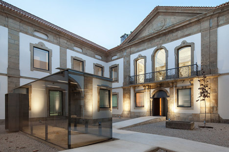
Gently sloping concrete ramps were introduced to improve access to different doorways around the edges of the central square.
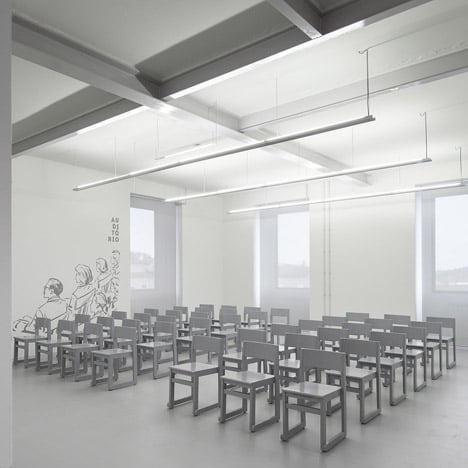
A total budget of €284,000 (£206,000) and a limited timeframe for the renovations prompted a simple materials palette, as well as the reuse of materials wherever possible. Wood salvaged from the demolition process was used to build new furniture, while basic off-the-shelf materials and details like the suspended lighting provided affordable solutions to practical requirements.
Photography is by José Campos.
Project credits:
Architects: DepA
Consultants: Luís Oliveira, Edgar Brito, NCREP
Museology: Glorybox
