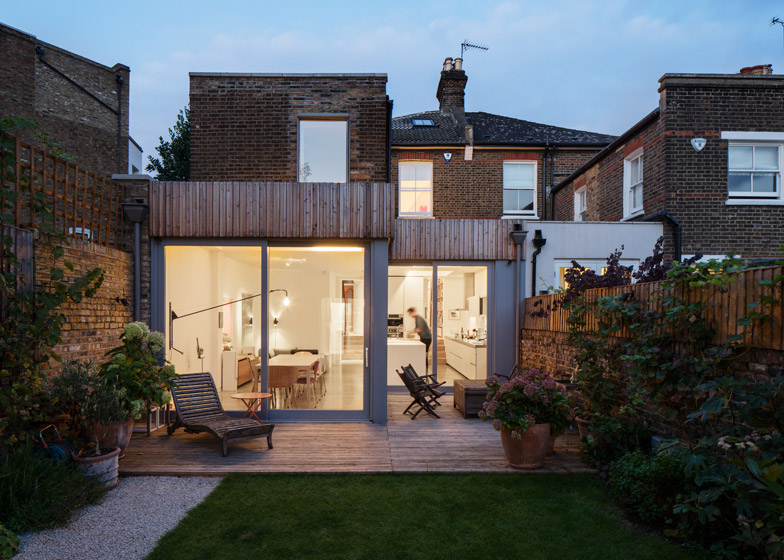
Slender batons of untreated larch cover two extensions erected in the garden of this semi-detached home in London, as part of a refurbishment and remodelling by architecture studio Haptic (+ slideshow).
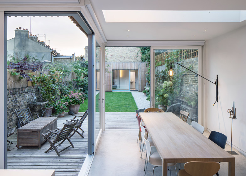
London-based Haptic added an open-plan kitchen and dining room in the first of two extensions to the rear of Highlever House, a two-storey Victorian property in west London.
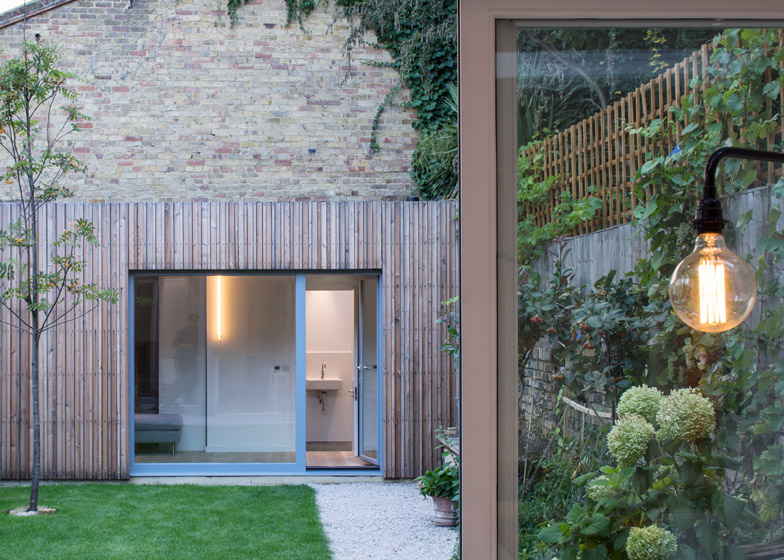
The second is a small guest annex positioned against the brick gable of a neighbouring property at the bottom of the garden.
Both are clad with narrow slats of untreated larch that will naturally grey over time. Large panels of glazing set into the ridged timber cover direct views into the garden, and trailing plants that hang from the garden walls soften the outline of the two rectilinear volumes.
"The untreated timber slats create a surface, which appears soft, drape-like and tactile, with a subtle three dimensionality," said studio director Timo Haedrich.
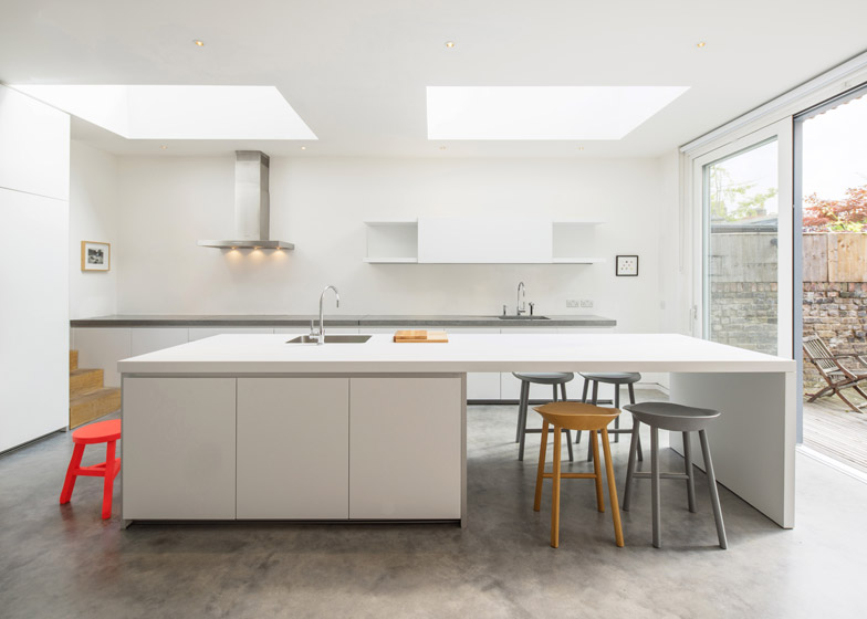
Two large skylights illuminate the white-painted kitchen and dining area, which are separated by a white breakfast bar with integrated storage.
Metal details including an angular extraction hood and taps contribute to a minimal aesthetic that contrasts the Victorian features in the original parts of the house.
"We utilised a limited palette of materials and colour, with oak and concrete featuring throughout the property and contrasting to the white walls and kitchen," Haedrich told Dezeen.
"These materials were used and detailed in a variety of ways to provide varying tactile experiences for the family."
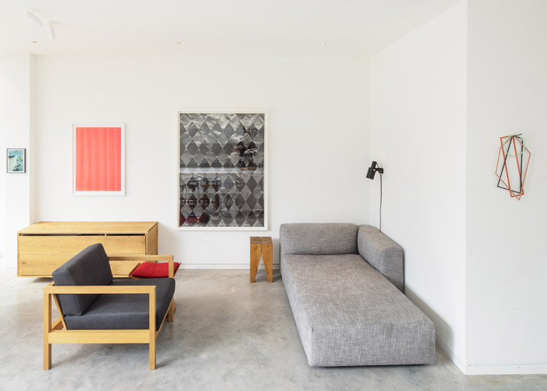
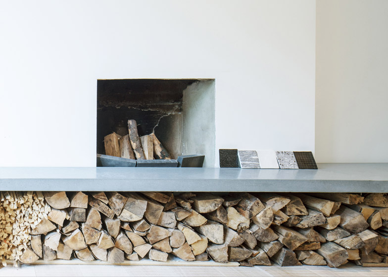
Poured-concrete floors visually tie the lounge at the front of the house with the kitchen and dining area at the rear. A short flight of wooden steps leads from the sunken kitchen to the lounge, where a fireplace is built into a slim concrete counter.
Although the architects removed "unsympathetic" additions to the property to make way for the new extensions, the Victorian layout, decorative moulding work and a wooden staircase were retained.
"The intention was to form a connection between the old and the new, to juxtapose the Victorian craftsmanship and love for intricate detail with modern construction techniques and to create generosity of space and light," explained Haedrich.
Old paintwork has been stripped from the wooden staircase that leads from the new timber floorboard of the property's hallway to the three bedrooms and a family bathroom positioned across the upper storey.
"The original Victorian staircase was left intact with the patina on show," said Haedrich. "We enjoy the contrast of this with the rest of the house, with crisp and refined detailing."
The largest bedroom faces the street, while the remaining rooms have windows that overlook a decked patio by the kitchen and the garden beyond.
Photography is by Simon Kennedy.
Project credits:
Architect: Haptic Architects
Team: Timo Haedrich and Chris Wong

