"Design has an important role to play in changing people's view of what women should look like"
Comments update: Dezeen readers have been discussing design's role in challenging idealised perceptions of the female body this week.
Debora Dax created her InConTextUre clothing range to highlight features of the body that people typically want to conceal. The designs include garments that emulate love handles, dry skin and pubic hair stubble.
"Design has an important role to play in changing people's view of what women should look like," wrote Martina. "Great to see it's being attempted on a conceptual level."
But although many commenters felt that Dax's collection "raises important body image issues", some argued that the garments perpetuated – or even enhanced – negative attitudes.
"Destigmatising bodies that have been considered undesirable and imperfect is important – but then to put the clothes on able-bodied, thin, 'perfect' models? It reduces imperfect bodies to a costume," argued Jacqui.
"These clothes dehumanise bodily traits and trivialise the oppression and discrimination some people face." Read the comments on this story »

Don't do it: sports brand Nike unveiled a clothing range created in collaboration with fashion designer Sacai, including flowing garments intended to make sportswear look more feminine.
But readers were angered by the use of lace and pleats and thought the clothes lacked functionality.
"Ruffles n' lace? Seriously? Never mind the sexist overtones, the designs are simply unappealing," added LOW.
Not everybody felt the same way. "There might be some advantages that come from this exploration," wrote The Liberty Disciple. "Less skin-tight clothing could encourage those with conservative cultures or body-image issues to exercise." Read the comments on this story »

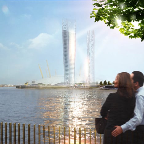
Fryscrapers: a concept for "shadowless" skyscrapers that bounce sun beams down to the ground reminded readers of Rafael Viñoly's Walkie Talkie building in London, which reflected a beam of light intense enough to melt cars.
"I didn't think we would want to replicate that!" said Frankie.
Other commenters questioned the logic of the design: "I don't see the point if you have to build a taller tower to remove the shadow of a smaller one," wrote Kekos.
"If you want a shadowless skyscraper, don't build it in the first place," agreed Steve O. "Highly reflective buildings do not work." Read the comments on this story »

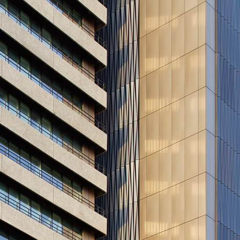
Facadism: Penoyre & Prasad's transformation of the world's tallest hospital prompted a discussion about the Brutalist style of architecture. Project architect Sunand Prasad described Guy's Tower prior to its makeover as an "ugly building" – a comment many took issue with.
"Its forceful, bold aesthetics have been continually undermined, first by the Shard and now by this," wrote MB. "We have lost another beautiful Brutalist building to fashion."
Stephen Mallory offered a similar view: "I think this would have been better if the metal cladding was coloured to match the concrete better. However, the folded cladding is quite beautiful."
"I would have preferred if it had been given the 'Park Hill' treatment," wrote Stuart W, referring to the refurbishment of the Brutalist housing estate in Sheffield. "I fear we will lose all buildings of this era in the same way." Read the comments on this story »