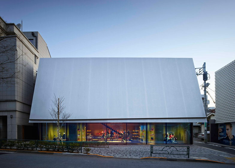
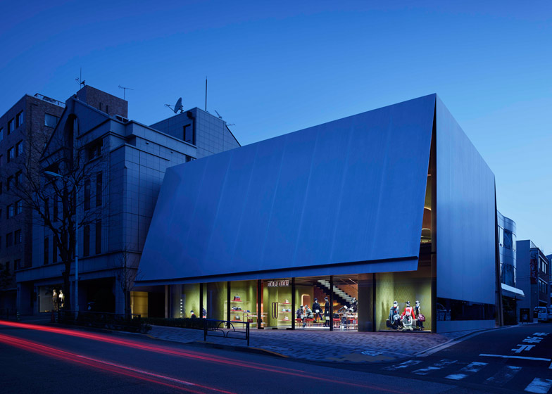
Herzog & de Meuron has completed work on an "understated" box-like shop for fashion brand Miu Miu in Tokyo's Aoyama district – opposite the flagship store it created for Prada almost 15 years ago (+ slideshow).
The 720-metre-square building designed by the Swiss architects for Miu Miu occupies a site on Miyuki Street, close to Omotesando Street, which is home to a string of luxury fashion stores designed by renowned architects.
Miu Miu is led by Italian designer Miuccia Prada, who commissioned Herzog & de Meuron to create their seminal Tokyo Prada store on the other side of the same road in 2000.
As well as wanting to create a building that would contrast with the crystalline glass structure of the Prada store, Herzog & de Meuron's design had to comply with zoning regulations that limited the height of the building.
"Contrary to expectations for a site that is home to so many luxury brands, Miyuki Street in Aoyama Tokyo is not particularly beautiful or elegant," said the architects. "The architecture is heterogeneous – a hodgepodge of freestanding buildings of different heights and shapes, with neither historical tradition nor common standards."
The two-storey opaque structure includes a steel facade that angles away from the glass glazing on the front of the building "as if the volume had been sliced open with a big knife".
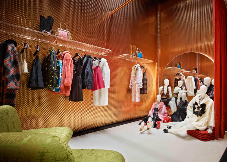
This acts as a giant metal awning, shading the interior while offering passers-by a glimpse inside. The other side of the sharp-edged steel sheeting is clad with textured copper that curves at the corners.
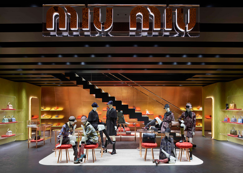
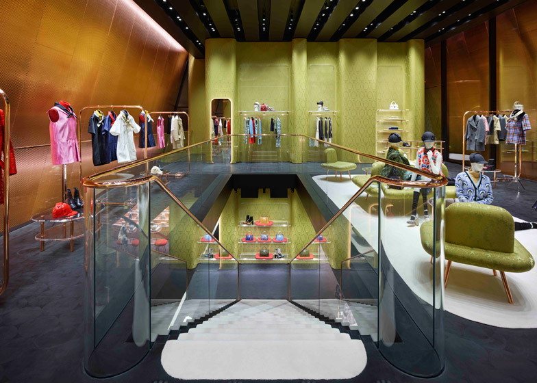
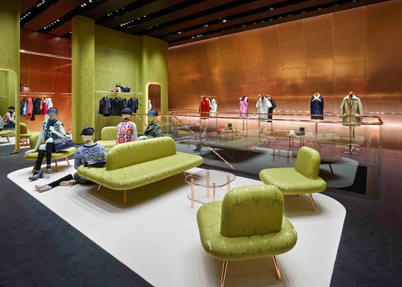
Shoppers enter beneath the steel canopy into the lower level of the shop, which the architects intended to look more like a "spacious and comfortable home" than a retail space.
"We used the following thoughts to channel our ideas: more like a home than a department store, more hidden than open, more understated than extravagant, more opaque than transparent," said Herzog & de Meuron.
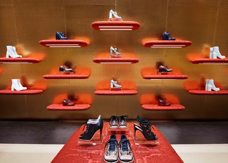
Another angled copper wall is used on the opposite side of the store, extending the full height of the building and providing a backdrop for displayed accessories.
A single-flight staircase orientated parallel to the main facade features glass banisters topped with copper rails.
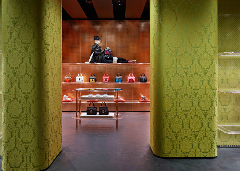
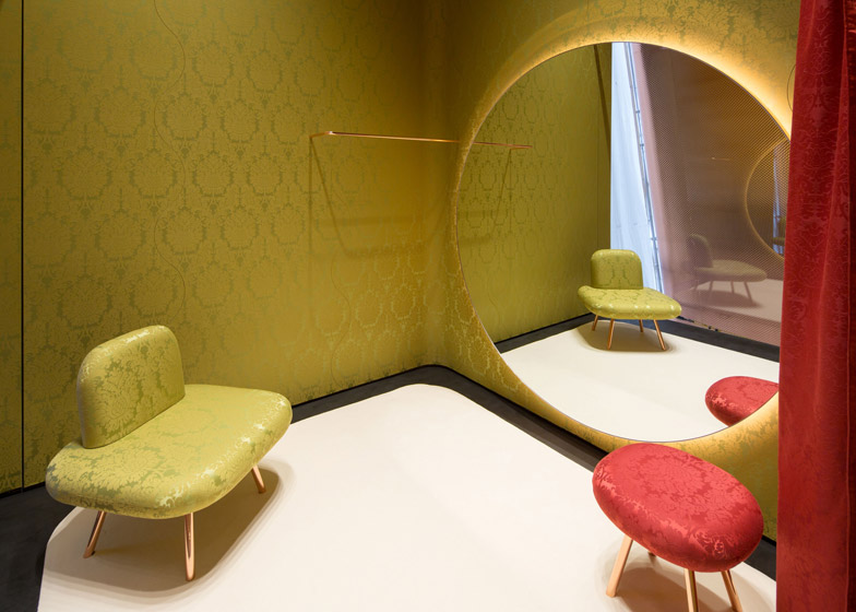
Other internal walls are covered with a brocade fabric produced in subtly different shades of green.
The pattern is also used to upholster the rounded seats and stools found around the interior, in both green and a contrasting bright red hue that covers shelves.
Branded with Miuccia Prada's nickname, Miu Miu was set up in 1993 as a platform for the fashion designer's explorations beyond her Prada line.
Herzog & de Meuron completed the all-glass Prada Aoyama store 12 years ago and the building has since become a popular tourist destination.
"At that time, we were interested in counteracting the situation – on one hand, by placing a small plaza to the side of the building, and on the other, by making the structure completely see-through so that one can see into the interior from all sides and can also look out from inside at specifically targeted views of the city," said the architects.
The Prada group was keen to place the new Miu Miu store in the same vicinity, close to other high-profile fashion-architecture collaborations that include buildings for Dior by SANAA, Coach by OMA, and Tod's by Toyo Ito.

