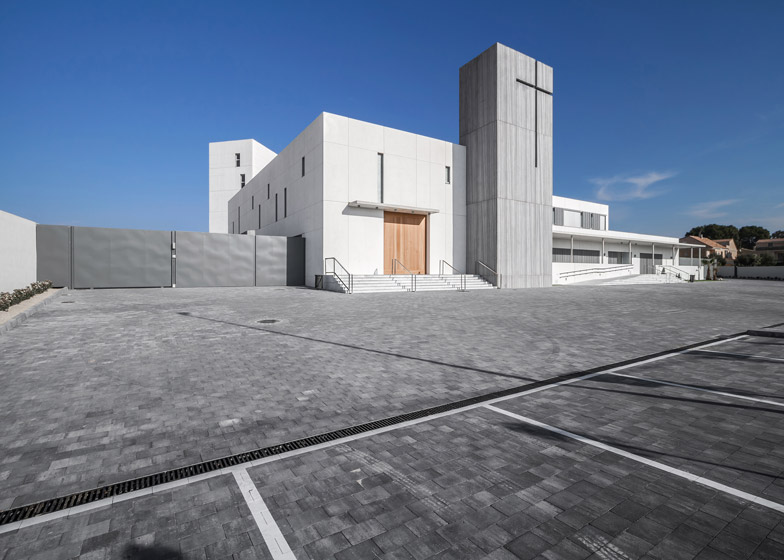
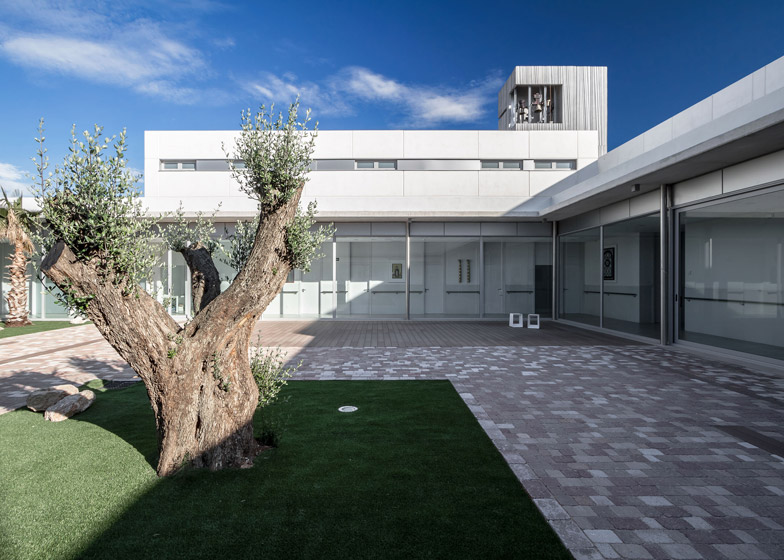
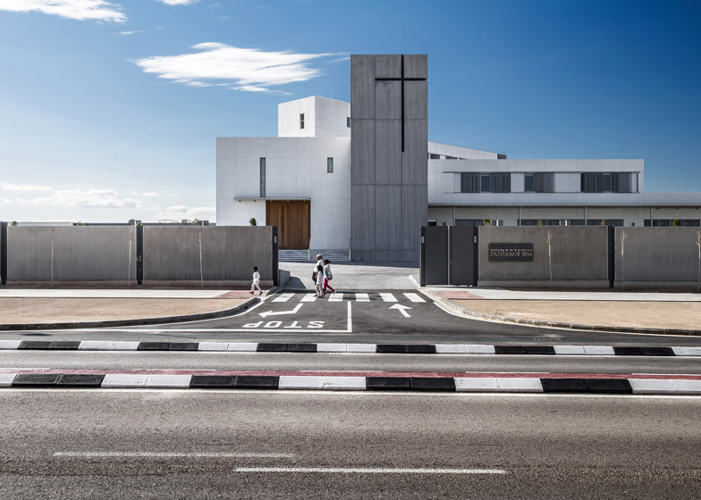
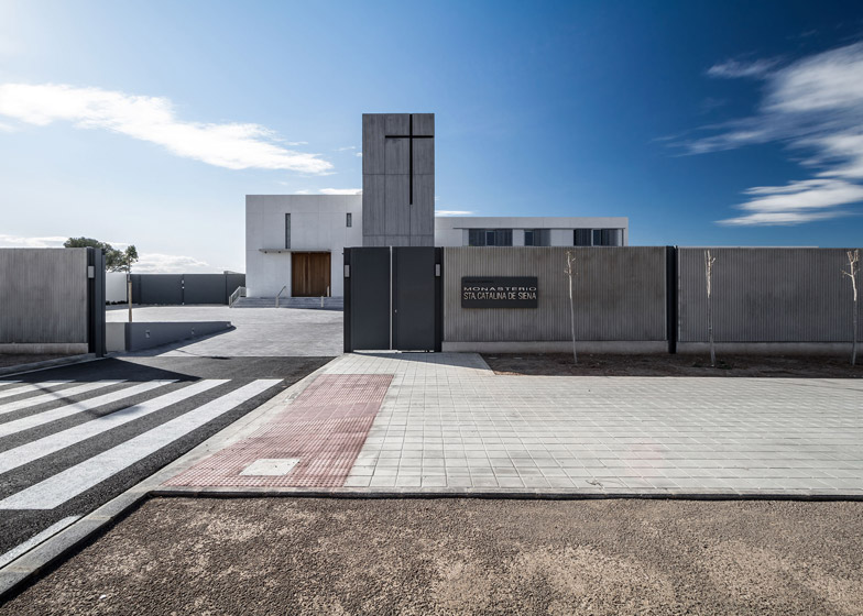
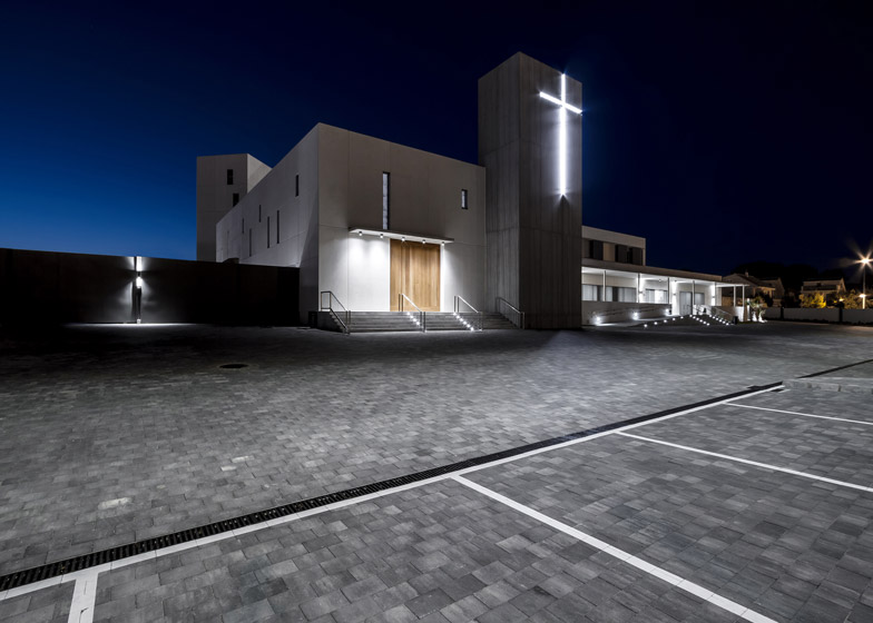
The bell tower of this monastery on the outskirts of Valencia features a ridged surface with a cross-shaped cut-out to indicate the buildings' use to passers by (+ slideshow).
The Monastery of Santa Catalina de Siena is located in the Paterna district to the northwest of Valencia, and was designed by local firm Hernández Arquitectos for a community of Dominican nuns.
The new facility replaces a monastery that previously accommodated the nuns, which was positioned alongside the site in a suburban area close to a busy road and a shopping centre.
The building is designed as a modern and functional environment that is divided into two distinctly separate parts to reflect the different activities and requirements of its occupants.
"The program is based on the needs of a peculiar client, a congregation of almost 30 nuns whose customs, routines, and way of life is outside of what we are accustomed to working on," architect Verónica Furió told Dezeen.
"The first step was to listen, learn and synthesise their needs in the architecture, linked to the proposals of habitability and design that we were presenting," Furió said.
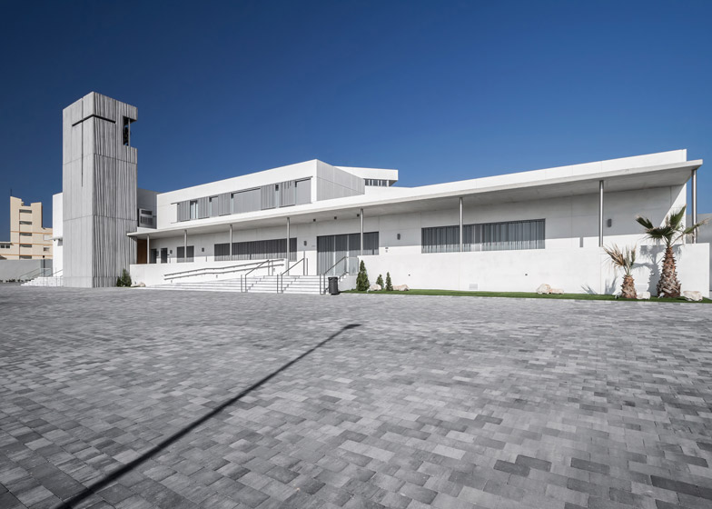
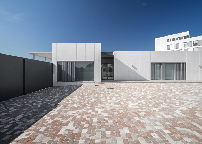
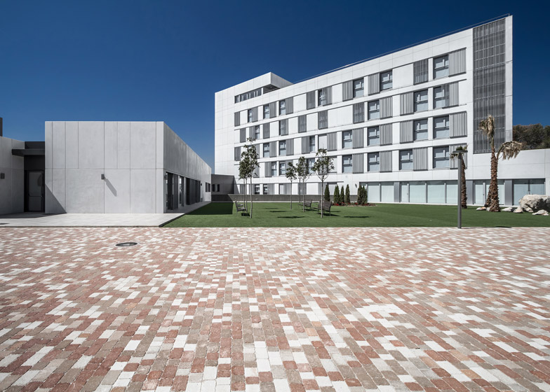
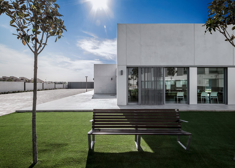
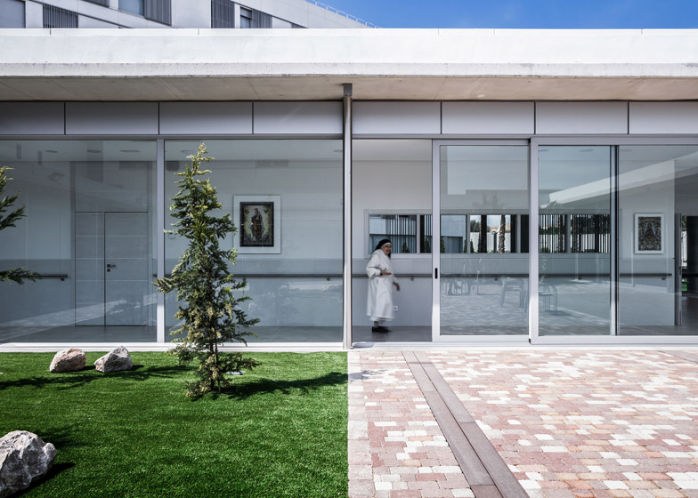
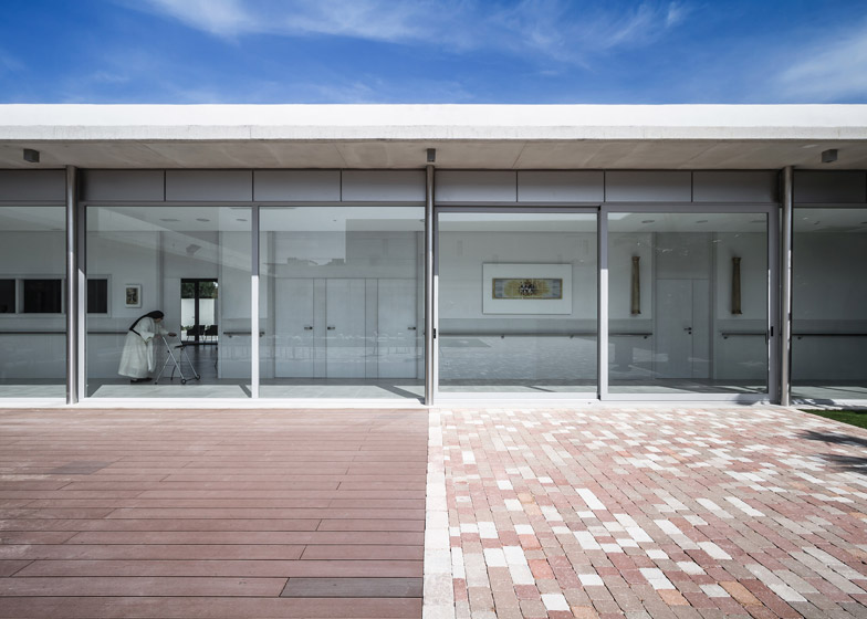
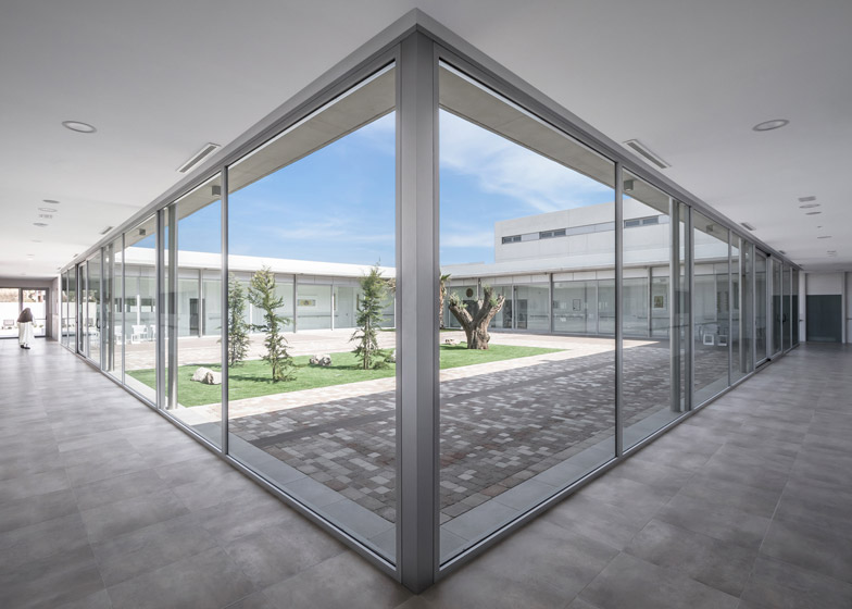
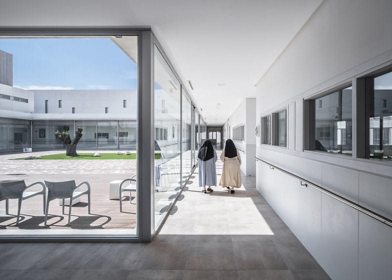
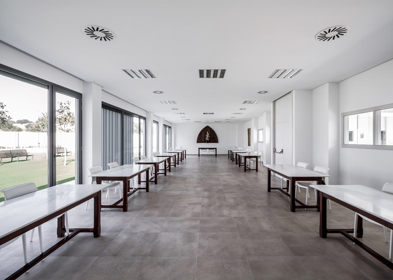
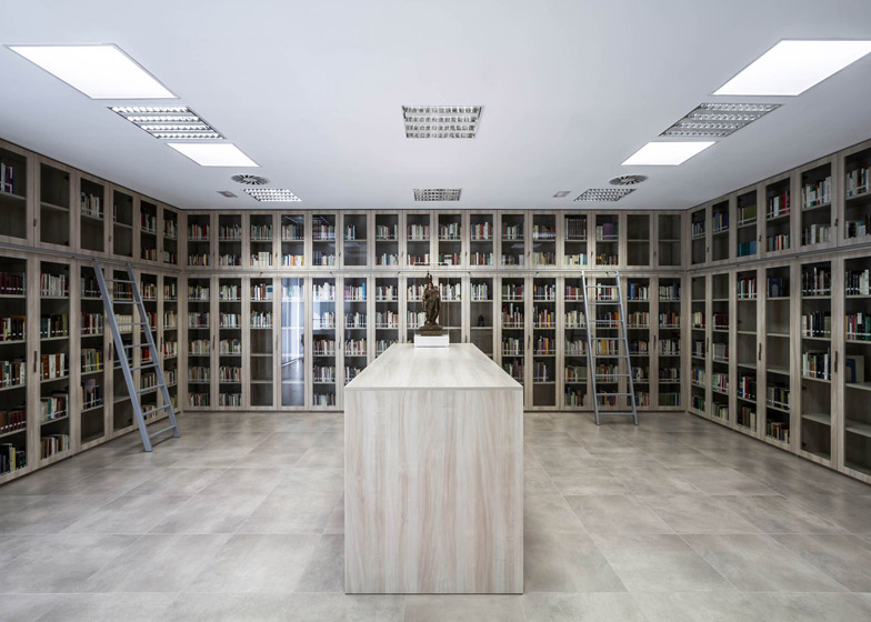
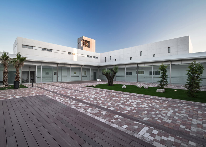
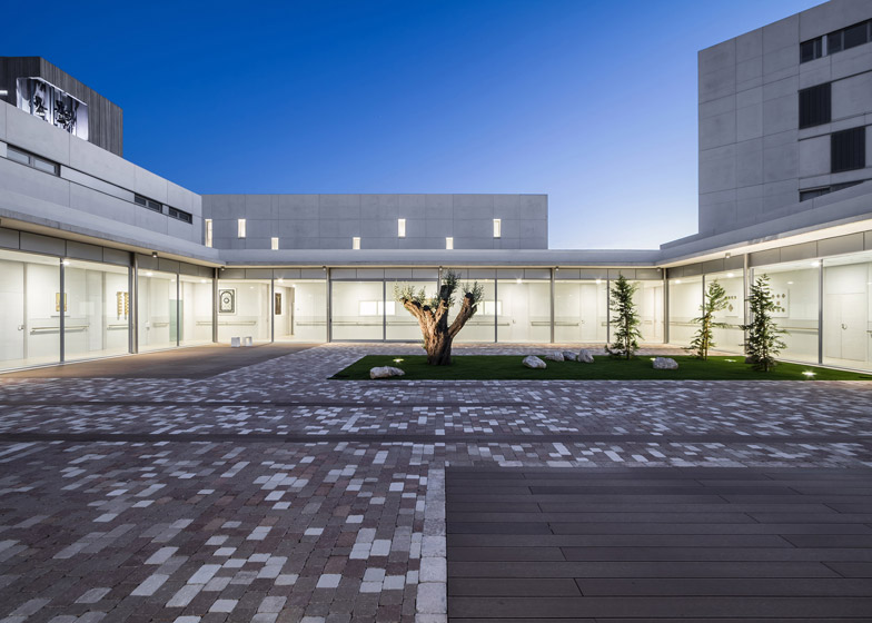
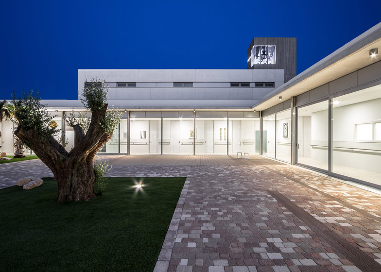
Two white blocks separate the building into the areas used primarily during the day and those occupied at night. The lower volumes surrounding a courtyard contain spaces including a library, community room, dining room, offices, and church, where the nuns spend most of their days.
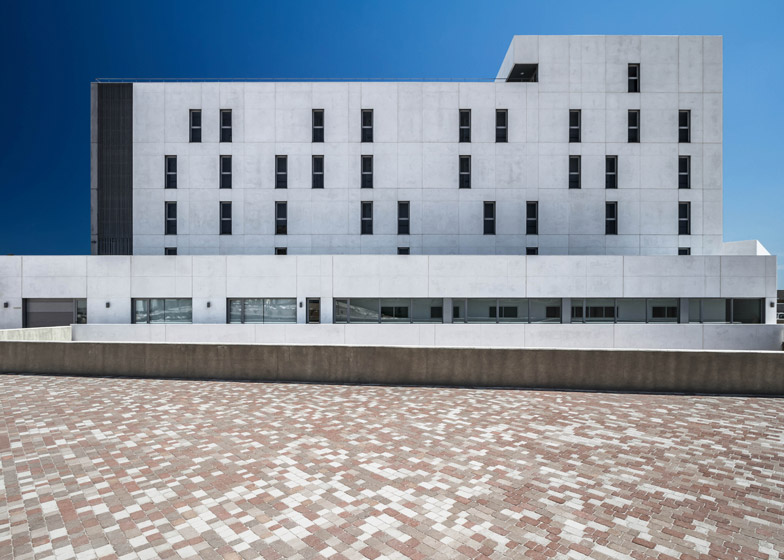
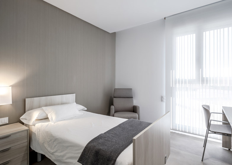
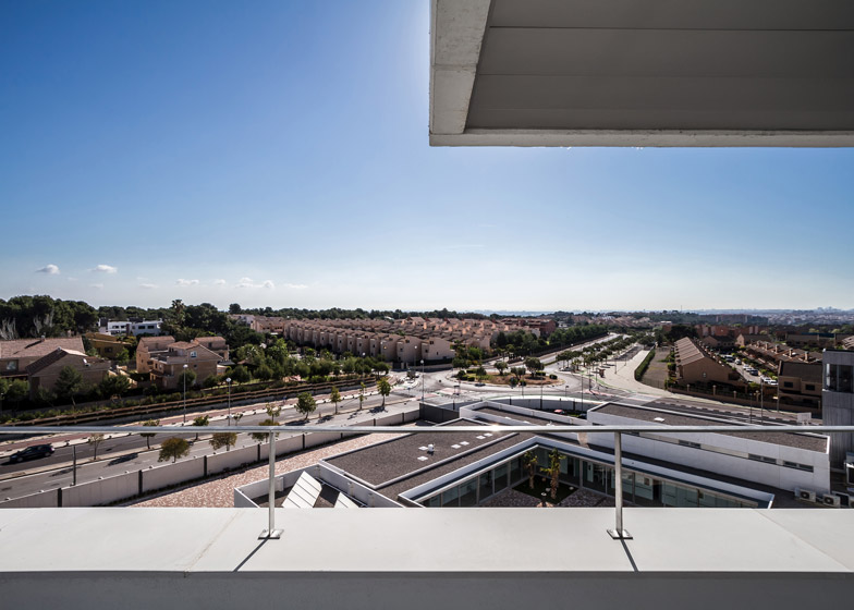
A taller annexed structure contains individual accommodation units incorporating private spaces for rest and prayer. A terrace positioned on the top floor of this building looks out across the city towards the sea.
Straight lines and a minimal monochrome palette seek to emphasise the building's simplicity and create an unobtrusive backdrop for the nuns' lifestyle, as well as for a collection of furniture and relics dating from as far back as the 15th century.
"The white synthesises the premises of the functional program, creating a clean container that is pure, simple and timeless," Furió added. "What we wanted to highlight is the content, with furniture belonging to the congregation representing several centuries of history."
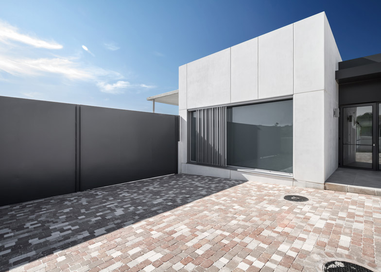
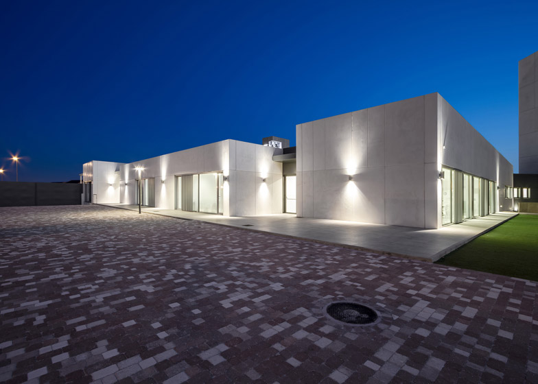
Prefabricated glass-reinforced concrete panels were chosen to give the exterior surfaces of the building's various volumes a homogenous appearance and to aid the speed of construction.
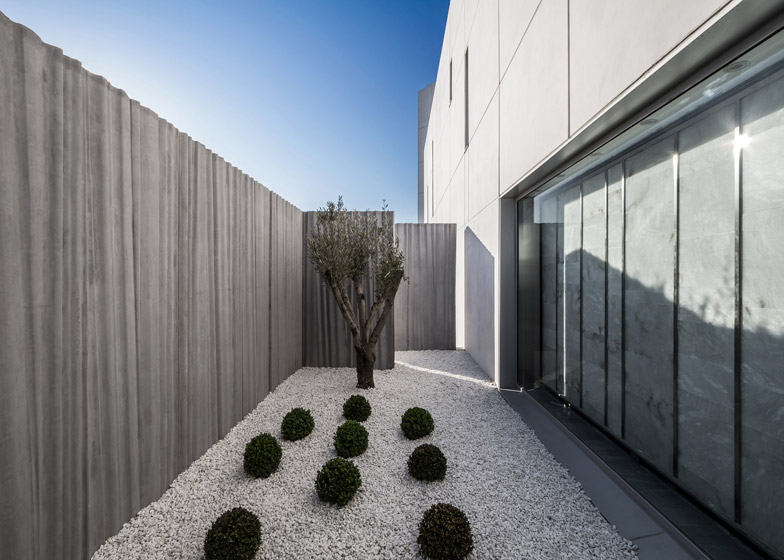
Darker grey panels with an irregular ridged texture are applied to the surfaces of the bell tower, to signify its importance and create a landmark facing the street.
The vertical rhythm of the tower's surfaces is continued by louvred metal shutters fitted outside windows on some of the facades.
Materials help to differentiate the private areas of the monastery from the church, where the nuns share Holy Communion with local residents.
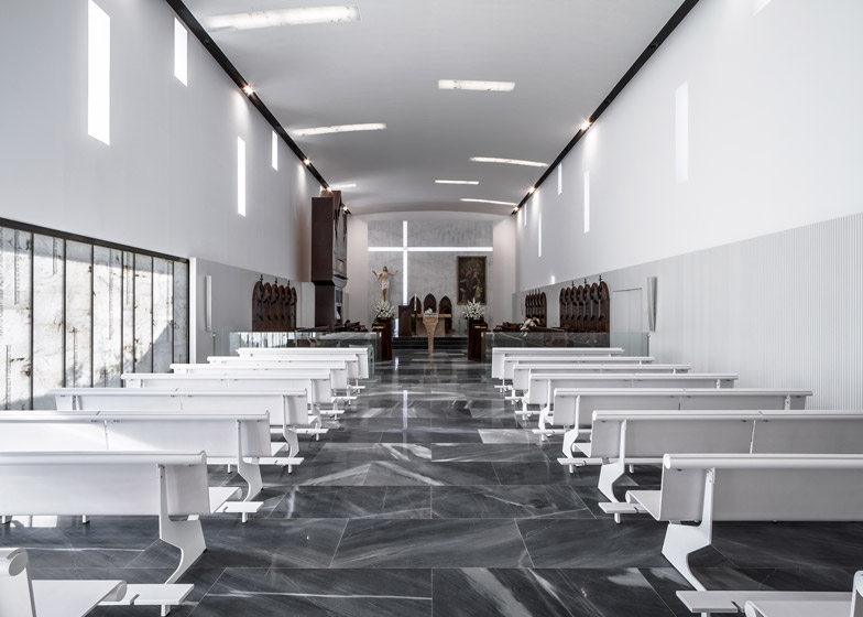
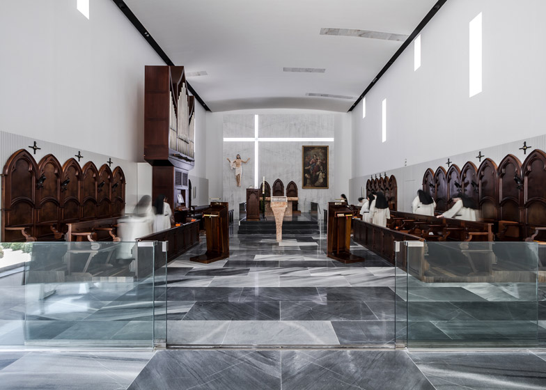
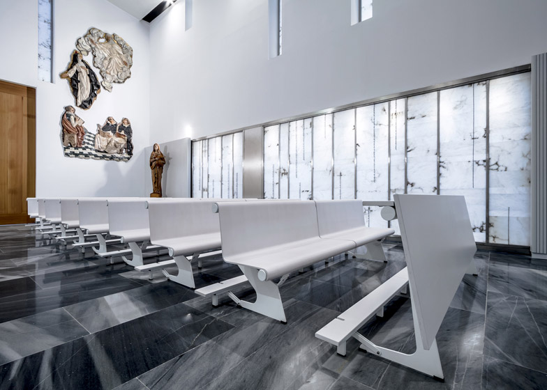
Stoneware tiles used for flooring throughout the monastery's main spaces are replaced in the church with glossy grey Macael marble, which adds greater tonal variation.
Glass partitions and modern pews for the congregation contrast with the traditional furniture and religious artefacts in the section of the nave where the nuns sit.
Paving stones also create visual segregation between the public and private spaces. Grey blocks form the surface of the parking area and approach in front of the building, while warmer tones are used for the courtyard and other areas within the boundary walls.
Photography is by German Cabo.
Project credits:
Architects: Pedro Hernández López - Hernández Arquitectos
Technical architect: Francisco Sánchez de Lara
Collaborators: Antonio Martínez, Ángeles Álvarez, Verónica Furió, Amparo Costa, Fernando Hernández
Engineer: Erso ingeniería civil y medioambiental SLP
Construction: Grupo Bertolín SAU

