Benjamin Hubert creates exhibition design for Designs of the Year 2015
Benjamin Hubert's studio developed a modular system of display plinths and wall mounts for this year's Designs of the Year exhibition at the Design Museum in London (+ slideshow).
London-based designer Benjamin Hubert was asked to create the displays for all 76 shortlisted projects in this year's exhibition, which range from huge architecture projects through to interactive road crossings, apps, cars, books and fashion collections.
Other objects on display include responsive street lights that play with the shadows of passers-by and a mushroom-based modelling kit.
This year's exhibition occupies the gallery space on the top floor of the Design Museum's building in Shad Thames.
"For the first time in the Design Museum's history, the full 4.5-metre height of the interior has been used to minimise visual noise and increase exhibition surface area," said Hubert.
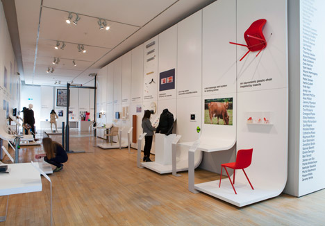
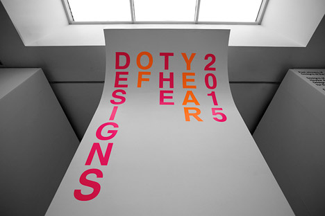
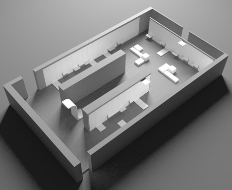
"Visitors are welcomed to the space by a dramatic cantilevered entrance structure that extends over the main stairwell," he explained. "This fluid design language is continued in the architectural structure of the entire exhibition space, which was inspired by the paper canvas used in photography studios."
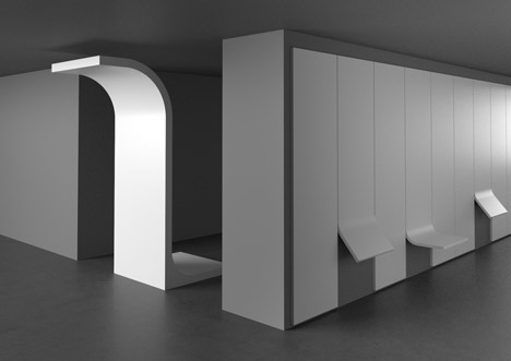
The entrance structure curves in one direction over the stairs at the top with the title of the exhibition printed on the front in pink and orange lettering.
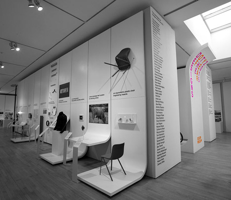
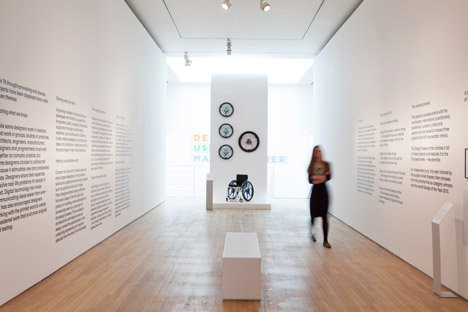
It flicks back in the other direction at the base, providing stability and creating a display for one of the exhibits – wheelchair wheels that replace spokes with springs so they can be used off-road.
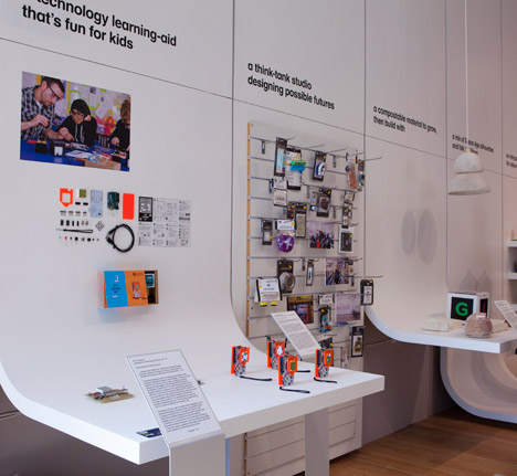
The walls of the space are clad in pine panels covered in a thin strip of flexible MDF – a material made by compacting fibres of wood – and coated with a smooth white finish.
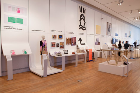
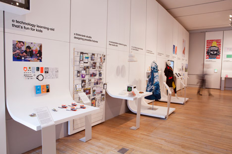
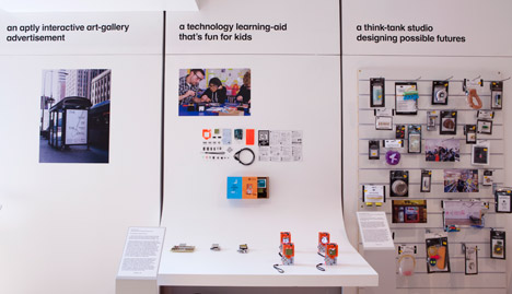
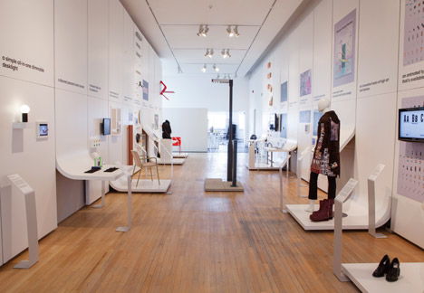
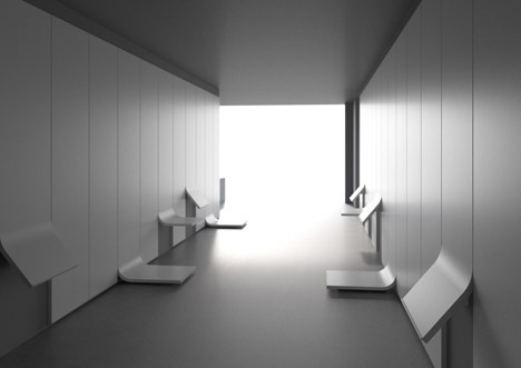
Hung just below ceiling level, these cover the walls in sections, with the lower panels curving out at different levels to create displays of different heights.
Two large white partitions create a corridor down the centre of the space. The introductory text for the exhibition was applied to the surfaces in a black typeface that conforms with the Design Museum's branding.
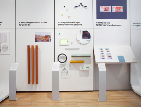
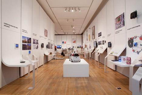
"The modular system can be used to display floor-standing objects, table-height exhibits, angled reading material and wall graphics," said Hubert.
"Our idea was clarity and consistency – the typeface is branding policy from the Design Museum. We focused on using type across the curved entrance to emphasis the shape and drama of the exhibition."
Freestanding steel signage is arranged in front of some of the displays with information about each project, and each exhibit has a short description printed in black lettering on the wall above it.
The designs on display cover six categories: architecture, digital, fashion, product, graphics, and transport.
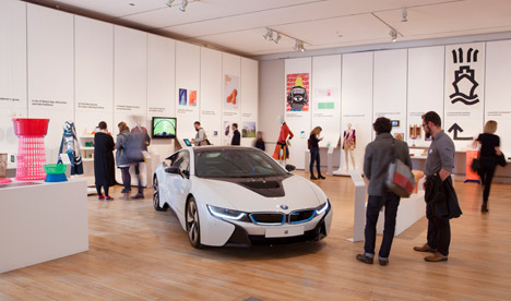
Some – like the BMW i8 hybrid electric and petrol-powered car and a bench made from blocks of dye-soaked wood by London studio Raw Edges – are exhibited in full size. Others are shown as models, or represented by images applied to the walls or videos that are shown on flat screens with headphones so users can listen to the narrative without disturbing other visitors.
Hubert's own Ripple table, which weighs just nine kilograms and was described as the lightest table in the world, was shortlisted for the Design of the Year prize last year, so the designer had already experienced being part of the annual exhibition of shortlisted entries.
"Having a product exhibited last year helped us understand the opportunities and pitfalls in the exhibition design of 2014," Hubert told Dezeen. "Clarity and cohesiveness were the primary opportunities we could see that needed improving on previous shows and we built the foundations of our design on these values."
The winner of the Design of the Year 2015 award will be announced in May and the exhibition will be open to the public until 23 August.
Photography is by Mirren Rosie, unless otherwise stated.