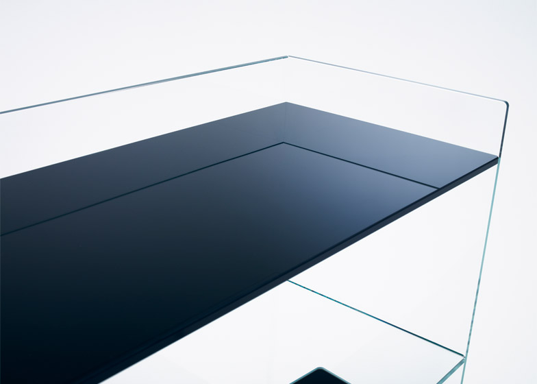
Milan 2015: dark surfaces appear to be slipping off these glass furniture pieces by Japanese studio Nendo (+ slideshow).
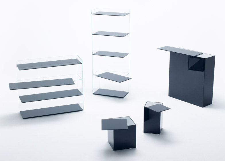
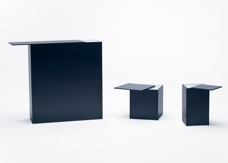
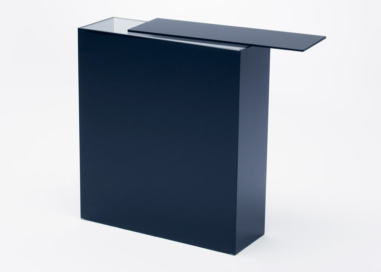
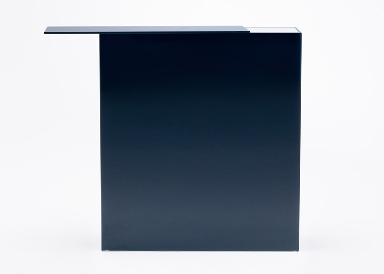
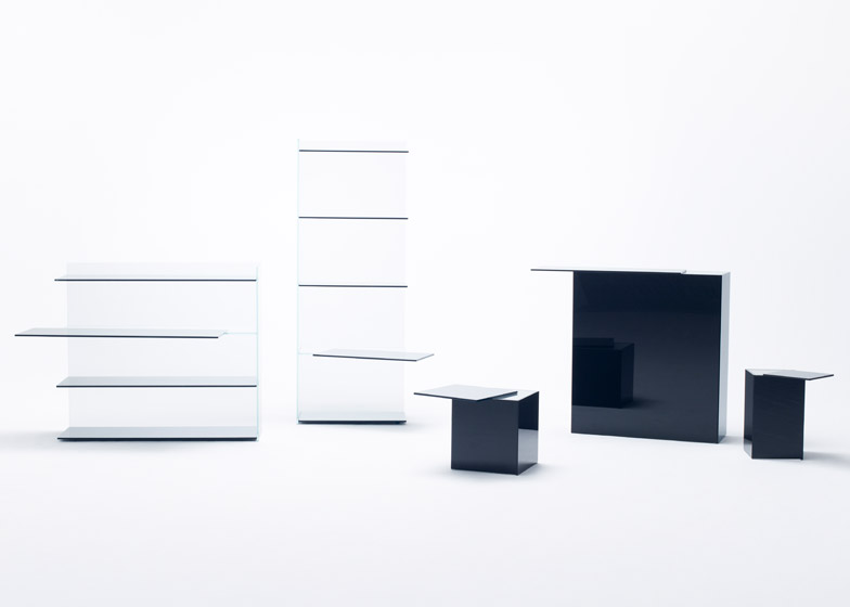
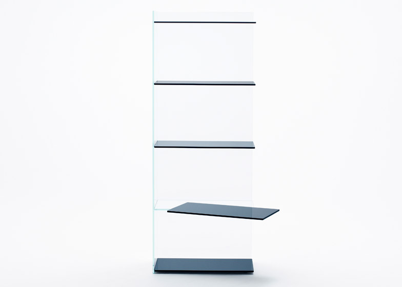
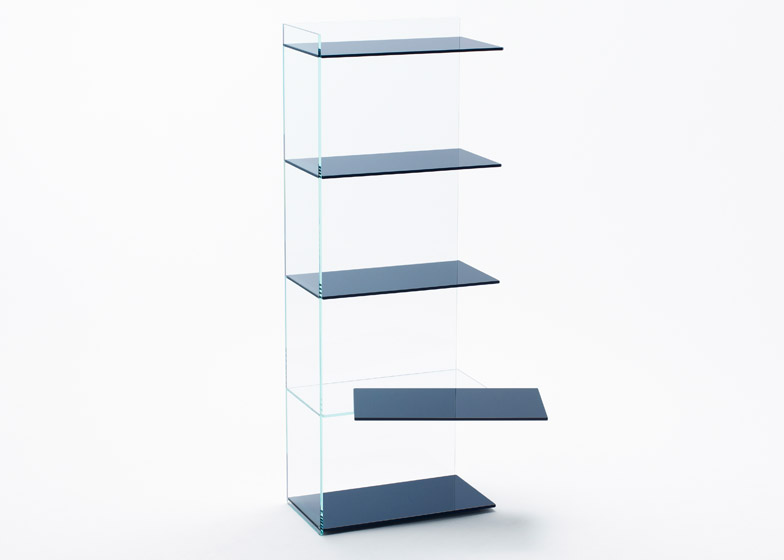
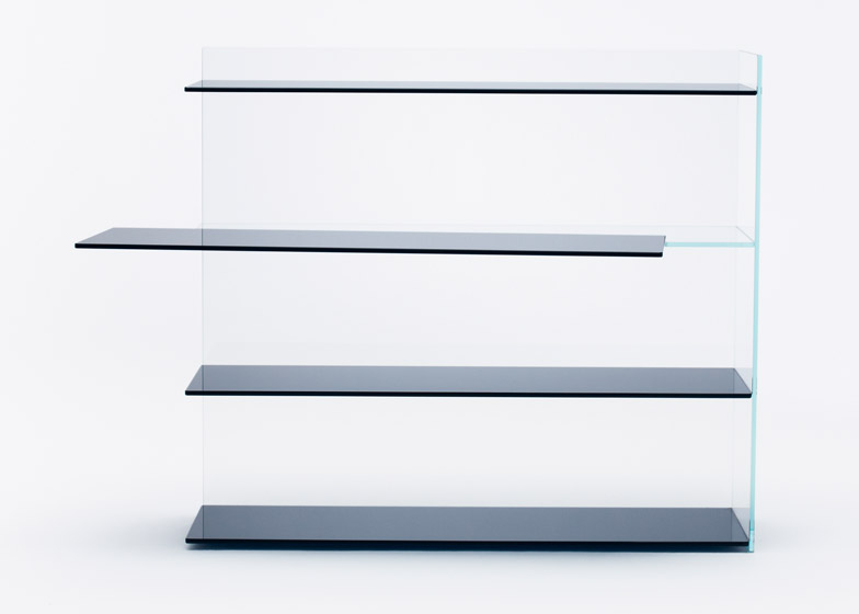
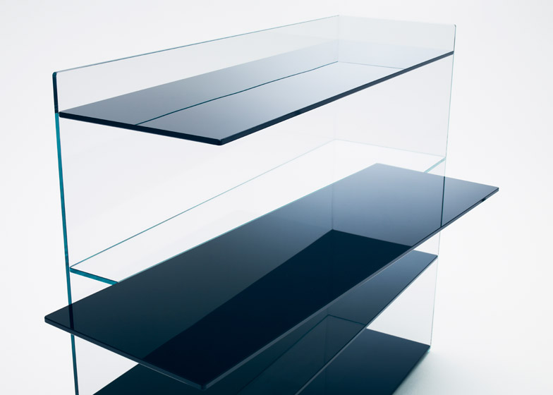
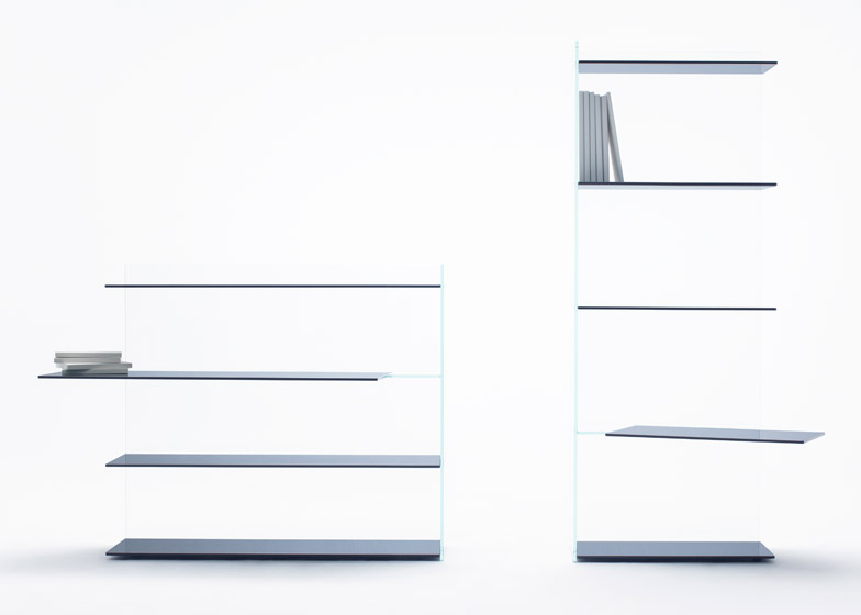
Designed as one of nine new ranges for manufacturer Glas Italia, Nendo's Slide collection includes two shelving units, a counter unit and a pair of small side tables.
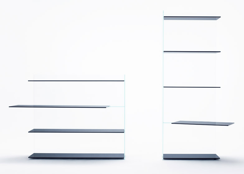
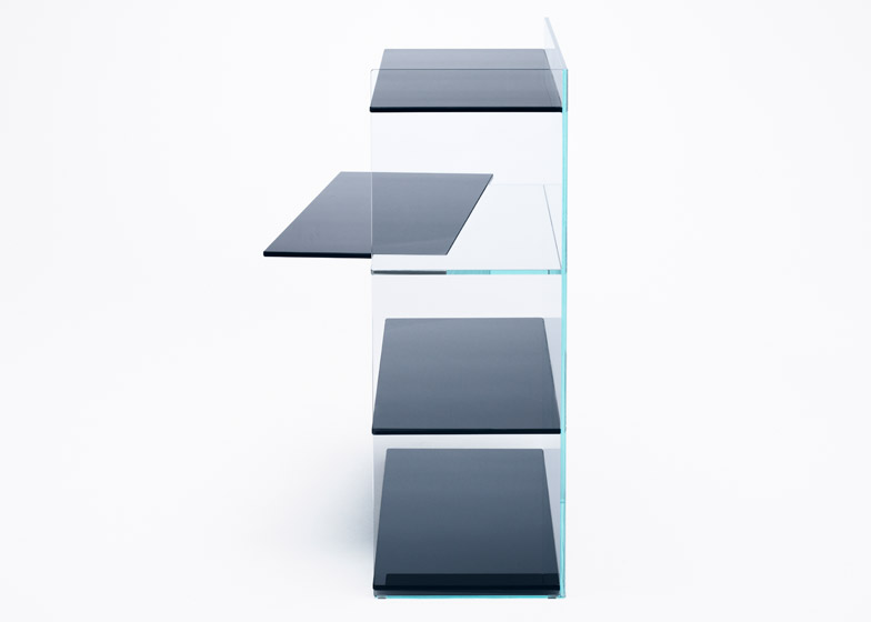
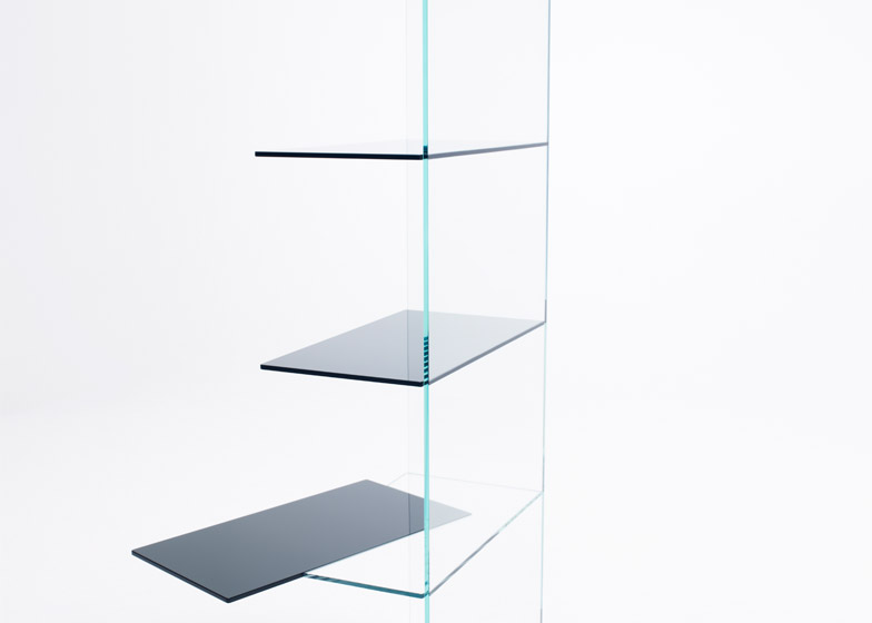
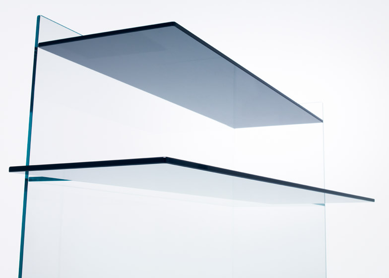
Black shelves are held between transparent vertical sheets to form the storage units – one of which is taller and thinner than the other.
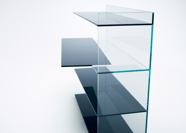
One shelf in each of the stacks is offset horizontally so it looks like it has slipped from its original position.
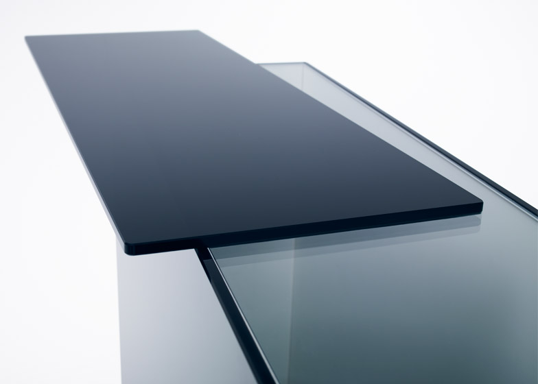
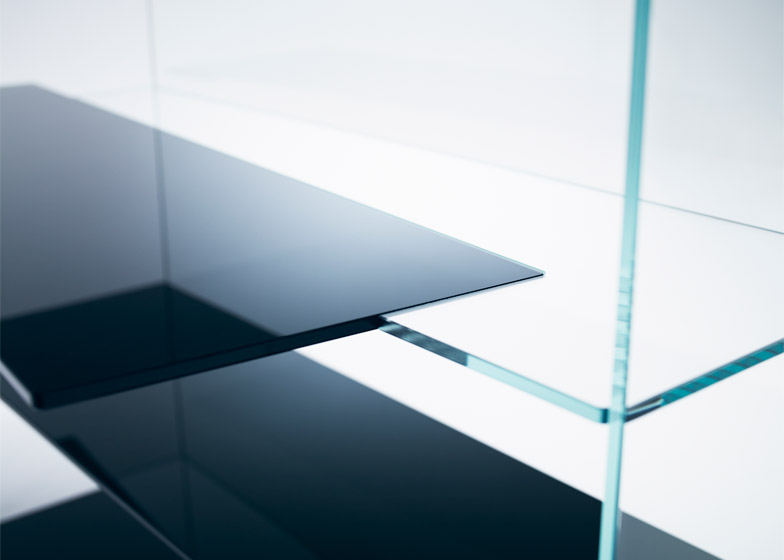
To achieve this effect, the rectangular glass sheets are bonded along their thin edges to see-through sections that fill in the gaps.
"The shelves are particularly challenging to develop, since the black glass that is sticking out has to be attached to a transparent glass using an extremely small area of the cross-section," said Nendo.
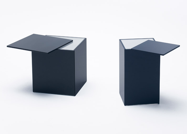
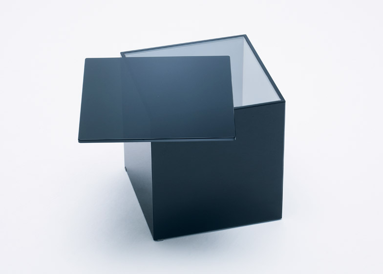
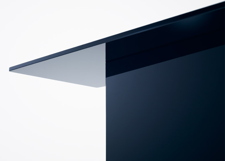
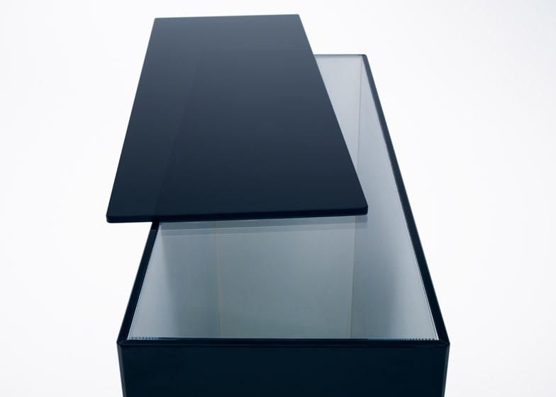
The same materials are used for the cuboid tables, which have tops shifted away from their dark bases in a similar way.
"The tables look as though the surface on top of the black box has been opened in a slightly slid position," said Nendo.
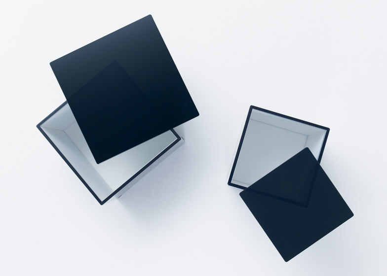
However, the boxes are sealed with a sheet of transparent glass beneath the dark lids so items can still be placed anywhere across the surface.
Visible through the clear elements, the insides of the tables are painted white to contrast with the dark exteriors.
Dezeen Book of Interviews: Nendo founder Oki Sato features in our new book, which is on sale now
The designs will be exhibited as part of the studio's Nendo Works 2014-2015 exhibition in Milan next week, along with a set of frosted glass tables with rainbow-coloured edges also for Glas Italia.
Nendo is set to show over 100 products created for 19 brands – all designed within the last two years – at the Museo della Permanente, Via Turati 34, from 14 to 19 April.
Photography by Kenichi Sonehara.

