David Kohn's Sanderson House extension conceived as a fox in the garden
This London house extension features a red brick exterior thought to look like a profile of a fox and a multi-hued interior that references Adolf Loos' Modernist houses of the 1920s (+ slideshow).
London-based David Kohn designed the single-storey extension to create more living space in the Tufnell Park home of British shoe designer Rupert Sanderson, his wife and their three children – hence the name, Sanderson House.
Rather than proposing the simple glass and brick extension typically added to London terraces, Kohn planned a structure with an assortment of unusual details – from a vaulted ceiling to a circular window, and walls of yellow, blue and turquoise.
"We like working with our clients and I am also interested in those things that much modern architecture arguably left behind – the layers of inhabitation, of things that tell a story about the occupants," explained Kohn, whose portfolio includes a boat-like hotel room and an apartment with decorative floor tiling.
"So when it came to extending the house, we wanted to foreground and accentuate that aspect of the original architecture – its openness to new layers and new stories, and a rich palette of materials and colours grew out of this concern," he told Dezeen.
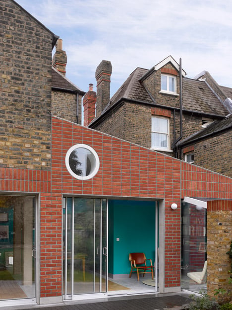
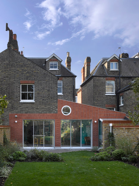
For the exterior, the architect selected brick slips – a type of clay tile with the appearance of brickwork. The aim was to match the building's red brick facade rather than the stained yellow London Stock brick used at the back – giving the building two faces.
This use of this material, coupled with addition of an angular roof and circular window, prompted the comparison with a fox.
"In the early design stages, the project was described to the client's children as a fox in the garden and the story stuck," explained the architect. "The red brickwork is given a textural quality, like a coat, through varying the orientation of the brick."
"At a meeting with the client, I joked it looked like a fox and the client's children loved this," said Kohn. "We did experiment after that with making it more fox-like, but in the end all we did was change the orientation of the brickwork where the roof narrows to a point, creating a fox's snout."
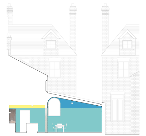
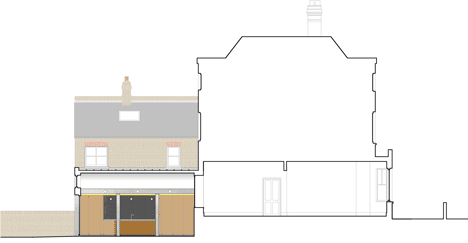
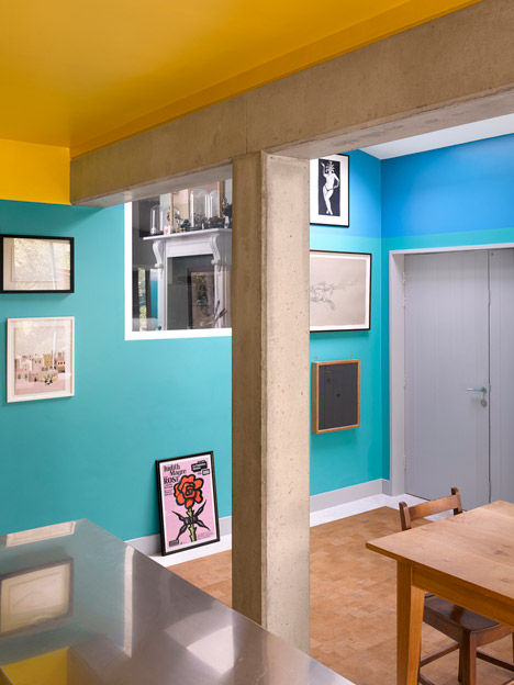
Inside, the structure is divided into three sections – a kitchen centred around an island counter, a dining space with a large wooden table, and a small glazed reading room that projects out into the garden.
There are no partitions – the division is instead created by changes in floor surface and ceiling height, as well as by the exposed concrete columns that form the building's structure.
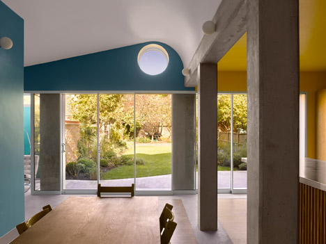
Two sets of glazed doors allow both the kitchen and dining area to be opened out to the garden. Framed by metal, these doors are set back from the concrete columns to create a slight recess – intended to recreate the aesthetic of a garden pavilion.
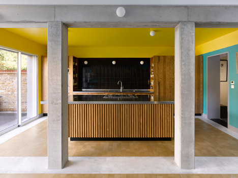
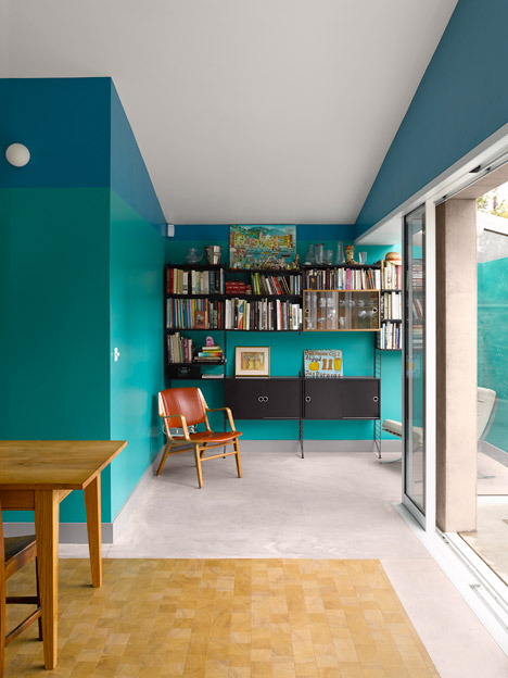
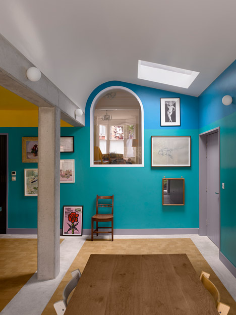
Walls are painted in shades in vivid hues, with yellow in the kitchen, and blue and turquoise extending through the rest of the space. Kohn compares the finish to interiors that Modernist architect Adolf Loos created in Vienna in the 1920s.
"I don't subscribe to the view that Loos was anti-ornament, rather that ornament should have a purpose and not be frivolous," he said.
"For example, a rippled surface can be beautiful but also affects the acoustics in a room; coloured walls can be arresting but can also provide a background to a dense hang of objects without making an interior feel cluttered."
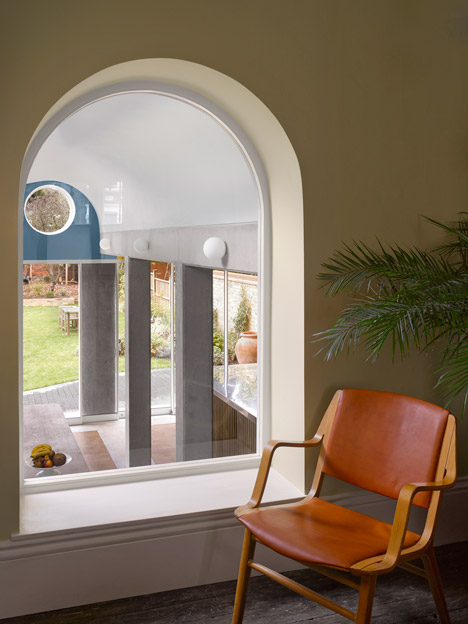
The circular window is positioned high up on the dining room wall, making it too high to be of use to anyone at the dinner table. Instead, it aligns with a new arched window at the back of the space, offering residents a view from the living room right through to the garden.
For the flooring, Kohn combined poured concrete with inlaid mats, created using wooden parquet blocks. Other details include a ridged timber front to the kitchen unit and glossy black tiles along one wall.
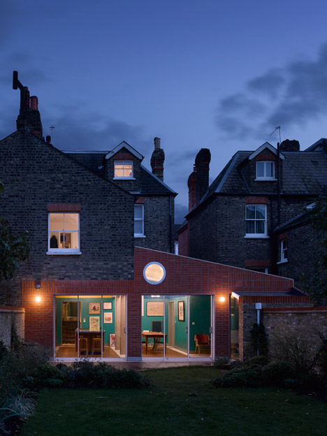
The final interventions were made in the garden. Three small trees were felled to help bring more light to the north-facing space, and a paved terrace was added to the area that receives the most sun.
Photography is by Will Pryce.


