Snarkitecture creates warren of textile ribbons for COS
Milan 2015: over 100,000 metres of translucent white fabric is cut into strips to create this tunnel-like installation by New York studio Snarkitecture for fashion brand COS (+ movie).
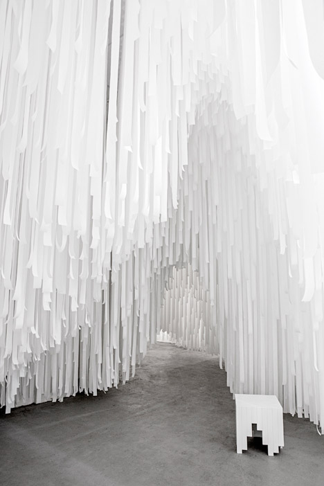
Snarkitecture's Daniel Arsham and Alex Mustonen used lengths of a synthetic non-woven textile to create the installation at Spazio Erbe in the Brera district of Milan – the same space in which COS exhibited its installation by Nendo last year.
COS gave the duo a "carte blanche" to design an engaging space for visitors and an environment to present its current apparel range.
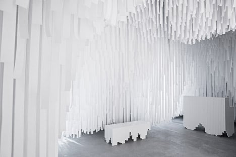
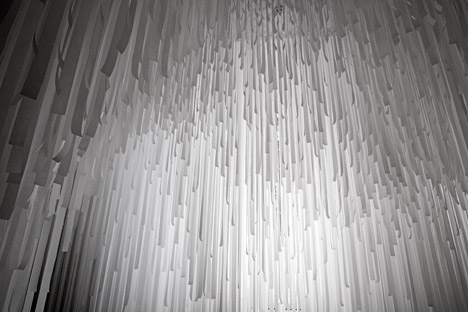
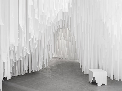
Snarkitecture began by filling the space with a dense offset grid of the white fabric strips, which are suspended from the ceiling. The studio then cut away some of the lower sections to create a warren of tunnels and spaces through the building's rooms.
"We started out this project with this idea of creating a subtractive architecture," Arsham told Dezeen. "Normally architecture is a process where you building things: walls, floors, ceiling, and create a space out of that."
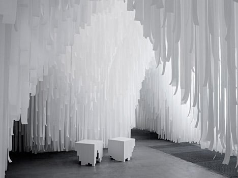
"This piece began with infilling the entire thing almost solid and then creating a volume excavated out of that," he added.
The duo chose the fabric for its translucent quality and its similarity to a material used in the latest COS collection.
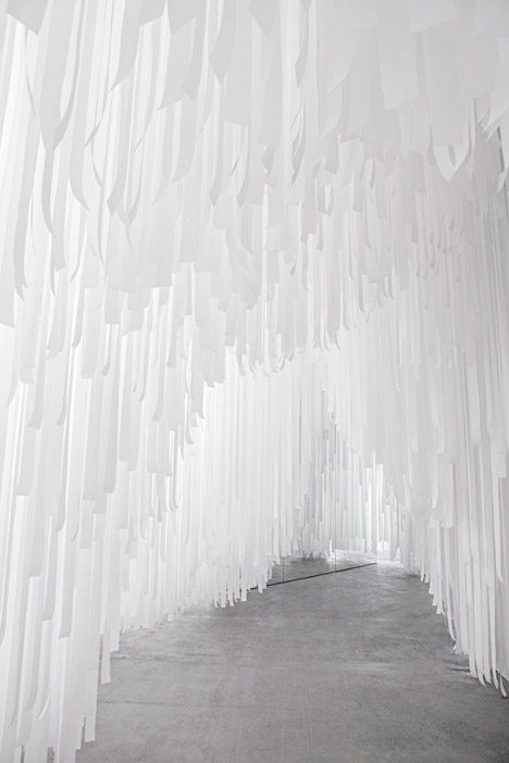
"There was a piece that Daniel and I both liked quite a bit, which was like a perforated fabric layered with a sort of semi-translucent fabric. That shifting translucency and shifting view was something that was really interesting to us," said Mustonen.
Visitors walk through a curtain of the strips to enter the space, and can then choose to follow the path created by the shorter lengths or pull aside the longer sections to cut through the spaces.
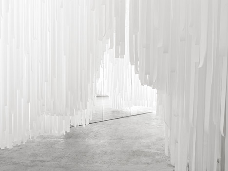
The COS Spring Summer 2015 collections for men and women are displayed at the end of the journey along the concrete path.
This season's silhouettes, materials and colour palette were influenced by tropical buildings from the Modernist architecture movement.
"It's Danish-inspired architecture built mid-century in Sri Lanka, so you have these kind of clean Scandinavian horizontal likes, but in the jungle," head of menswear Martin Andersson told Dezeen.
The garments are presented on simple rails and accessories are laid out on tables, which Snarkitecture designed along with a set of stools positioned in small clearings within the space. These have irregular bases that echo the pattern of the fabric strips.
The desaturated colour scheme of the installation was chosen to compliment both the existing gallery space and the pared-back aesthetic of the COS clothes.
"We always work in a very pale palette," said Mustonen. "In a lot of ways there is an alignment here when we were looking at the existing architecture of the space, which is essentially a white box, but also this very classic white COS shirt."
The COS x Snarkitecture installation will remain in place for the during of Milan's design week until 19 April. Elsewhere in the city, United Nude is showcasing 3D-printed shoes by well-renowned architects and designers, and David Adjaye is launching an Art Deco-influenced seating range for Moroso.