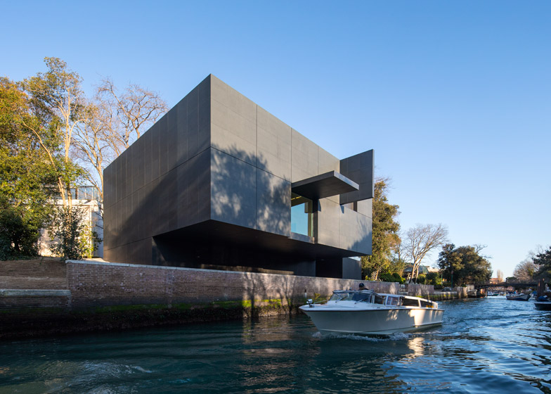
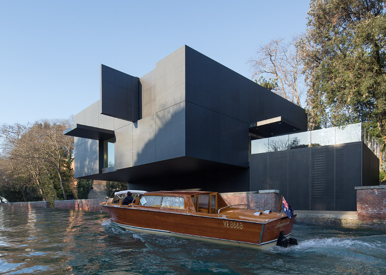
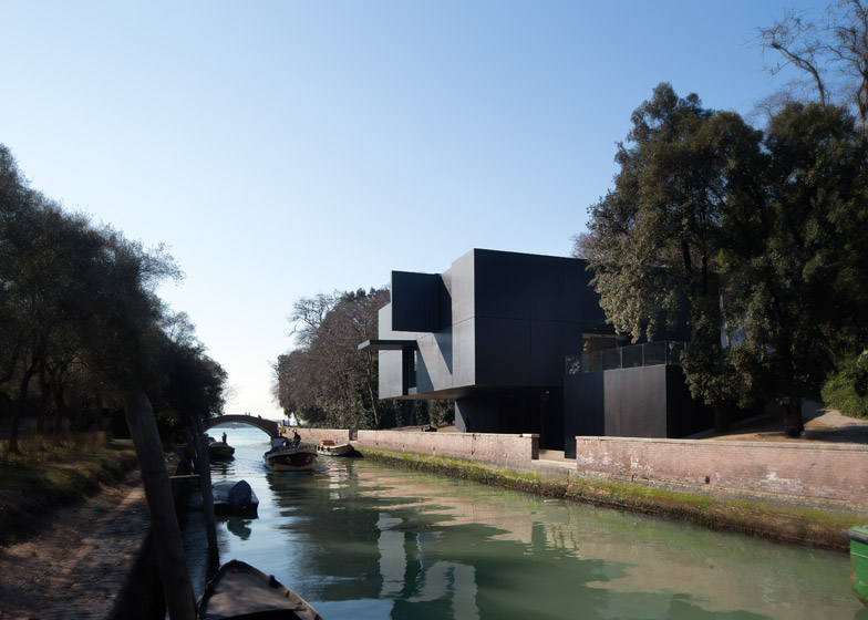
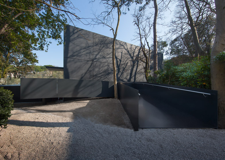
Architecture firm Denton Corker Marshall has unveiled the new pavilion Australia will now use for its exhibitions – an austere black box looming over a canal (+ slideshow).
Denton Corker Marshall was granted the rare privilege of adding a new pavilion to the Giardini, one of the main venues of the art and architecture biennales, to replace the temporary structure that Australia has been using since 1988.
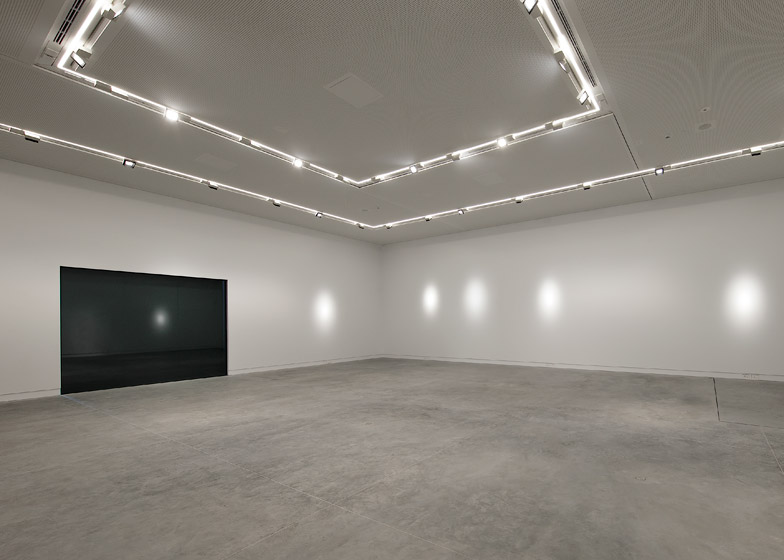
As the first 21st-century structure to be built in the park – which also includes pavilions by Carlo Scarpa, Gerrit Rietveld and Alvar Aalto – the Australian Pavilion's form was designed to be as simple as possible. The architects describe it as a "white box within a black box".
"Our idea for the new Pavilion of Australia was to create a simple yet powerful pavilion – a distinct presence within the Giardini della Biennale, yet sensitive to the historic gardens and surrounding pavilions," explained the Melbourne-based architects.
"We also wanted to create a pure, timeless sculptural object that could exude both subtlety and confidence within the context of the Giardini," they said.
"Thus, we designed a white box within a black box, carefully positioned on the site to ensure minimal impact on the existing landscape."
Large slabs of black granite give the building its dark exterior. Some panels fold open to reveal the clean white interior and allow some natural light inside.
The aim of these protruding panels is to allow the building to take on a new appearance when an exhibition is taking place.
"By allowing the opening of the panels, this otherwise solid, singular object is able to change character, chameleon-like, as the exhibitions themselves change within – closed and mysterious, open and visually accessible, or extroverted and colourful," said Denton Corker Marshall.
"In designing the pavilion as a sculptural object or, a box inside a box, we envision it as a container, transporting it from Australia to Venice," added the architects. "We like the idea of a mysterious black box that opens up to reveal its contents particularly in the context of the Giardini, which closes during the winter months and reopens in the spring."
The building's entrance is approached via a steel ramp that arrives onto a concrete terrace overlooking the Rio dei Giardini canal. Glazed doors lead through into the first-floor exhibition space – an all-white space with a simple square plan.
"In the interest of both artists and visitors, we were determined not to cross the line of architectural expression by competing with display content," said the architects.
"The white box interior is a pure rectilinear space of an almost perfectly square proportion. It is the largest single volume that the site allows, thus providing maximum exhibition flexibility."
The lower storey contains office space, storage areas and a loading bay. This floor is only half the size of the one above, allowing the building to cantilever out over the canal.
With the 2015 Venice Art Biennale kicking off next month, the pavilion's inaugural exhibition will be an immersive multi-sensory installation by photographer and sculptor Fiona Hall.
The artist described it as "a minefield of madness, badness, and sadness in equal measure". It opens in May.
Photography is by John Gollings.
Project credits:
Client:
Australian Council for the Arts
Architect: Denton Corker Marshall
Local architectural associate: FARE Studio
Services and structural engineers: Arup, Steam
Engineering consultant for operable panels: Advanced Design Innovations
Project manager: InTeA SrL
Contractor: SICOP SrL

