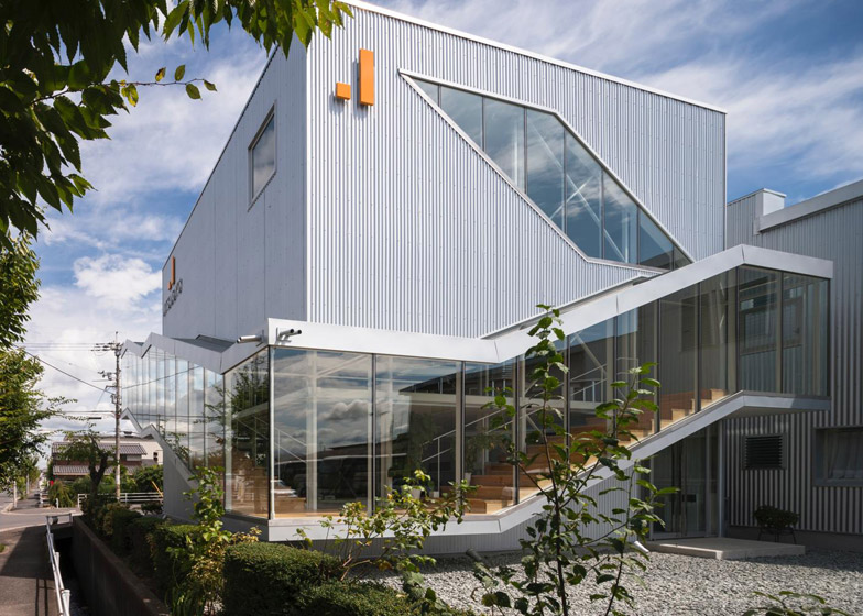
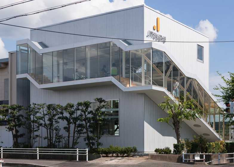
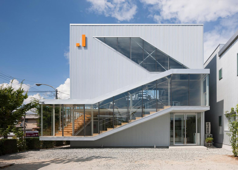
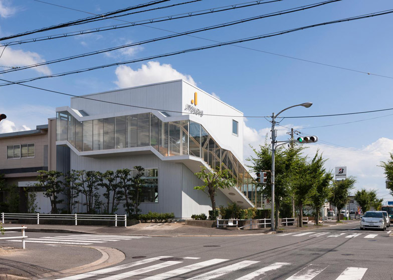
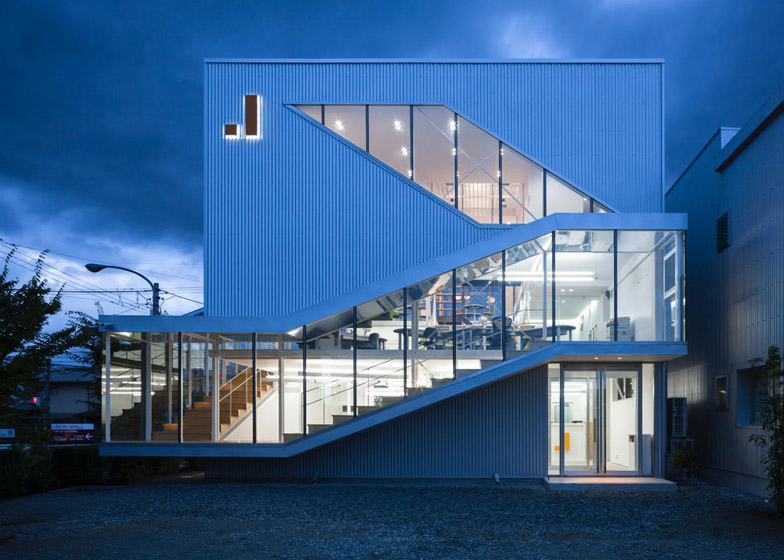
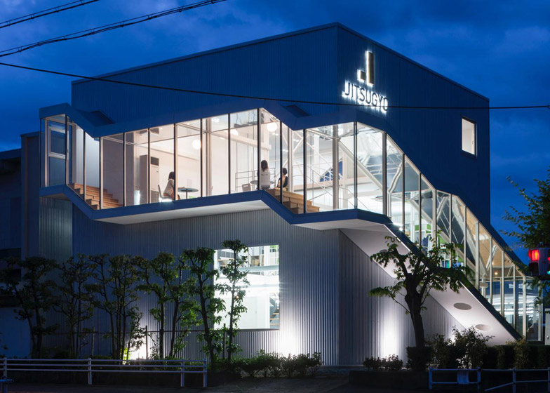
A glazed corridor climbs up around the exterior of this Japan office building, intended by architect Masato Sekiya to create the impression that the structure has been "cut in half by glass" (+ slideshow).
Sekiya and his firm Planet Creations designed the three-storey building to house the main office and sales centre for a printing firm, located next to the company's factory on an industrial park in Nara.
The architect was keen to avoid the plain utilitarian style often employed for out-of-town developments, and instead chose to design a building that would open itself up to the surroundings.
"I wondered whether it would be possible to express, through the architecture, the corporation's image and its relationship with society," explained Sekiya.
"I aimed to create an architectural design that would enable the people working in the building to be aware of the surrounding environment, the movement of other people and the flow of time," he said.
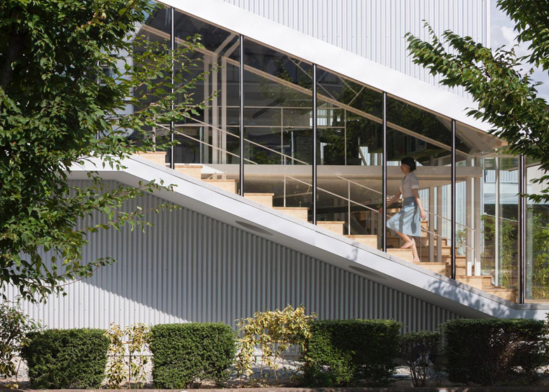
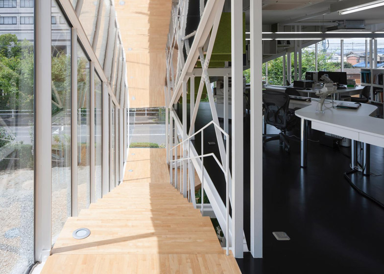
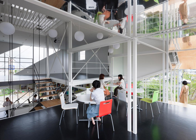
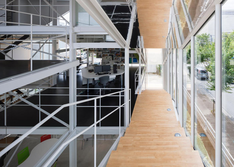
A protruding glass corridor was suspended from the building's outer walls, creating a meandering route all the way up from the reception to a conference room at the very top.
It boasts a mirrored ceiling, designed to make the space feel even more generous.
"The corridor functions not only as a three-dimensional line of movement to let people move from place to place, but it also brings in vistas of the exterior and natural sunlight," said the architect.
"From outside, the movement of the workers inside can be seen, and the design allows an interesting but limited view of the inner workings of the corporation."
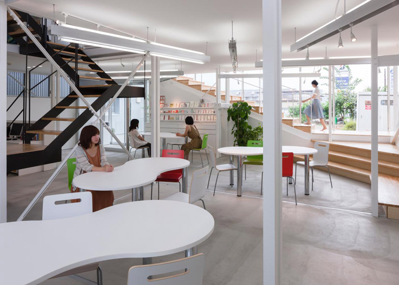
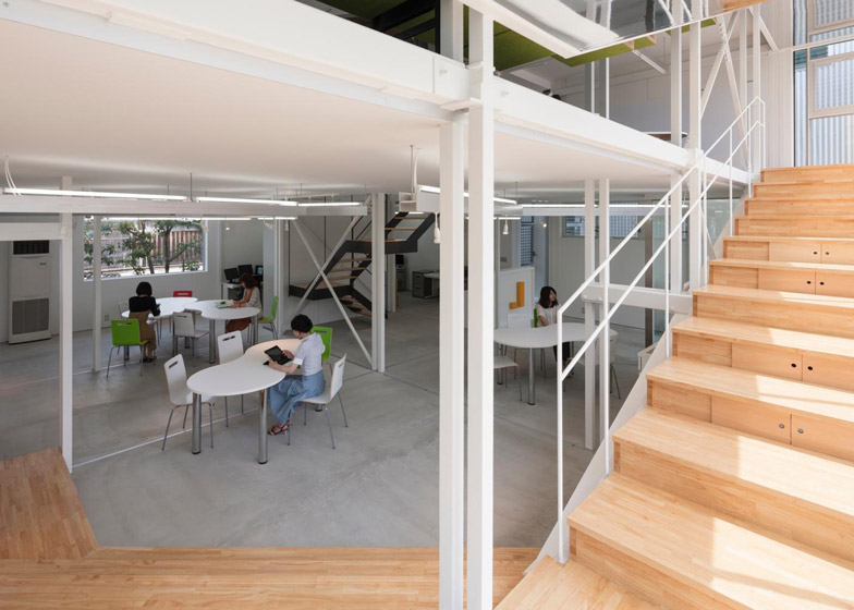
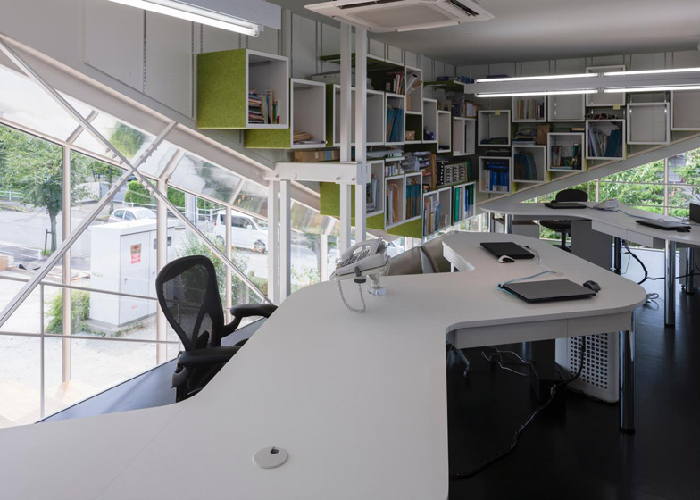
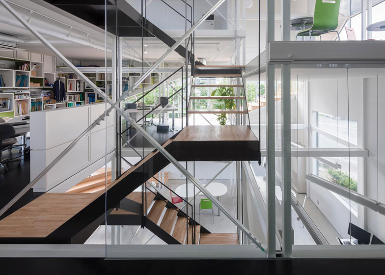
Inside, the three floors all feature an open-plan layout, organised by split-level floors rather than by internal walls.
This allows views across different departments and ensures that every space is filled with daylight.
The ground floor accommodates a showroom and meeting space, while the first floor contains the sales department, and the second storey houses the conference room and a staff lounge.
As well as the outside corridor, there's also a central staircase positioned directly underneath a skylight.
The building's structure comprises a system of 65-centimetre-wide steel I-beams, organised in pairs. This prompted the building's name – Monostruct Office.
"In comparison to the steel structures employed elsewhere, this space has a lighter feeling more akin to a wooden structure," said Sekiya.
Vents concealed underneath the perimeter corridor help to keep the interior well-ventilated. On particularly sunny days, the space also functions as a shading device for the rooms behind.
"This wrap-around corridor serves to bring sunlight into the building, but because it extends from the outer wall, the direct sunlight does not strike the interior and in summer, it acts as a buffer zone to ameliorate the heat," added Sekiya.
Project credits:
Client: Jitsugyo Printing Co
Architect: Masato Sekiya/Planet Creations
Structural Engineer: Katsuo Nakata and Takashi Takamizawa/ Nakata&Associates
Contractor: Hirota Co Ltd

