Snøhetta designs new visual identity for Norway's national parks
Architecture and design studio Snøhetta has developed a new graphic identity for Norway's 44 national parks, featuring a logo designed to look like a doorway on a hillside (+ slideshow).
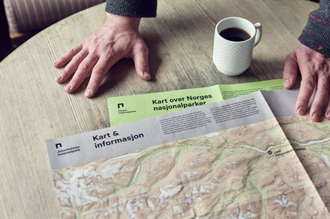
Having already worked on the country's new banknotes and one of its most iconic modern buildings, Snøhetta was commissioned to create a visual identity that would unite all of Norway's national parks.
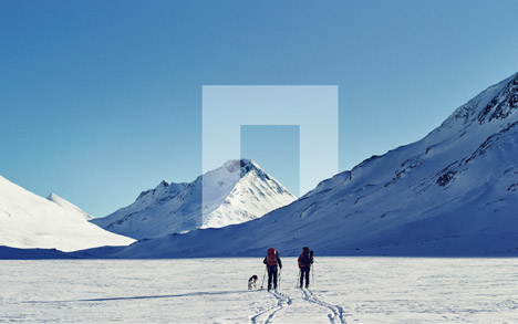
The concept centres around the idea of a gateway between the cultivated world and the natural world. Around this, the studio developed a logo that combines both straight and curved lines.
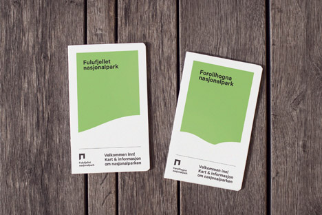
"The logo represents a portal – a protective frame shaped by a natural landscape curve," said Snøhetta. "It shows the interaction between culture and nature, as well as the balance between visit and protection."
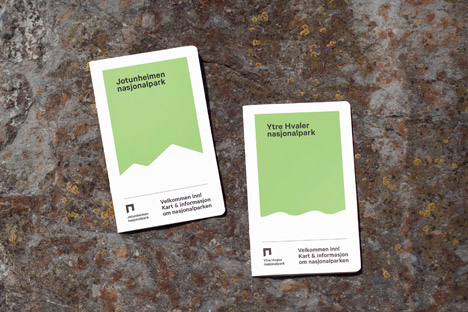
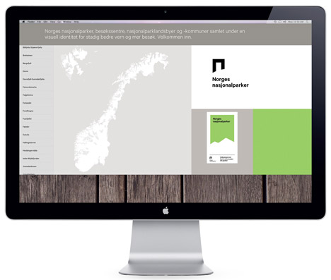
Norway's national parks predominantly comprise mountain landscapes, varying from large plateaus to deep ravines, fjords and glaciers. This influenced the colour scheme, which includes moss green and dark orange.
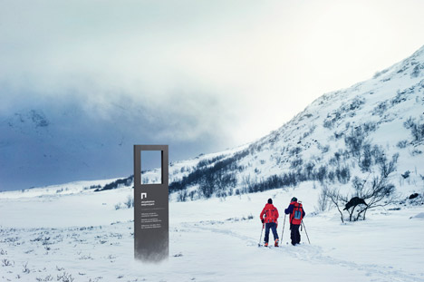
The typeface chosen was Calibre – a modern sans-serif font family featuring large circular forms. The designers felt this would offer clarity for different applications, whether for signs, printed brochures or on digital screens.
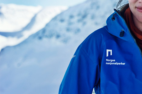
The graphics are accompanied by a series of photographs of snowy landscapes, rugged coastlines and woodland camping trips.
Next month the company will launch a manual laying out the guidelines for using the identity for stakeholders of all of the parks.
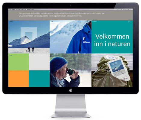
"By gathering all stakeholders under one symbol, a clear common identity is created for all national parks, visitor centres, as well as national villages and municipalities," said the team.
Oslo- and New York-based Snøhetta is best known as an architecture and interiors studio, but the company launched its branding design department in late 2011. Since then it has also worked on the identity for Oslo's bid to host the 2022 Winter Olympic and Paralympic Games.
Photography is by Øivind Haug.