Oficina d'Arquitectura's Portuguese guest house is cut in two by a recessed entrance
A void in the centre of this gabled guest house near Porto contains an entrance onto a patio that links it to the adjacent main property (+ slideshow).
Casa Lela was designed by architects Florêncio da Costa and José Pinho of Oficina d'Arquitectura, as an addition to a family estate in the Santa Cruz do Bispo district north of Porto.
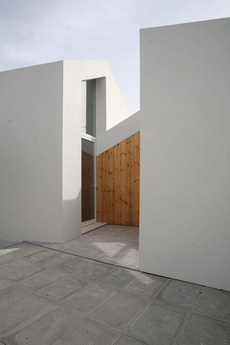
The client had purchased two abandoned dwellings on the edge of his existing property, and asked Oficina d'Arquitectura to convert them into a single guest house.
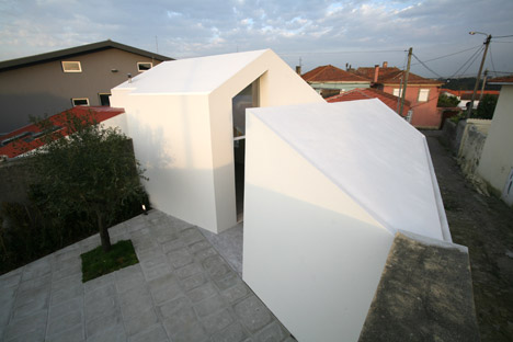
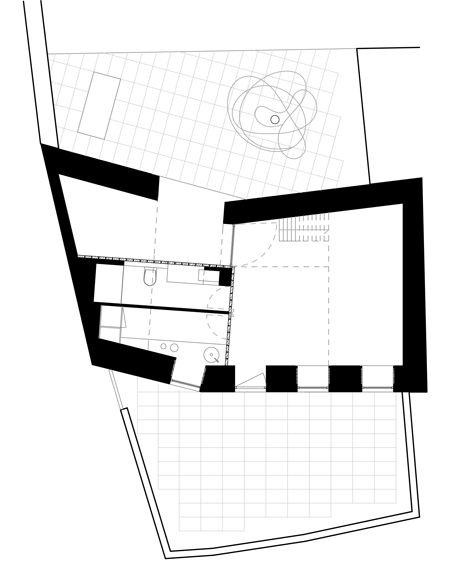
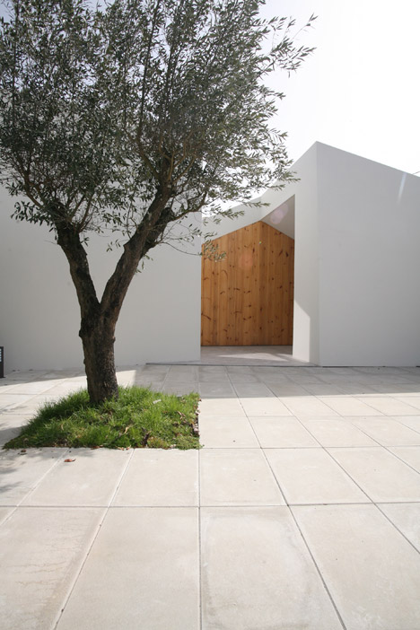
To provide a visual connection between the new addition and the main property behind, the architects created a cut in an otherwise solid elevation facing a shared patio.
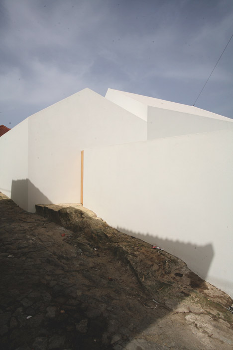
"This cut was carefully chosen in order to achieve the best shape relation between the two old houses," José Pinho told Dezeen. "In the end they become a single crystallised object, as we use the same material for both the walls and roof."
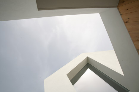
A wall at the back of the entry void is clad in timber boards that stand out against the white surfaces and accentuate the gabled form of the structure.
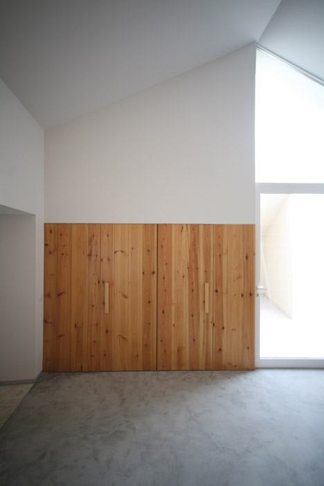
The cut divides the building's lower section into two parts, with the front portion forming a multi-purpose storage area adjacent to the courtyard.
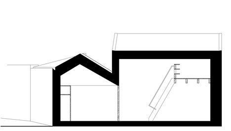
Opposite the storage space is the entrance to the guest house's main living area, which was given greater height by adding a new roof to the existing structure.
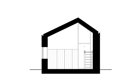
The vertical extension creates space for a window above the doorway that is angled at the top to follow the line of the pitched roof.
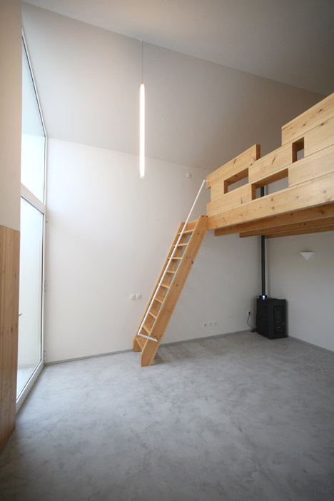
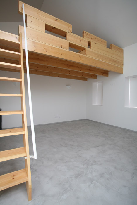
The minimal interior features an open living area connected by a ladder-like staircase to a mezzanine sleeping platform.
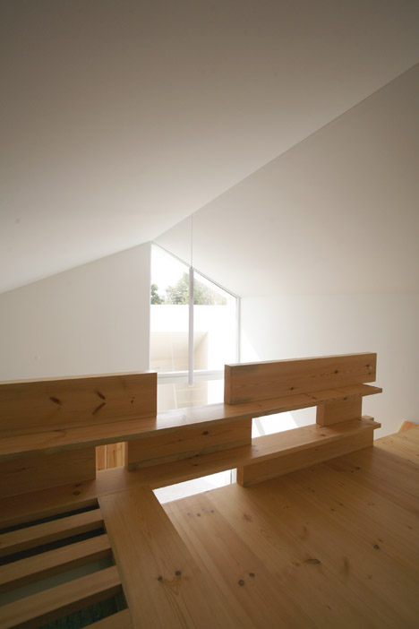
Wooden boards similar to those used to panel the external wall form the structure of the mezzanine, which incorporates storage and gaps offering views to the lower level.
Another timber surface incorporates doors that connect the living area to a kitchen and bathroom contained in the adjoining wing.
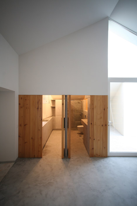
The rooms are divided by a central wall and the kinked shape of the floorplan results in an angled work surface in the kitchen.
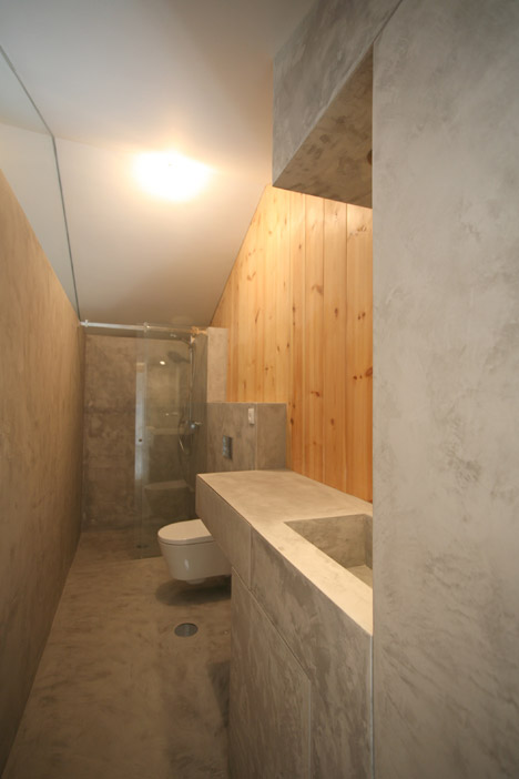
To minimise the project's material palette, the same cement finish used for flooring throughout the building is also applied to the surfaces of furniture in the kitchen and bathroom.
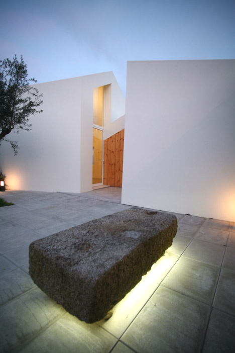
The building's thick walls integrate recessed windows, as well as a door at the rear that leads onto a second more-enclosed courtyard.
Photography is by the architects.
