BEL Architecten leaves rough surfaces on show in warehouse converted into a cultural centre
Peeling plaster and exposed brickwork reveal the interventions made by BEL Architecten to convert this former Antwerp warehouse into a cultural centre (+ slideshow).
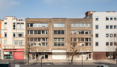
Antwerp's governors asked local studio BEL Architecten to transform a centrally located derelict goods warehouse into a creative space for the city’s young inhabitants.
Amenities housed in the new centre include venues for music, theatre and visual arts, as well as a cafe, restaurant, kitchen, offices, computer rooms and garden. Its name, Het Bos, translates as The Forest.
The existing building was not suitable in its previous condition, due to the lack of circulation and emergency stairs, as well as the cramped layout of the rooms.
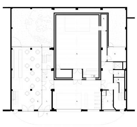
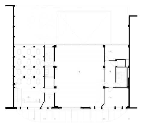
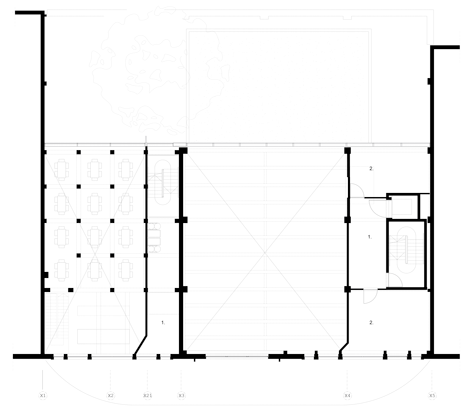
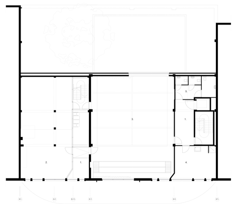
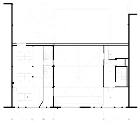
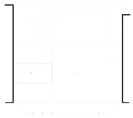
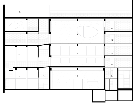
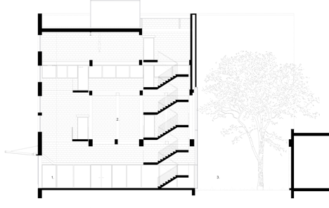
The architects resolved these issues by removing internal walls and carving a five-storey void into the centre of the warehouse that accommodates a new staircase.
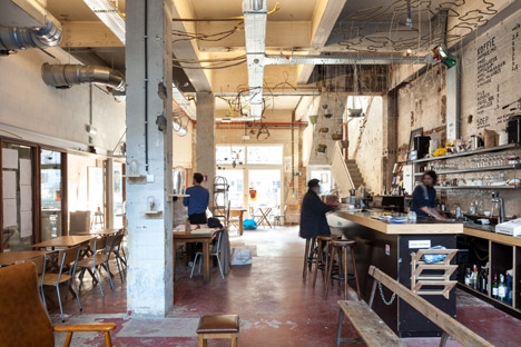
"We made the building suitable by 'taking away' or 'deconstructing' instead of adding," architect Jeroen Beerten told Dezeen. "In this way we created spaces with the right dimensions for the different functions."
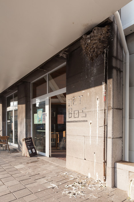
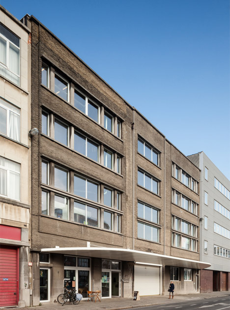
At the entrance, a white-painted steel canopy was added to signal the building's public purpose and create a sheltered space where visitors can congregate.
The entrance leads to a narrow foyer from which the newly created atrium stretches back towards the garden and upwards to the roof, revealing footbridges and sections of the upper storeys.
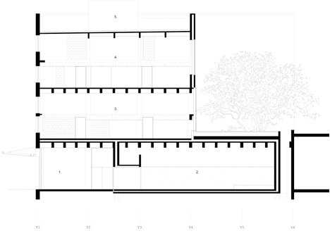
Existing structural elements determined the building's new programme. A 12-metre span at the centre contains larger facilities including the concert hall, exhibition room and theatre.
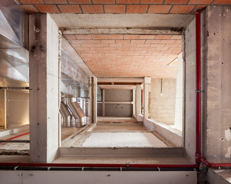
The architects claimed to have removed roughly half of the original warehouse's walls and floors to improve its functionality, including demolishing a floor to create a double-height theatre with a capacity of 80.
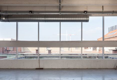
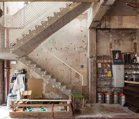
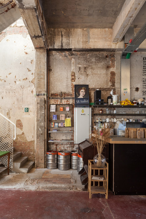
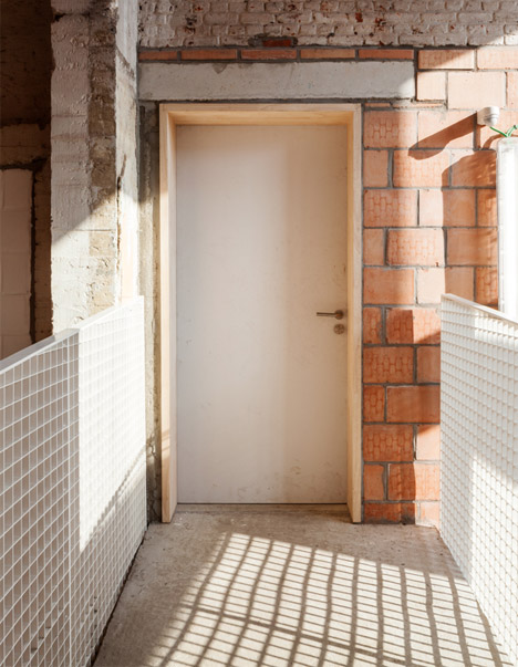
The interventions are clearly visible as scars on the plastered walls, and in the contrast with new brick additions used to delineate some of the rooms and improve their fire resistance.
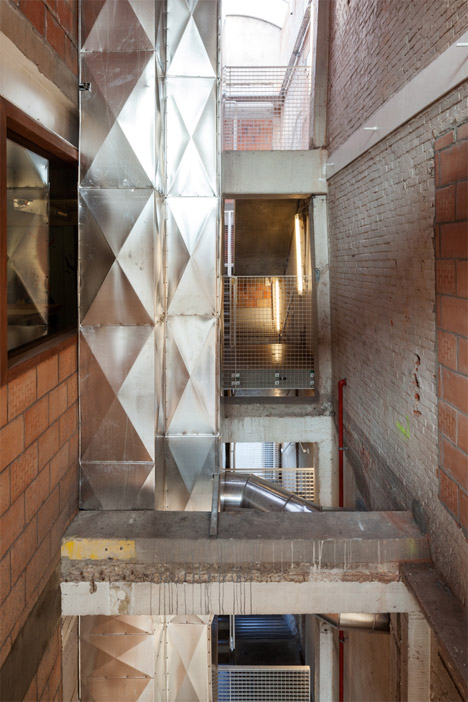
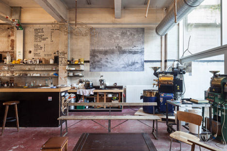
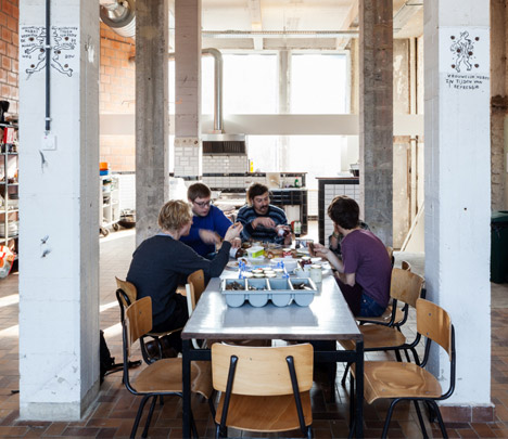
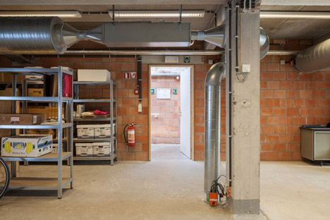
Rather than applying render, paint or other finishes to the existing and newly exposed surfaces, the architects left them in their original state. Any additions use basic materials such as concrete or brick, which reduced costs and merged with the industrial palette.
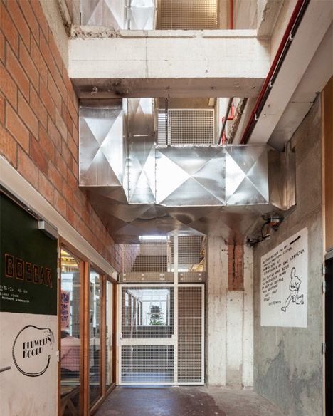
"We made the creation of the spaces our priority so there was no money left for finishings," Beerten explained.
"Also, the users are very creative and wanted to make the building their own, so we left them free to paint or decorate it how they want. In this case we think architecture is more about creating opportunities than limiting these creative users."
Improving the feeling of space and light inside the building was another key concern. The warehouse's rear facade was windowless and ten metres further back, so it was removed and replaced with a new wall with a large area of glazing.
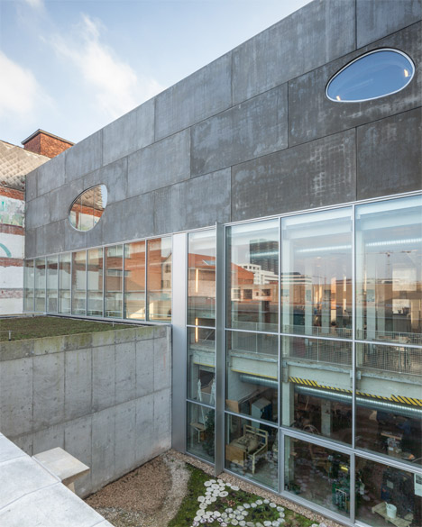
Pulling the facade forward created space for a garden, into which a concrete box housing the 200-person capacity concert hall extends.
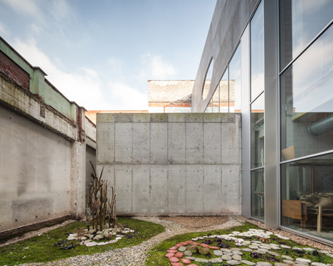
The new concrete facade is interrupted on its upper levels by two irregularly shaped windows that overlook the nearby Wilhelm Dock.
Glazing extends along the front of an exhibition space located between the concert hall and the theatre to ensure the room receives plenty of natural light.
The new staircase features a white metal balustrade with an open grid pattern that reduces its visual weight. An additional evacuation stair and an elevator are also incorporated into the new interior.
Photography is by Tim Van de Velde.
Project credits:
Design: BEL Architects
Structural Engineering: UTIL CVBA,
Technical Consultancy: Bureau Bouwtechniek
Acoustical Engineering: Daidalos Peutz
