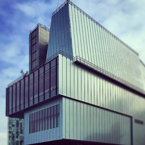
Renzo Piano's "prodigiously misassembled" Whitney Museum is a grower, say critics
Renzo Piano's new building for one of New York's most prestigious museums has been described by critics as an "art tanker", "ungainly" and "more clunky than romantic" – but they like it anyway.
Due to open to the public on 1 May, the Whitney Museum of American Art invited press and critics for a preview of the completed building yesterday.
The nine-storey, $422 million structure occupies a site in the city's Meatpacking district and overlooks the High Line on one side and the Hudson river on the other.
Italian architect Piano described the design – which appears like a stack of randomly sized blocks – as being a response to the character of its setting amongst warehouses, railway lines and loft buildings.
"It is an awkward hulk, lurching this way and that with a clumsy gait, somehow managing to channel the nearby vernacular of warehouse sheds, refrigeration stores and district heating plants into one gigantic industrial lump," said Guardian critic Oliver Wainwright.
New York magazine's Justin Davidson said the building looked like an "awkward kit of protruding parts and tilting surfaces."
"The thing might have arrived in an Ikea flat pack and then been prodigiously misassembled," he wrote.
In a bells-and-whistles review for the New York Times, which included interactive fly-throughs of renders and video footage of the building, Michael Kimmelman described the new Whitney as appearing "ungainly and a little odd".
And Paul Goldberger, critic for Vanity Fair magazine, said the museum's industrial aesthetic was "more clunky than romantic".
"Even in an age that is willing and eager to ascribe beauty to industrial buildings the exterior of the new Whitney poses a challenge," said Goldberger. "It is many things, but conventionally beautiful it is not. I don't know that it is so unconventionally beautiful, either."
"From the outside, the building seems like an awkward hybrid: part glass box, part big metal beast, with neither the gracefully crafted heaviness of an old industrial building nor the crisp, pristine lightness of a new commercial one," he added.
At 20,500 square metres, the Whitney is one of New York's most ambitious new-build museum projects in decades – almost four times bigger than the New Museum on Bowery completed by SANAA in 2007 and 11 times bigger than the Sperone Westwater gallery completed for Foster + Partners in 2010.
Despite initial reservations about the building's external appearance and hulking mass, it has won praise from critics – particularly in comparison to the museum's former Brutalist home on 75th Street, which was designed by Marcel Breuer and opened in 1966.
The Breuer building was also initially unpopular for its external appearance, but became popular among New-Yorkers and was described by Kimmelman as having "perfect" galleries.
"The new museum isn't a masterpiece," said Kimmelman. "But it is a deft, serious achievement, a signal contribution to downtown and the city's changing cultural landscape. Unlike so much big-name architecture, it's not some weirdly shaped trophy building into which all the practical stuff of a working museum must be fitted."
Piano's design offers the museum twice as much gallery space as the Breuer building, as well as large external display areas and various viewing points, with windows over the High Line and an external staircase that looks like a fire-escape.
"I like it a lot, for two reasons," said Goldberger. "First, the interior is fun to be in — visually active, strongly architectural, and excellent for the display of art. Second, Piano brilliantly comments on the old Whitney, never copying a single element from Breuer's building but always evoking it, subtly, inventively, and powerfully."
"It feels like a private homage from one architect to another, acknowledging the fact that the older building was beloved and deserves to be remembered, even as the institution moves on."
Wainwright said the design was a "grower". "From the outside it might be shockingly ugly to most eyes, but it trumpets its awkwardness in a strangely compelling way. It is all elbows, but gradually, thin slivers of sense can be read in the great industrial bricolage," he wrote.
"Once inside, the heave-ho envelope begins to make more sense too, as the building has been pushed and pulled according to the requirements of the vast column-free galleries... such functional requirements have clearly come first over architectural indulgences," added Wainwright.
"Even when they're divided up by temporary partitions, the galleries are like landscapes: You don’t only see what's in front of you but also catch tantalizing glimpses two rooms away," said Davidson.
"The old Whitney, whatever its virtues, had a sternness, especially on the inside, that always seemed to get the better of its virtues. The new Whitney is the opposite," concluded Goldberger.
"All its faults are on the outside, and you forget them once you get past the front door, when an exuberant, upbeat spirit takes over. Inside this ungainly box, Renzo Piano has made a museum con brio."