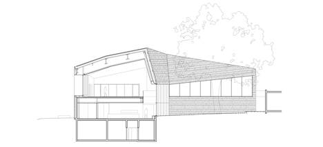
Paris library by Agence Pascale Guédot angles around an old walnut tree
The chunky quartzite walls of this library on the outskirts of Paris are faceted to accommodate the span of a century-old walnut tree at the centre of the site (+ slideshow).
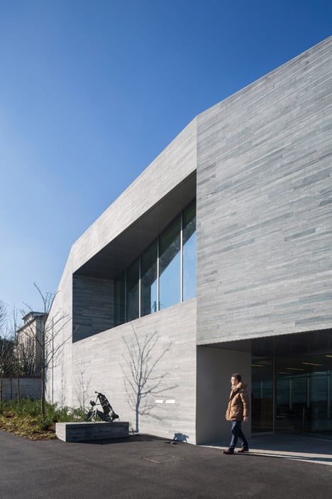
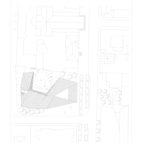
Paris studio Agence Pascale Guédot designed the media library for a plot amidst the city hall, church and music conservatory in the heart of Bourg-la-Reine, a suburb of the French capital.
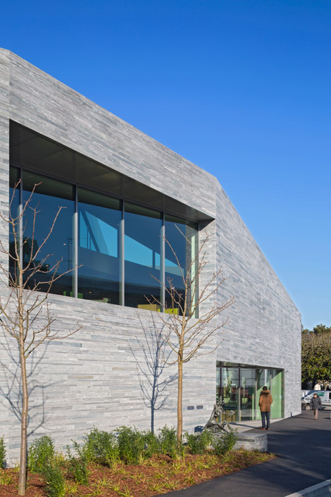
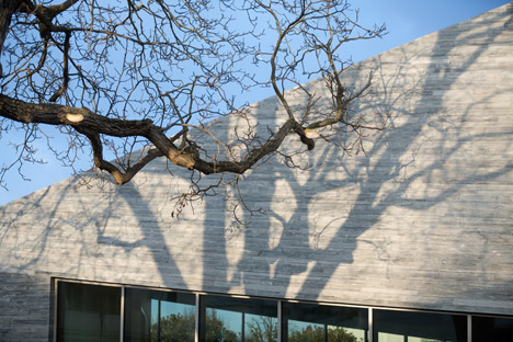
The faceted U-shaped form, designed to curve around the trunk of a the tree, is covered in slim sections of pale grey quartzite – a type of heat and pressure-treated sandstone.
The dimensions of the stonework vary across each facade, while thinner blocks were used to cover the roof's metal substructure.
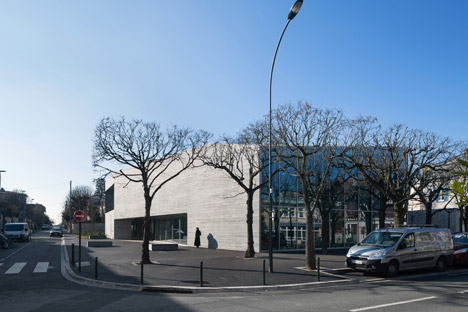
"A landmark building, the new media library is deliberately visible and identifiable, yet it blends politely with the existing urban fabric," said architect Pascale Guédot.
"The layout and form of this media library evolved naturally from the will to preserve a 100-year-old walnut tree."
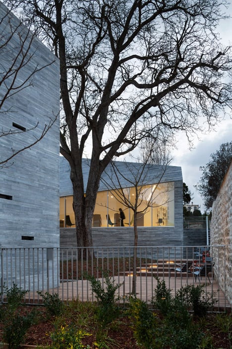
"Respectful of the setbacks, it refrains from overshadowing the neighbourhood," she added.
"Shy of signalling its existence, it calls for a discreet discovery as one comes nearby. Only then is one struck with the force of the volumes and the architectural identity."
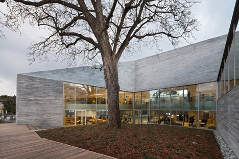
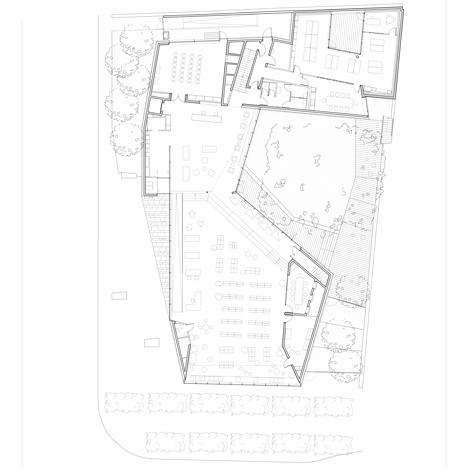
The building presents large glazed openings on the street-facing aspect, but solid stonework folds away from the road at either side to encircle a garden to its rear.
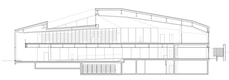
The roof too is also faceted, with an asymmetric pitch that is steeper on the garden side to leave sprouting room for the tree's branches. Wooden decking surrounds the base of the tree to provide a sheltered outdoor reading area.

"This is a building, which is not afraid of stating its bulk," said the architect. "The facade of the media library presents several folds, each facet responding to a specific context and a particular constraint."
"The monolithic character of the construction is reinforced by the use of a grey quartzite stone," she added.
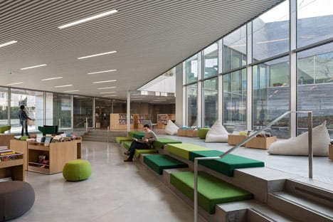
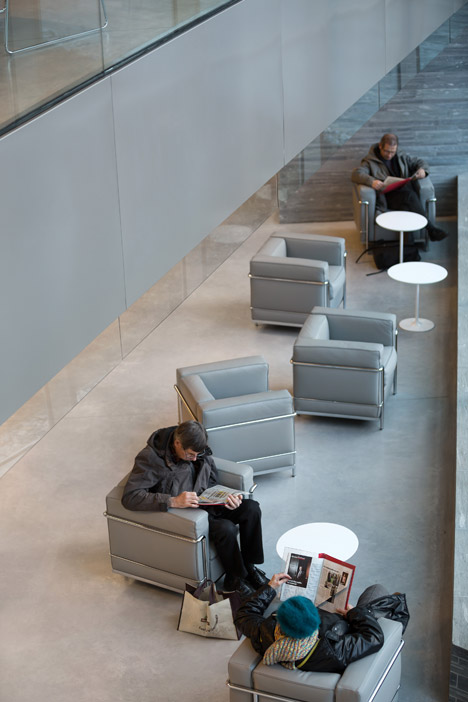
The goalposts shifted between the design and construction phase, with the library downsizing its collection by 40 per cent, said Guédot. This led to the inclusion of more public meeting areas and seating.
Bright green cushions are arranged on the terraced floor at ground level, providing an impromptu reading spot adjacent to the decking, while loose furniture can be arranged to adapt the building's primarily open spaces for a changing programme.
A children's reading room occupies one corner of the ground floor, while smaller reading rooms are tucked away against the exterior walls.
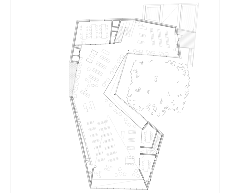
The main reading room sits at the top of a wide staircase on the upper floor. This level is almost entirely open-plan, with a handful of private meeting rooms positioned at the ends of the space.
Photography is by Hervé Abbadie.
