Milan 2015: Nendo's ideas to reinterpret the simple wooden door include sliding portions, an additional opening for children and a portal that wraps around a corner (+ slideshow).
The prolific Japanese studio, led by designer Oki Sato, experimented with a range of concepts to celebrate the 70th anniversary of doors and partitions specialists Abe Kogyo.
"They were asking for new ideas for doors and not necessarily finalised products but they were looking for a new concept," Sato told Dezeen at the Nendo Works 2014-2015 exhibition in Milan, where the doors were presented along with 100 other products designed over the past year.
During the interview, the designer said that working on so many projects at a time "relaxes" him and that the studio is expanding to encompass even more disciplines.
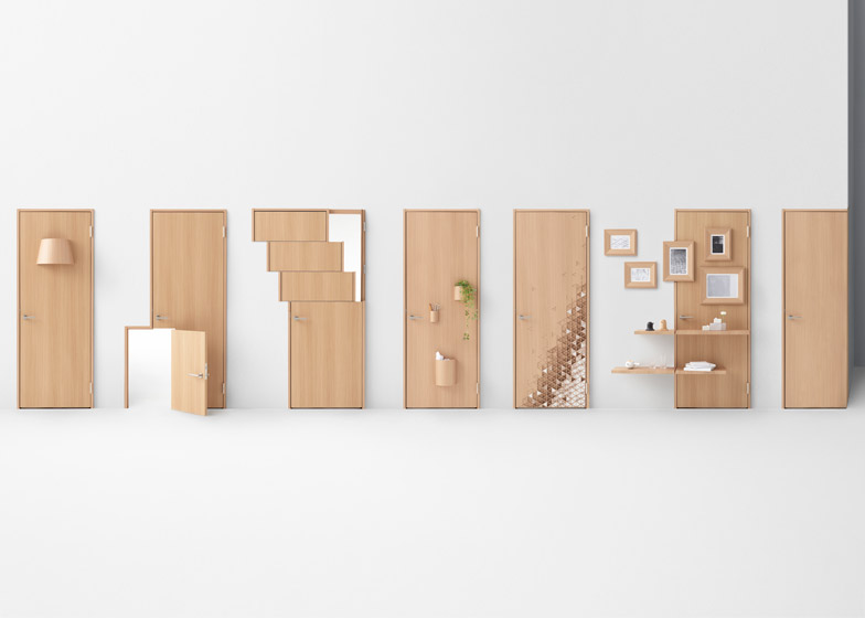
The seven doors created for Abe Kogyo range between simple deviations from a plain design and more complex reinterpretations.
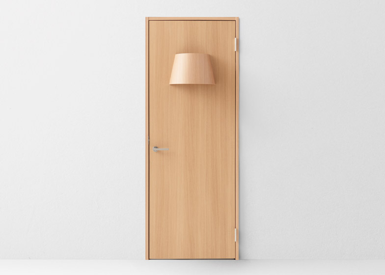
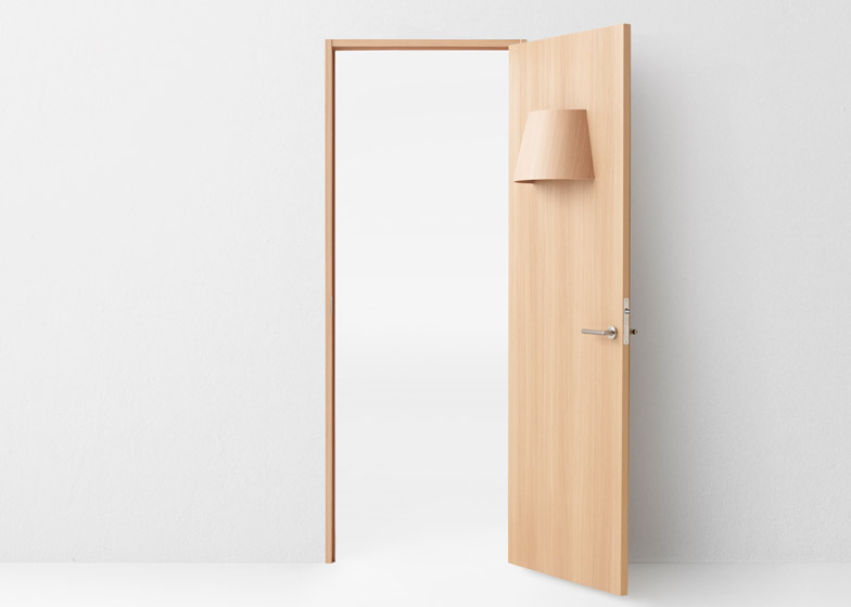
Small changes include integrating a light into the door, employing wiring techniques used in electronic locks to transfer electricity to the bulb.
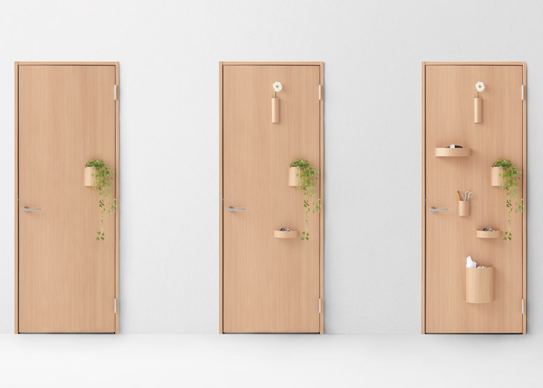
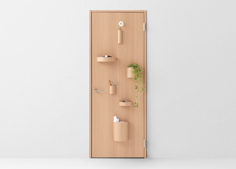
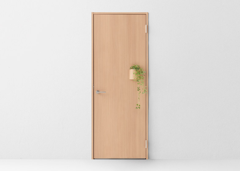
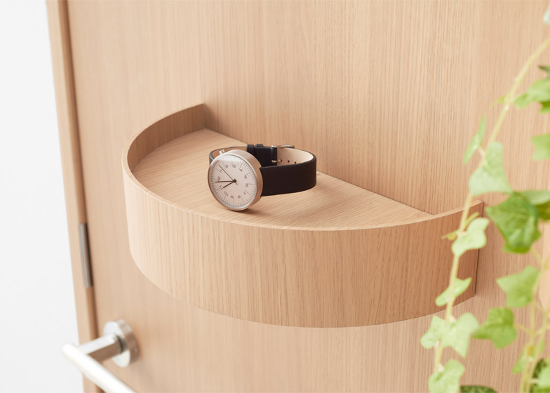
A 2.5-millimetre magnetic sheet is fitted behind the front of the Hang door, so accessories such as trays, dustbins, flower pots and vases can be placed and rearranged across the surface.
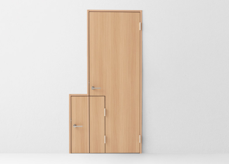
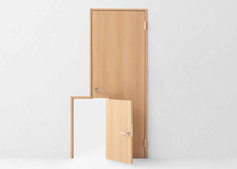
To accommodate small children, a full-sized door called Baby has a smaller portal that straddles one corner and opens independently.
"Abe Kogyo also manufactures various interior fittings for nurseries and pre-schools, and this gave rise to the idea of having adults and children walk through doors that match their respective sizes," said Nendo.
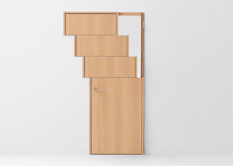
The top of the Slide design has three sections that roll horizontally within the staggered frame to create small openings.
"Much like a window blind, this door can create small spaces to let light in, to let a breeze through, and to create a greater sense of connectivity between rooms," the studio said.
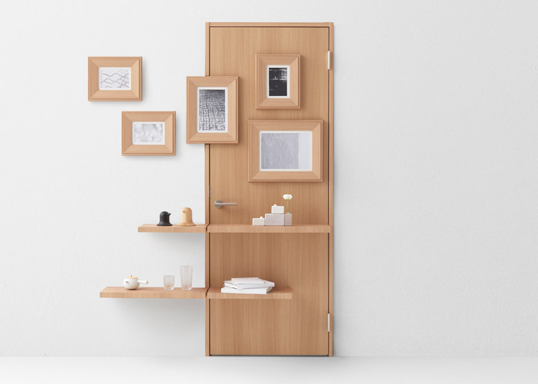
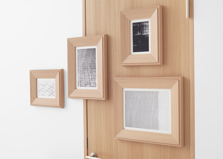
For Wall, the door is treated like part of the room and features shelves and picture frames that span across its edges.
Dezeen Book of Interviews: Nendo founder Oki Sato features in our new book, which is on sale now
"This unit dims the very concept of a door, allowing it to blend into the wall to an unprecedented extent," Nendo said.
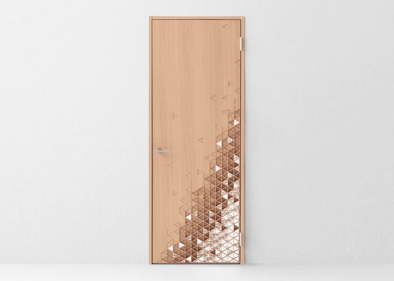
The Kumiko design is based on the assembly of doors used to enter traditional Japanese tatami rooms. A wooden lattice held together without nails blends into the plain surface from the bottom corner.
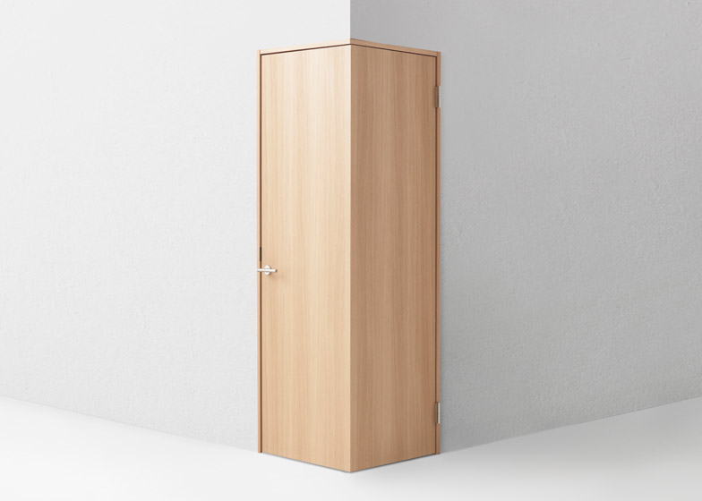
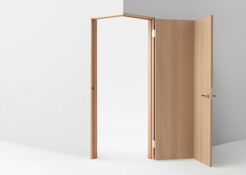
Finally, the studio created a door with a 90-degree angle in the centre so it fits in the corner of a room.
"We noticed that the door on the corner works well for wheelchair users because it opens up so nicely," Sato told Dezeen.
"It really changes the way we design rooms or architecture because usually doors are not in the corner, they are in the wall," Sato said. "When people can walk through corners, it really changes the way we think about architecture."
Nendo Works 2014-2015 took place at the Museo della Permanente in Milan from 14 to 19 April, during the city's design week.
Photography is by Hiroshi Iwasaki.

