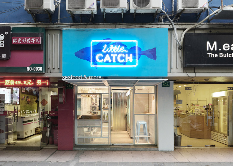
Shanghai design studio Linehouse has overhauled a former takeaway restaurant to create a small fishmonger's on a busy street in the middle of the city's former French Concession (+ slideshow).
Little Catch specialises in selling fresh and cooked seafood, and occupies the bottom of a unit in a strip of buildings on a road filled with food stalls, small restaurants and shops.
The shop was previously a Chinese takeaway called Lucky Bear. Linehouse decided to remove all evidence of this former occupant and conceived a design that would wrap around the interior and stretch out into the street.
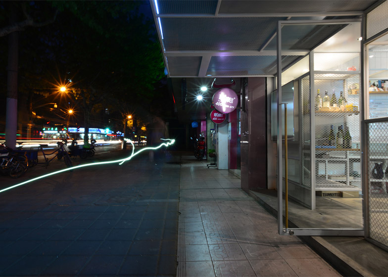
"We created a three-dimensional net that externally reaches into the street as a canopy and envelops the customers as they enter into the shop," explained the designers.
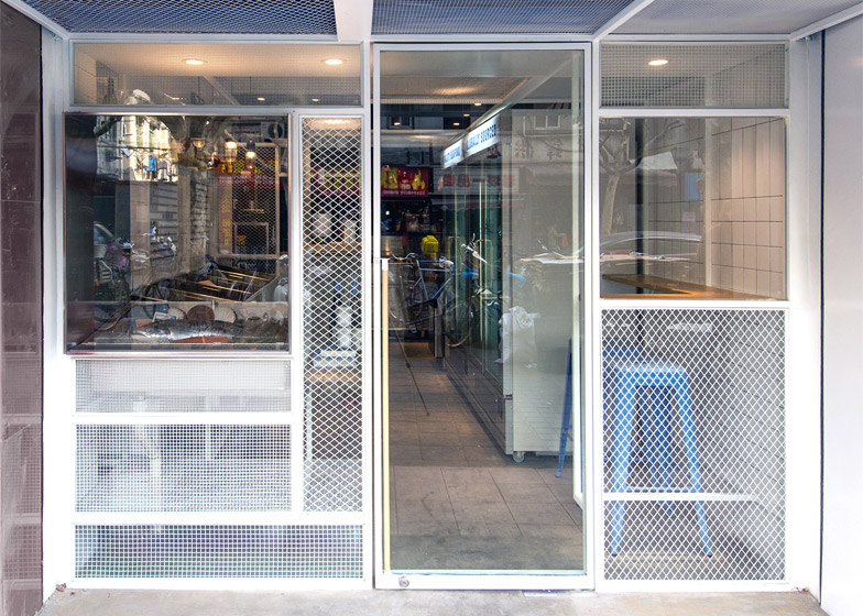
This "net" is made from a white powder-coated frame constructed using pieces of metal in different widths, and arranged to create various-sized openings and shapes that delineate the different uses of the space.
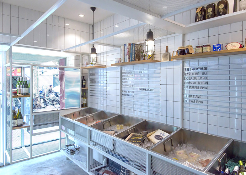
On the facade, the frame is filled either with pieces of glazing or white metal mesh panels and a slightly protruding glazed steel box that is used for displaying the best produce each day.
The extending canopy provides shade under the front area of the shop, where a wooden counter in one corner providers customers with a place to sit and eat while watching passing traffic.
"The exact address is 247 Wulumuqi Road, which is in the heart of the former French Concession, an Art Deco, tree-lined residential district in the heart of Shanghai," explained Linehouse's Alex Mok.
"It was designated in the 1920s as Shanghai's premier residential area and today the lane house and small alleys are inhabited by both local Shanghainese and foreigners," he told Dezeen. "The road itself is quite particular in that it still hosts a lot of the street life that has been wiped out in many other areas due to China's rapid development."
The shop sign dominates the upper part of the facade, and features a blue fish printed on canvas with a neon sign reading Little Catch layered on top. The words "seafood & more" sit on top of the canopy in front.
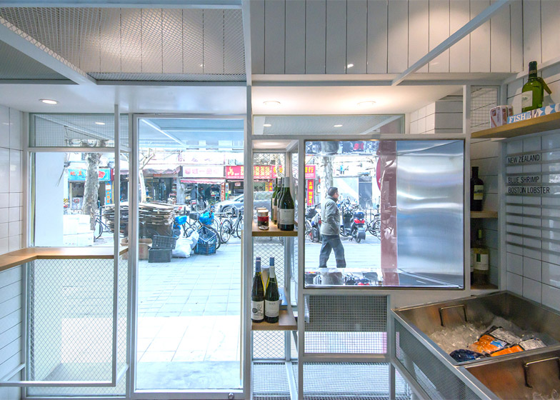
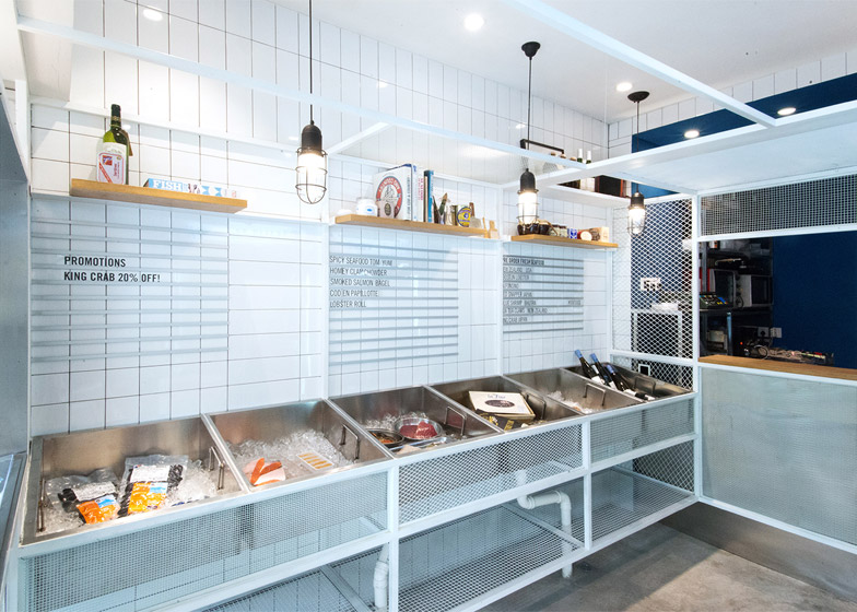
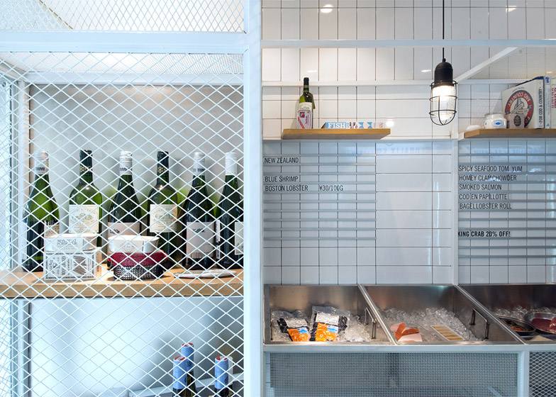
Inside, sections of the frame are filled with a white metal mesh, while others around the walls are left open to frame sets of shelves.
"On the walls the metal structure folds and bends to hold the fresh seafood display, the cashier, product shelving and a table seating two," said the designers.
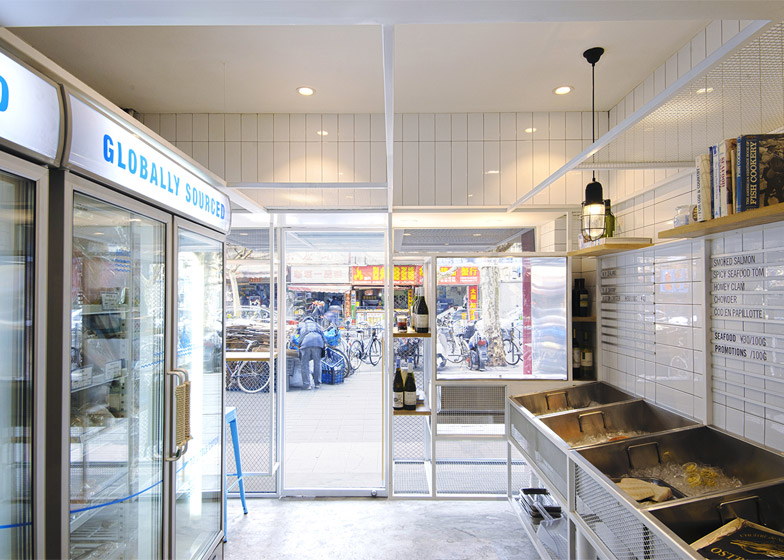
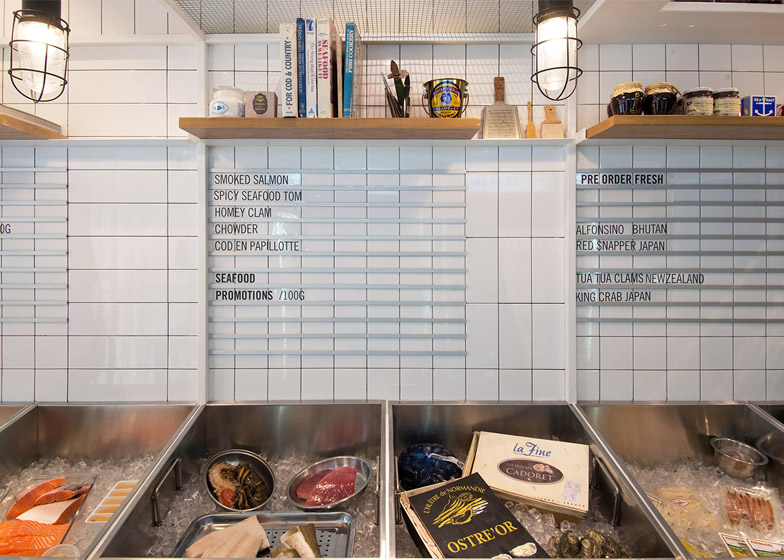
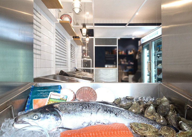
A row of bespoke stainless steel display buckets – for filling with ice to lay out fresh fish – lines one wall in the front service area.
Behind these, menu boards are created using thin strips of aluminium to support pieces of clear acrylic with the words printed on them in black.
The other wall is occupied by refrigerators and the small dining bar that wraps around the corner so customers can eat while looking out at passersby.
The floor was finished in rough concrete to create a hard-wearing but easy to maintain surface, while glossy white wall tiles in three different sizes are used to finish the space.

