Norm Architects puts a Danish spin on an Italian restaurant interior
Danish studio Norm Architects has pared back the look of a typical Mediterranean interior to create a more Scandinavian aesthetic for this Italian restaurant in Copenhagen.
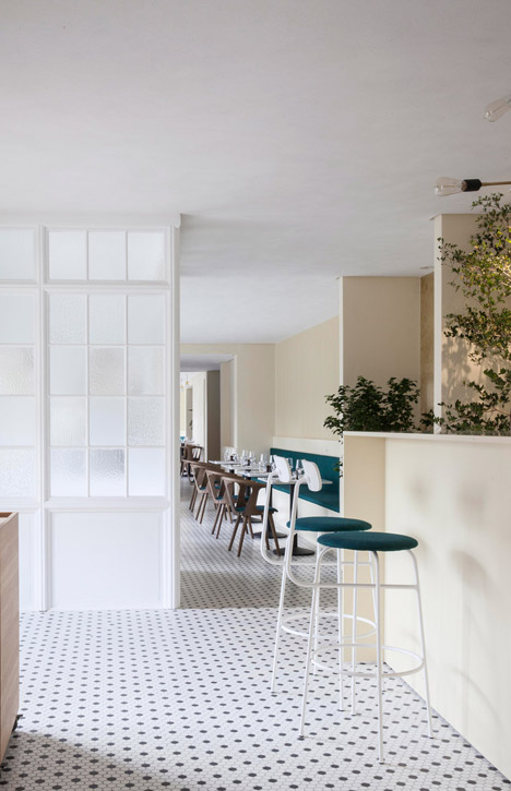
Norm Architects designed the interior for the first in the Italy chain of restaurants run by the owners of Cofoco, a bistro in the Vesterbro area of the city.
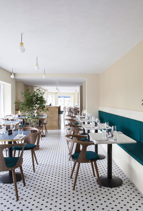
"We are embracing the Italian mindset," said Norm's Linda Korndal. "The atmosphere is warm, inviting, full of life and joy but we have translated it into interior motives that Danes can relate to."
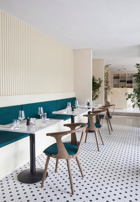
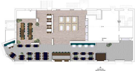
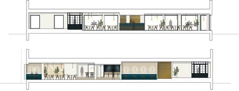
The restaurant's dining area is divided into two main spaces. The first runs along the glazed facade of the building, and features small hexagonal black and white tiles across the floor.
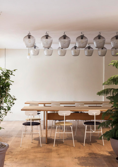
Set back in an area of the building that receives less natural light, raised wooden flooring defines a second space with tables for larger parties.
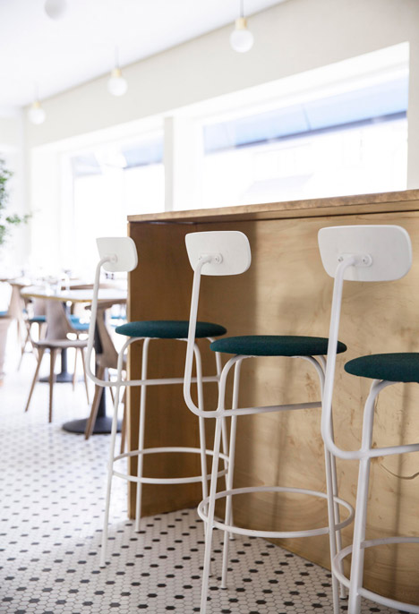
The wood used to create the bar located within a tiled corridor is left untreated to allow the water marks from drinks to build up and pattern its surface.
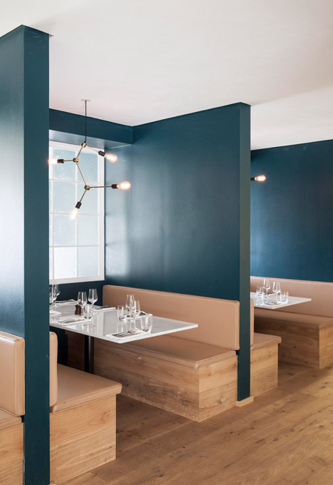
Teal upholstery covers bench and seat cushions, and the same colour has been painted onto partition walls that separate a series of booths where seating is finished with tan-coloured leather.
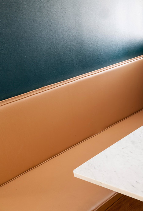
"In our Scandinavian climate the cosy feeling is very important," said Korndal. "Many authentic Italian restaurants in Italy are often simple and crisp."
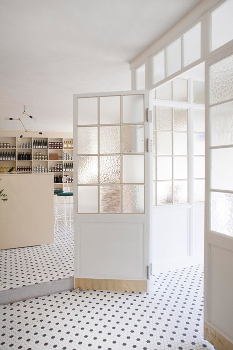
A shop selling ingredients and pre-made sauce mixtures is located at one end of the space, a small step up from the rest of the tiled floor.
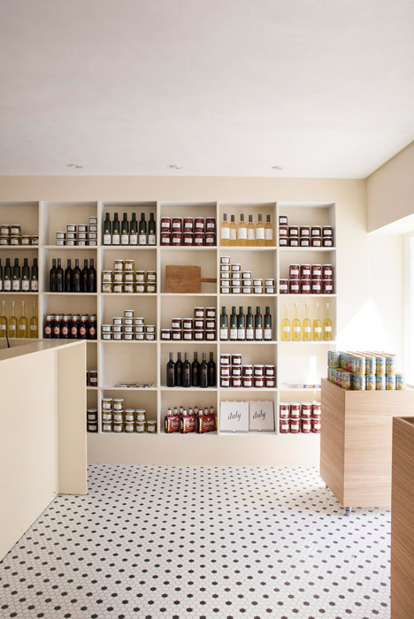
The products are displayed within a large shelving unit or on podiums, all made from the same light-coloured wood used to build the service counter.
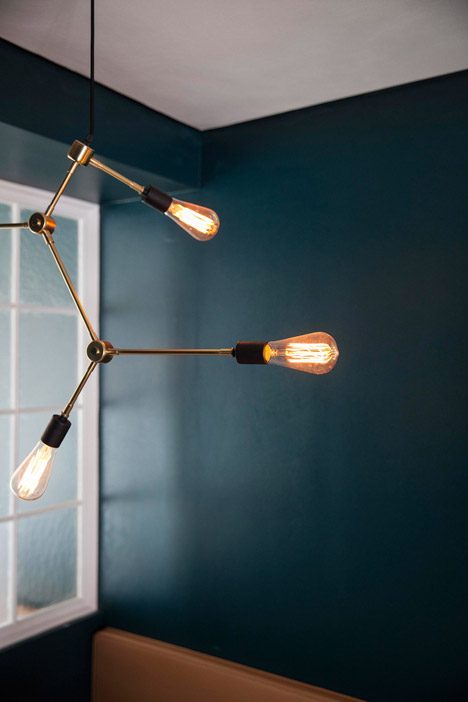
As Norm's co-founders Jonas Bjerre-Poulsen and Kasper Rønn are also creative directors for Menu, many of the Danish brand's furniture and lighting designs are used throughout the interior.
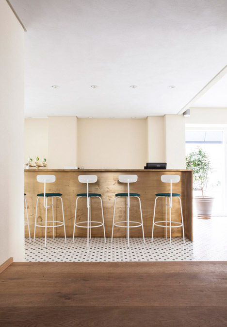
These include white chairs and stools with spindly legs by Afteroom, and brass Franklin Chandeliers by Søren Rose Studio that hang in the booths.
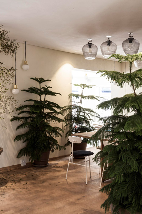
Potted plants dotted around the space soften the contrast between the teal seating and the pale yellow walls.
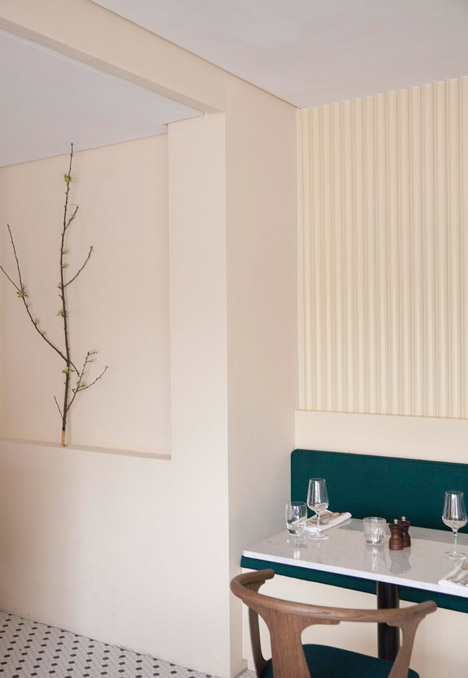
The studio developed four "spatial archetypes" as part of the design to ensure the restaurant's aesthetic can be translated at the chain's upcoming branches.
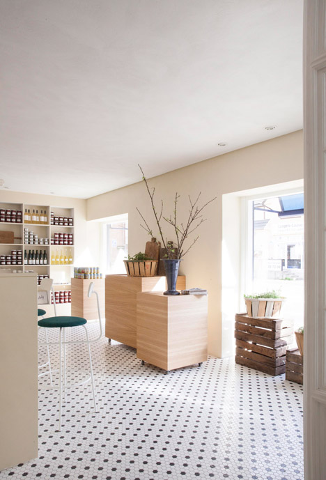
The niche, the passage, the courtyard and the dining room all follow similar colour and material palettes, but each uses a different layout to make the most of contextual restraints.
Photography is by Jonas Bjerre-Poulsen, Norm Architects.
