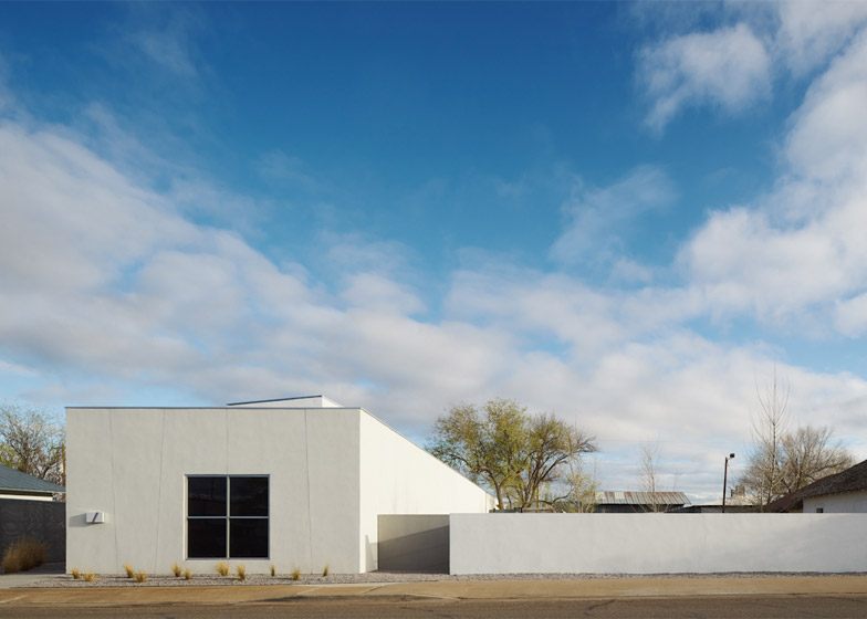
Claesson Koivisto Rune has designed an art gallery in Marfa, Texas, which is the Stockholm studio's first completed project in the USA.
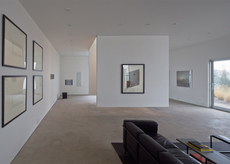
Claesson Koivisto Rune's new building was designed to house the Inde/Jacobs gallery, which specialises in Minimalist artists.
The stark horizontal landscape and piercing light of Marfa particularly fascinated the late artist Donald Judd – considered a pioneer of Minimalism in the US.
This lead him to make the small Texan city both his home and the setting for numerous site-specific installations in the 1970s and 1980s. Today, despite its remote location, Marfa remains a major art and design destination.
The new gallery is intended to continue Judd's legacy into the present. "You have to respect Judd without quoting him directly," said principal Eero Koivisto of the studio's design approach.
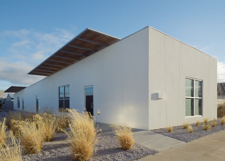
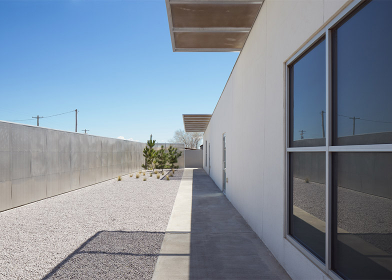
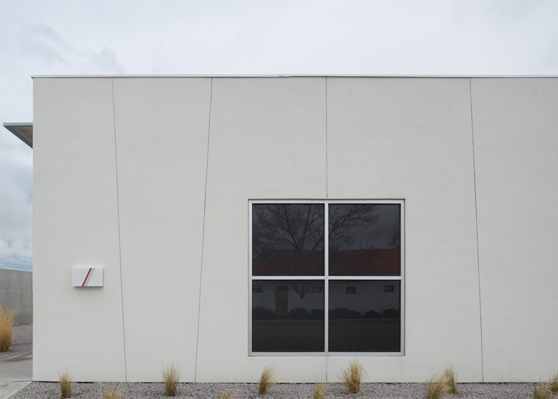
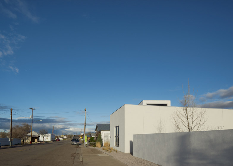
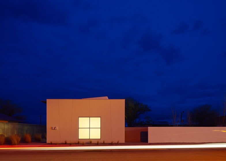
The building appears blocky and purposefully mundane from the street, both fitting in and standing apart from the vernacular structures that surround it.
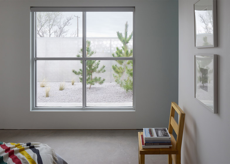
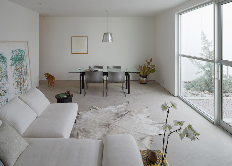
Though it appears as one from the road, the complex is actually comprised of two separate buildings – a gallery and a residence for its owners – joined by a courtyard.
The studio used subtle sculptural moves to shape perceptions of light and space in the project.
For example, the inner courtyard wall is canted slightly to make the space appear larger than it is.
Openings for the windows and doors on both white-coloured buildings vary just slightly, playing a trick on the eye.
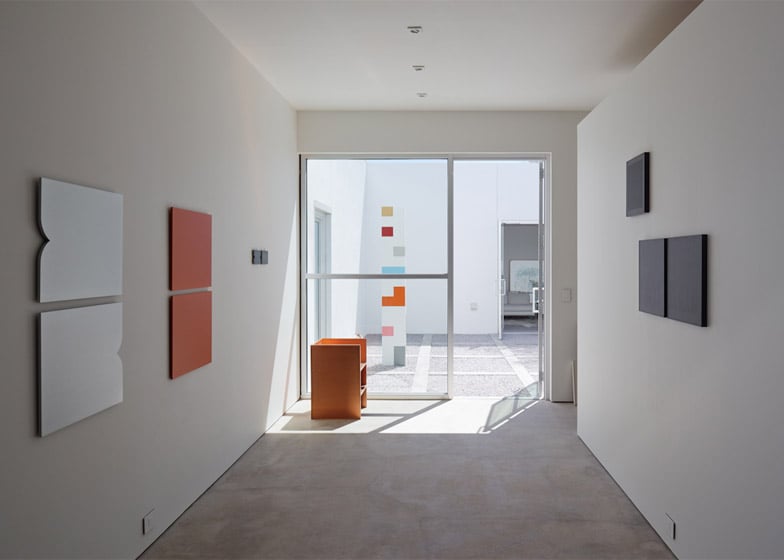
The courtyard serves as both a sculpture garden for the gallery and an outdoor space for the residents.
In addition to Judd, the architects cite the influence of the Mexican Modernist Luis Barragan in the design of the courtyard, which features a rocky planted area.
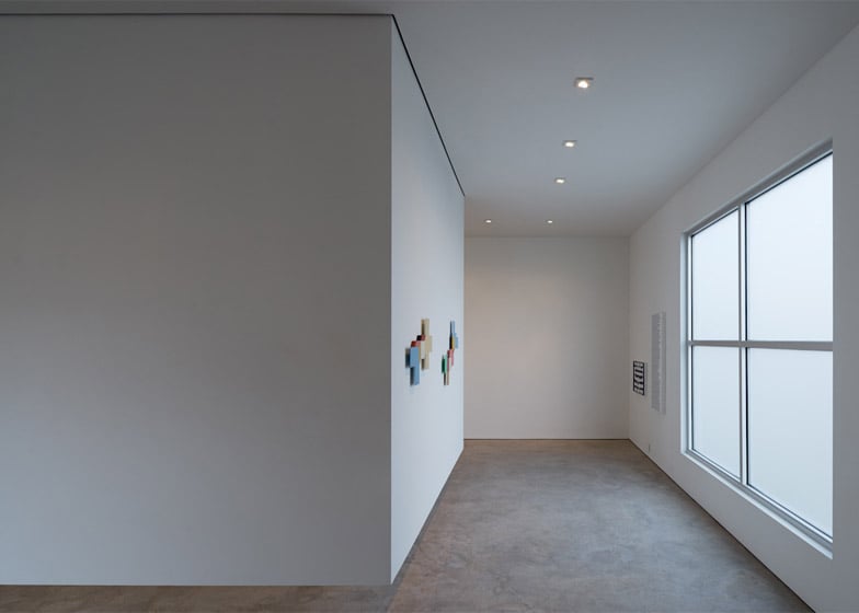
Inside the gallery, a skylight brings the bright Texas light into the white-walled space. "The light is very vertical, very strong," said Koivisto.
Around the aperture, three partitions hang from the ceiling and extend nearly to the floor, creating a U-shaped volume.
The skylight enclosure provides additional wall space for mounting artworks while also modulating the light level.
The art storage room is also treated as a detached object; its walls do not reach the ceiling.
This helps maintain the sense that the gallery building is a single large volume, while also providing varied spaces for display and back of house functions. "These two boxes are in dialogue," Koivisto said. "You don't see everything immediately."
Photography is by Åke E:son Lindman.

