"A punch in the face to bland, Modernist crap"
Comments update: a fairytale-inspired Essex house by architecture studio FAT and artist Grayson Perry was the most discussed project this week. Read on for more on this and the other most commented stories on Dezeen.
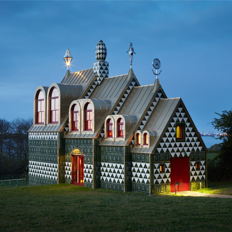
The only way is Essex: a House for Essex – commissioned as part of philosopher and critic Alain de Botton's Living Architecture programme – was designed as a shrine to the fictional character Julie Cope. But not everyone fell for its elaborate stylings.
"Folly, fluff, even art; call it what you like, but please, not architecture," said one commenter.
However, most readers were won over by the design and celebrated its unique character. "I really disliked this before I saw the pictures," commented Jackexe, " but now I can't help but feel the grotesque charm of the place."
"Truly amazing collaboration," said Derek_V. "A punch in the face to bland, Modernist crap." Read the comments on this story »

Mexican wave: commenters have been comparing Zaha Hadid's first project in Mexico – a high-density housing development – to the Brutalist Robin Hood Garden estate in London.
"I usually like Hadid's work, but I thought there was a consensus about demolishing these types of buildings," argued regular Dezeen reader Leo. "This will become a gated community with very expensive maintenance fees."
Others discussed the sinuous design and its relationship to the surroundings. "I appreciate what the design is trying to do by being wavy, but I still think it's going to create one solid site rather than offering permeable areas," said TiagoX. "This could be a catastrophic, alienating design if realised." Read the comments on this story »

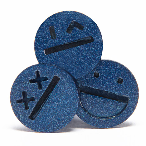
Screw up? These screws featuring smiley faces were created as part of a collection highlighting the overlooked elements of furniture design, and triggered a discussion about the health of the design industry.
"Design has become a stretched-out concept," wrote M. Vitruvius. "Just like a rubber band that has been under too much stress for too long, it might lose all use and meaning. As it does here."
Not so, replied a commenter calling themselves DiscoDancer: "People want new things all the time, why not update already-owned items with something that is necessary and that requires few resources to produce? This makes sense and is clever."
"Screws are purely functional and don't need jazzing up with decoration," added James. Read the comments on this story »

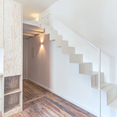
A step too far: dangerous staircases were back on the agenda, as readers pointed out risky design features inside a renovated Berlin apartment.
"Those stairs are dangerous and are therefore badly designed," said Z-Dog. "They look nice though."
Barbara Jones broadened the point by asking if the designers had considered elderly people when designing. "It amazes me how little consideration is given to inclusiveness," she wrote. "This may work for fit, young people but wouldn't be great for children, those with limited mobility or the elderly." Read the comments on this story »