Interview: Alex Garland's science-fiction movie Ex Machina features just one location: a tech billionaire's minimalist hideaway in Alaska. Production designer Mark Digby told Dezeen how architecture was used to create the thriller's clinical mood and provide a "seducing" backdrop (+ slideshow + transcript).
"It's a very particular film," said Digby. "There are only three or four people in it and it's all set in one house. There's very little space to escape to somewhere else. So the house had to be important."
In the film, directed by British writer Alex Garland and released last month, coder Caleb Smith wins a company-wide competition to spend a week at the wilderness retreat of Nathan Bateman, his reclusive billionaire boss.
Trailer for Ex Machina
After arriving by helicopter at the house, Caleb learns that Nathan wants him to spend time with Ava, a robot he has built, to ascertain whether she shows genuine artificial intelligence. From then on, all the action takes place within the confines of the home.
The location for this claustrophobic encounter between men and machines "had to be welcoming and seducing but at the same time it also had to make us wary and slightly on edge," said the British designer.
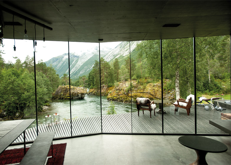
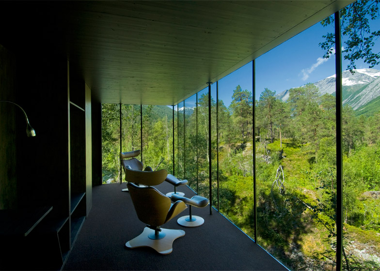
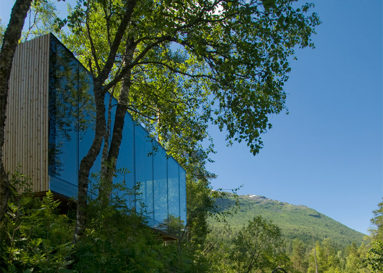
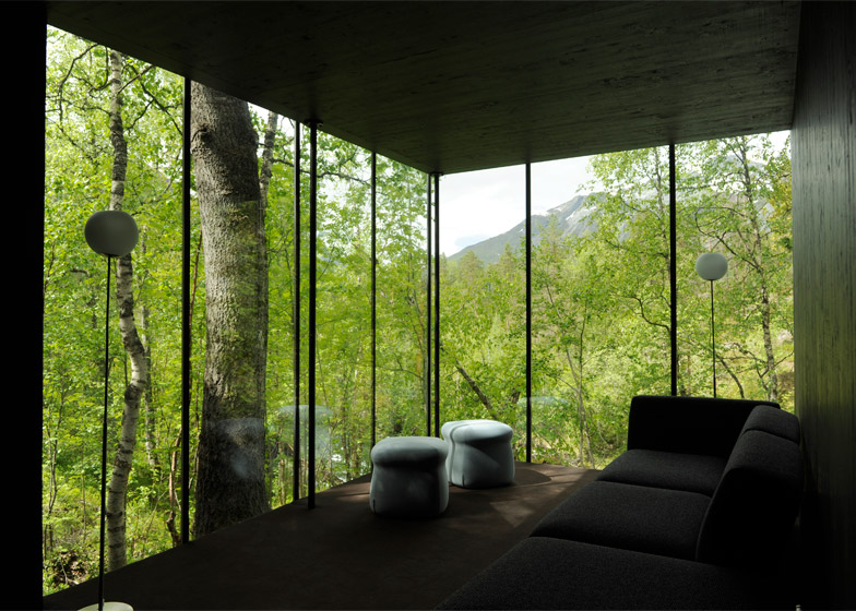
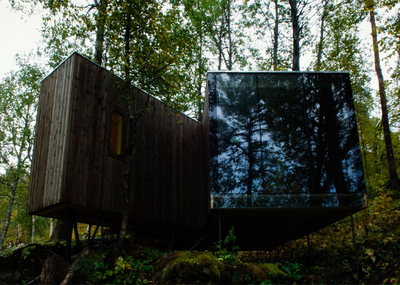
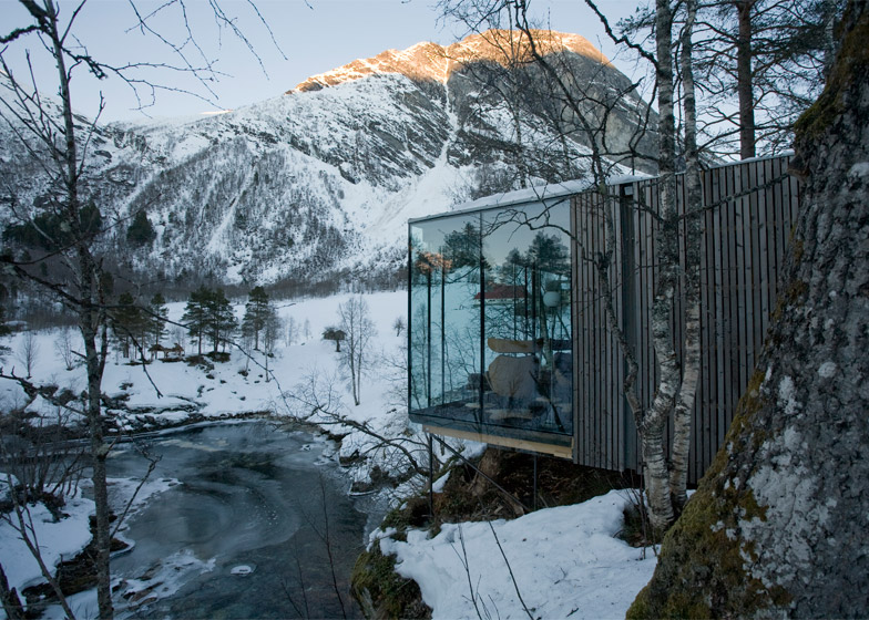
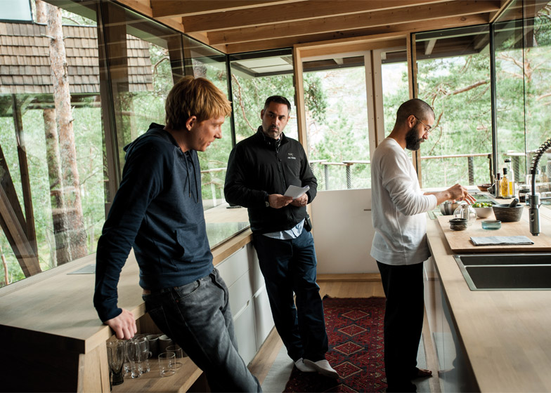
A lengthy location search led to the Juvet Landscape Hotel in north-west Norway. Designed by Jensen & Skodvin Architects, the hotel features timber-clad cabins set amid trees in a glacial valley.
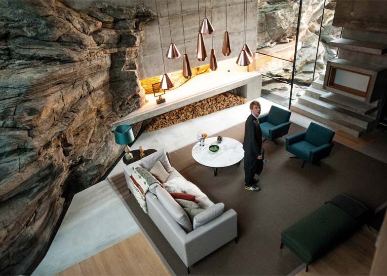
The Residence, a cliff-top house by the same architects, was used as a secondary location while an underground suite of austere concrete rooms that host many of the scenes was constructed at Pinewood Studios in England.
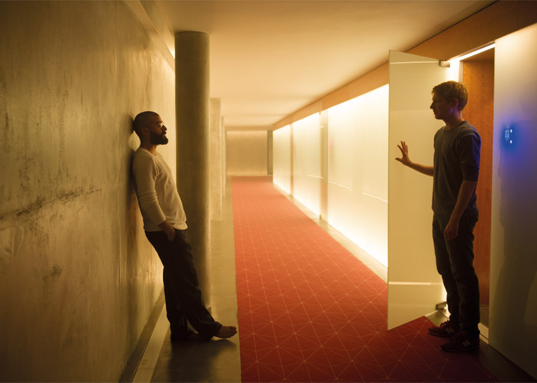
"It's set in about five rooms and they are all built of concrete," said Digby. "It was quite a challenge to take concrete and make it beautiful and seducing and hopefully we did that."
"Hard shiny surfaces are for the bad guys," he added, referring to Hollywood's tendency to house villains in Modernist structures. "We wanted to keep away from that, but we wanted to still use it. So that was quite a challenge really."
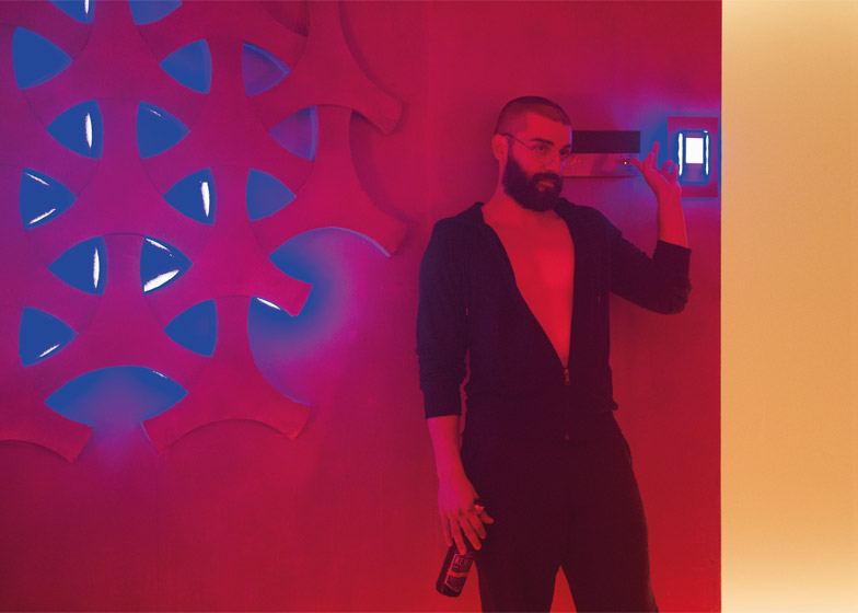
Tastefully furnished in a vaguely Scandinavian-retro manner, the Ex Machina interiors deliberately eschew sci-fi genre cliche, Digby said. "That goes back to our want as designers not to feed into the literature of films and popular culture, which says that for the future it has to be shiny and bright and in your face."
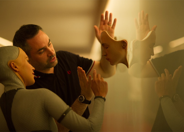
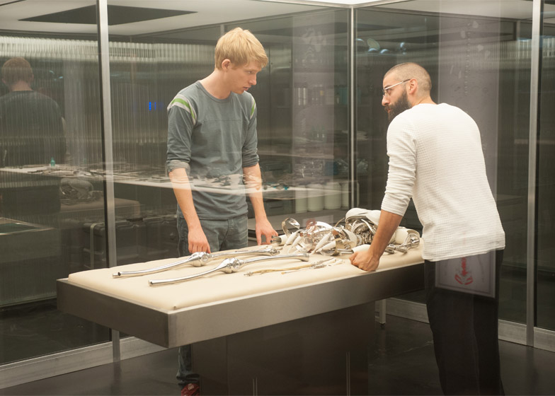
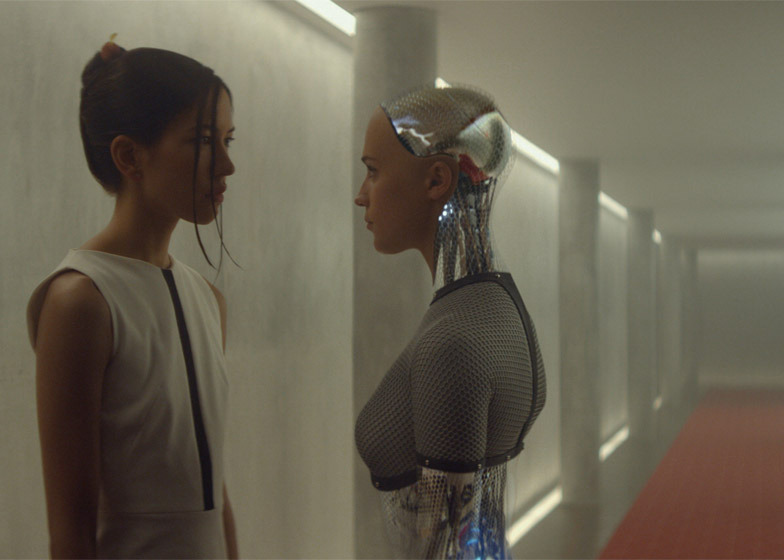
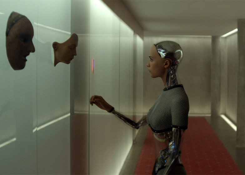
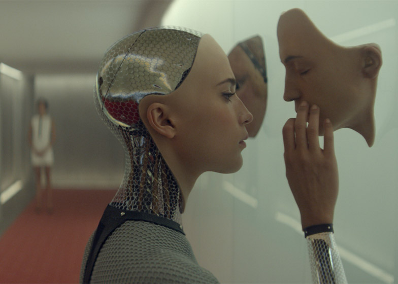
The low-tech vibe of the interiors contrasts with "female" robot Ava, whose partially transparent torso, limbs and skull reveal flashing circuitry.
"There's a duplicity that runs through the whole film," said Digby. "All the way through we wanted both Caleb and the audience to be confused and reminded perhaps that she is a robot, yet she has human attributes. She had to look a bit weird, and constantly not human."
Ex Machina stars Alicia Vikander as Ava, Domhnall Gleeson as Caleb and Oscar Isaac as Nathan.
Below is an edited transcript of the interview with Digby. Spoiler alert! The interview reveals key plot details.
Marcus Fairs: Tell us who you are and what you do.
Mark Digby: I'm a production designer. I take care of everything three-dimensional on a film; everything that we see in the film. So I take care of physical sets, whether they're built or found by a location manager or a location team, but also small props, furniture, pens, pencils, furniture, dogs, cars, guns, aeroplanes, grass, trees or greenery… everything you might touch in a three-dimensional sense, apart from costume and the actors, is under my brief.
Marcus Fairs: So you weren't involved in designing the robot in Ex Machina?
Mark Digby: I was to some degree. The bulk of the robot ended up being a CGI brief but I got involved in some of the initial ideas for her skin and outer appearance, the inner workings. This was taken on by the costume department and the prosthetic department to build her geometric-patterned skin.
And then we talked collaboratively about the internal workings of the robot, and the CGI guys then took on the design of that, and then handed some of that back to us because we made physical skeletons, then gave them back for them to scan and further use in their final design. So it was very collaborative the way it worked.
Marcus Fairs: How did you get to be a production designer? Did you study design or did you fall in to it from somewhere else?
Mark Digby: I guess I fell into it. I did engineering at university but I didn't finish it. I joined a theatre and I got heavily involved in that and then moved on to film and television. I built my career from the bottom really. I just took the opportunities that came my way.
Marcus Fairs: What other films have you worked on?
Mark Digby: We did the forthcoming Dredd 3D and the Kazuo Ishiguro book Never Let Me Go. I also did Slumdog Millionaire and Rush, the Formula 1 film with Ron Howard. I just finished a film called Genius which is about Ernest Hemingway, F Scott Fitzgerald and literary agent Max Perkins.
Prior to that, I worked on 28 Days Later [with Alex Garland], Millions, and a fair few of Danny Boyle's films. In my very early days I worked on children's TV, and one-off dramas for Channel 4 or BBC.
Marcus Fairs: Tell me about the background of this film. How did you get involved with it and what's it all about?
Mark Digby: I got involved through my long-term collaboration with Alex Garland. I've known Alex since [2002 movie] 28 Days Later, and then Never Let Me Go and then Dredd. He came to me and my team and asked us to go along this journey with him based on this fantastic script.
I've got to admit, it's always the first thing you look at and it was a script that I really, really enjoyed. And early on we realised that the set and the location and the architecture was a very important thing.
It's a very particular film. There are only three or four people in it and it's all set in one house. There's very little space to escape to somewhere else. So the house had to be important. It had to both reflect the unusual character of Nathan, a multibillionaire who has a secret hideaway where he's building technology of the future. It had to reflect his wealth, but also his technical ability and his intellectual status.
Marcus Fairs: And his weirdness in a way…
Mark Digby: Absolutely, it had to be welcoming and seducing but at the same time it also had to make us wary and slightly on edge. It had to be secure but not too secure, it had to show his wealth without being too ostentatious because that was his character, and it also had to be interesting. It's set in about five rooms and they are all built of concrete. It was quite a challenge to take concrete and make it beautiful and seducing and hopefully we did that.
Marcus Fairs: That sort of hard, contemporary architecture does tend to get associated with the bad guys. You know, all the Bond villain lairs.
Mark Digby: Absolutely. I think we like to think that one of our design strengths is that we shy away from the language we're given by other films, by contemporary culture. As you say, those hard shiny surfaces are for the bad guys. We wanted to keep away from that, but we wanted to still use it. So that was quite a challenge really.
Marcus Fairs: And this demand for there to be just one remote location, was that already in the script or did you help develop that concept?
Mark Digby: No, that was in the script. I wouldn't say it needed to be particularly remote, but it needed to be secure. And part of that security comes with being remote. Initially we imagined a multibillionaire would probably have a palatial, highly modernistic, large-scale building, and probably in somewhere less inhospitable. But we couldn't really find anywhere that fitted the bill, practically for shooting or even thematically.
So our journey, by chance, took us over glacial and alpine territory and we suddenly realised, well, why don't we make the landscape itself the security and the remoteness, and therefore our house, our living space can be smaller. The thing that shows his wealth and his power is that he can have a house in such a location, because most people can't.
But it also served all the other purposes. Originally in our brief we thought we'd build a walled and gated residence, but we don't need that if you put it in a place that is very hard to get to. That was the interesting turn on that.
Marcus Fairs: Is it normal in a movie like this to go and find an existing building that fits the bill, rather than building one yourselves?
Mark Digby: Well there are no great rules in filmmaking. I think it's what best fits our plan for the film – and a lot of that is down to economics and ideology. It's very hard to build reality, and certainly I believe that it's very hard to build the idiosyncrasies of reality. When you're building from scratch and building a set, you've got to work hard not to build perfectly regular shapes and easy access and easy patination because life isn't like that. And economically it's very hard for us to build something of that stature.
One of the things with sets is it can end up being a theatre space unless you're able to look out of the window. And if you're in one space often, and you're looking out of that same window and it's not a reality – no matter how much CGI you have, no matter how much scene painting you have – you can get caught out.
So it made more sense on this occasion to do part build, part location. And I think that's the perfect balance. You get the best of both worlds.
Marcus Fairs: Tell us about the location you found.
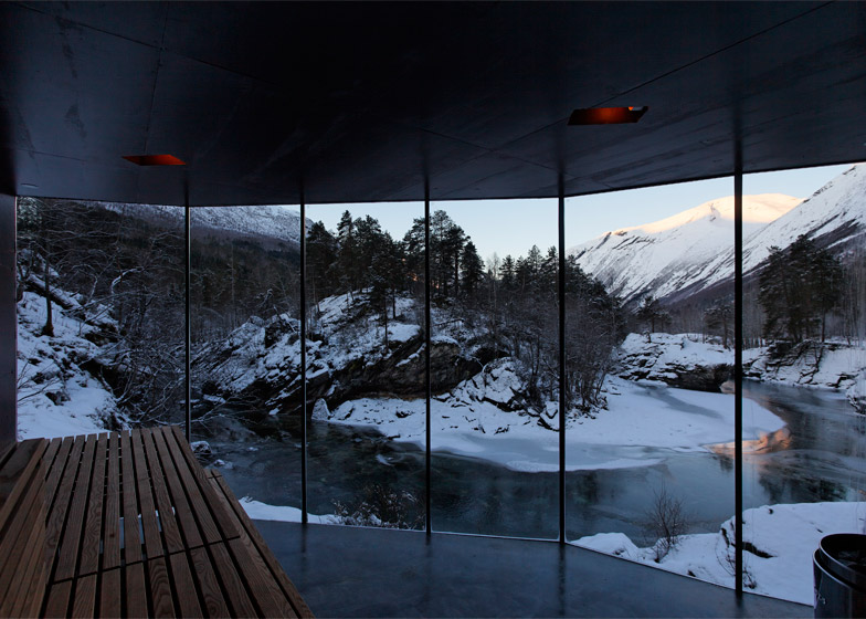
Mark Digby: It's in Norway. We were quite lucky really. We found a hotel complex, which has these little cabins. When you first approach the film you see what looks like a small wooden cabin and then it expands into a bigger house and a subterranean world as well. And they have breathless views, which you see in some of the rooms. In the dining room for example, looking out onto a beautiful valley with a meandering but fierce glacial river. We liked that, but the space was too short to do the whole film in. We thought we might have to build, but the guy who owned it said well, there's a house being built by the same architect not half an hour away.
We went to have a look at that, it had exactly the same architectural features and the same texture of the concrete, same height, same structures, except it was built into the mountainside. We had a duality of nature and the man-made structure there, which was something else we quite liked because it mirrored our Ava, our robot, being a blend of humanity and nature with man-made science. We took that theme and put it in some of the other rooms, which were built sets.
Marcus Fairs: So the suite of underground rooms linked by a glass corridor was built for the film?
Mark Digby: We built the rest at Pinewood Studios. That corridor was a build in a studio, and in the same studio space right next to it we had Nathan's bedroom with all the cupboards. And right next to it was his office space with all the Post-It notes on the wall. And then a bit further down, still connected, we had his bedroom, which has no windows, which was part of the theme for that.
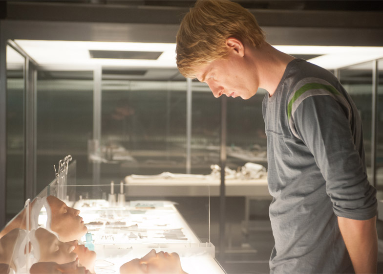
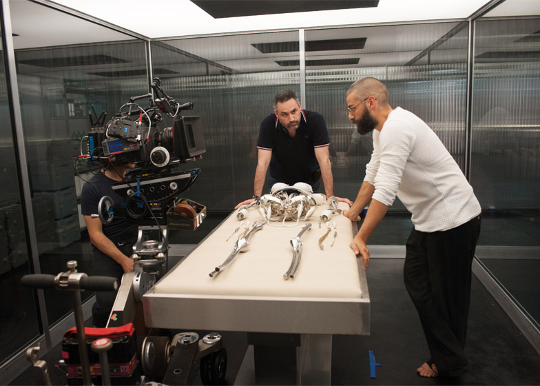
And then in another studio we built the construction lab, which is where you see obviously all the skulls and the bits to make Ava.
Marcus Fairs: So what was your starting point for the architecture used in the film? Did it come out of the location in Norway or did you get out a big architecture book for inspiration?
Mark Digby: Well it's a combination of things. Our initial design encompasses any ideas that hit our head when we look at it, so it is actually a gallery of sculptural pieces. Because we thought we were going to be filming in big mansions, we actually started off looking at big airport spaces, big concrete buildings, big museums. We looked at a fantastic book on Ando's work.
Marcus Fairs: I was going to mention Ando actually…
Mark Digby: Yeah there was certainly a nod to that, especially in the early days because some of the buildings we looked at actually were art galleries and scientific research laboratories. So I guess we were influenced by those big municipal buildings, and then you fine-tune it down with lots of little ideas that you find along the way. But it's a cornucopia of stuff really. I think that's important.
Marcus Fairs: From the outside the house is very Scandinavian: boxy with weathered timber. Inside it's architecturally very harsh, but then the fixtures and fittings are actually quite soft and humanising.
Mark Digby: We put it together like that because we're in a stark environment outside, we've built a concrete structure inside, but someone's living there. And you need to balance that out with the softness of human life. It was very much driven by Nathan's character. He's a man alone living there; he focuses on his work. But certainly he's been allowed life experiences and life choices and he's clearly an intelligent man. He certainly is able to afford art and is educated about art. Remember this is the man who controls everything on the internet. So he can find out everything about anything.
Marcus Fairs: So did you have a look in mind for the interior furnishings? Is it mid-century Modern, is it Scandinavian?
Mark Digby: Well I think it ended up being mid-century classic with a Scandinavian tilt. I think for both the purity and the simpleness, but also the effectiveness of Scandinavian design. And it was driven by the fact that we were in a Scandinavian country. You're all the more reminded of it although the film is supposed to be set in Alaska. But I think much of the design is in empathy with that sort of landscape, hence it fits very well.
Marcus Fairs: But for someone who is a powerful figure in technology, the technology is very hidden in the house. It's not in your face, there's no banks of blinking LEDs.
Mark Digby: No and that goes back to our want as designers not to feed into the literature of films and popular culture, which says that for the future it has to be shiny and bright and in your face, and also if you have wealth you have to be highly ostentatious with it. I think there is an alternative reality of people who are so focused on other aspects of their life and so rich that they don't need bling.
And there's also a matter of design functionality that says if you don't need something it doesn't have to be there. So if the lights have no function or it doesn't need to be shiny, don't make it. Again it's for us a reaction to a lot of popular culture that says if something has to be weird or in the future, it has to have LED lights, which are the technology of now, and it has to be in your face.
And it doesn't. Most of the technology in our own life even in beautifully designed houses is hidden; the light switches, the panels, things are hidden away. We have cupboards for stuff and we have lighting that's recessed and not in your face. So we worked very hard to follow that through. I guess that's just one of our mantras really.
Marcus Fairs: But on the other hand, the robot has LED lights flashing inside her. Did you feel like you had to make it quite obvious that she wasn't human?
Mark Digby: Yes, absolutely. There's a duplicity that runs through the whole film. All the way through we wanted both Caleb and the audience to be confused and reminded perhaps that she is a robot, yet she has human attributes. I think we played with that right the way along the film. So we needed to be seduced by her artificial intelligence and her humanity, but the next second be reminded: 'Oh, hang on a minute, this is the purpose of it, this is the purpose of what Nathan was trying to do'.
Marcus Fairs: Ava had to look a bit weird then?
Mark Digby: She had to look a bit weird, and constantly not human. You know, we could've done the whole human skin, but it would've worked against what we were trying to do, and against what Nathan was trying to do. It's always an arbitrary decision about design and beauty. We also wanted it to feel less mechanical and hydraulic, and have some living and beating essence in it, and one way of showing that is with light. To be able to show light within her, she then needed to have an element of transparency and an element of solidity as well.
Marcus Fairs: You said you were involved in the design of the robot. What was the process?
Mark Digby: The CGI guys very much designed what was going to be in her internal organs and how they might look, and they drew that on computers. But then we were able to take those technical drawings and 3D-print from them. So we built it into a skeleton, and some of those pipes and fluids were the organs, so we had her skeletal structure 3D printed. And also built a life-size skeleton, which we used in a scene that was cut, but that's what filmmaking is all about.
Marcus Fairs: What's your favourite moment of the film in terms of your set design?
Mark Digby: There's quite a few. I really like Nathan's bedroom and those curved cupboards and that curved room. And we really enjoyed separating that with a glass forest, that was really lovely.
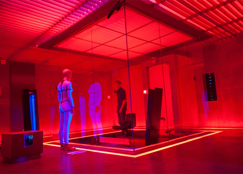
Her space was very interesting as well. We were teasing her to remind the audience that there is nature, there is a light outside, we had a tree and a little garden at the back and that was always supposed to be a bit of a thorn in his side, in her side. We flipped around the theology about how we view people so if you look again at the film, he is in a box trapped looking out at her, who can view him by walking around, well 270 degrees. Now normally, our first take is to put the observed in the box, in the fish bowl, and have the observer go around the outside, and I think I loved the spatial arrangement of that and the theme and depth into her living space and her garden behind. So I guess the observation room is my favourite.
Marcus Fairs: Do you start to get attached to the characters?
Mark Digby: Yeah you do, you do get very much attached. I think you have to get attached to the characters, you have to get deep into them. And ideally we need to have the same feelings that the audience are going to have, in order to understand what to do.
Marcus Fairs: Throughout, you're sort of, who's the hero and who's the villain is always going through your mind – whose side are you on if it's not going to be a love story at the end?
Mark Digby: What I liked was that although you can guess the ultimate scene, even now I'm not sure who are the goodies and who are the baddies, and I like that complexity.
At some stage, you have an amount of empathy for Caleb. He's a guy and he's falling in love with a woman, inverted commas, and she betrays him, but he sort of betrays her too. When it really comes to it and she asks him what will happen, will you protect me, what happens at the end of this when you go away, he covered his bases and he didn't really say: 'Well that's it, you'll be gone, I'm not going to help you'. So in a sense she had a motive and every right to leave him behind. And maybe it is about survival of the fittest, and in that case, what would a human do?
So I'm in two minds about her actually. She was ruthless, but so were the other two characters. Nathan's pretty ruthless to her and Caleb was confused. But ultimately, he was going to go home and leave her there. And he knew she wasn't the final model. And that's why I loved the script. It was very much about some of those big questions. Existence, life, loyalty, love, a lot of things.

